
Web and mobile typography continued to boom in 2012, with more and more typefaces making their way directly to the browser.
Thanks in no small part to the lovely nerds at Google, web fonts that the consumer doesn’t have to download are now legitimately A Thing. Google’s ongoing Web Fonts project is now home to more than 600 typefaces, all of them free and Internet-friendly.
Also, we’ve got the @font-face rule in CSS3, which makes displaying new and interesting faces directly in the browser much easier on everyone.
Just don’t use fake bolds and italics and we’ll all be fine.
Also, you can check out last year’s mobile/web typography round-up if you’re particularly interested in watching trends change over time — or if you want to pick up some still-hot free typefaces for your work in 2013.
Best font for your new tablet magazine: Noticia
4 fonts | FREE
This @font-face compatible type family (also available from Google Web Fonts) is as versatile as it is legible. For those of you over the age of 25, Noticia will be instantly recognizable as a loving tribute to the news magazine faces of yore. Its ample x-height and sturdy serifs make long blocks of text in those meaty investigative pieces a pleasure to read. Also, Noticia gives you a break in the interior curves of round characters. “While this break makes some interesting forms at large sizes, their true purpose is to help make the counterforms more open at small sizes by allowing straighter stems,” say the creators.
Best new rounded face: Bariol
6 fonts | PAY WHAT YOU WANT
Rounded fonts are one of the design trends we’ve been seeing around the web and various app marketplaces lately. Legible and playful, they’re in keeping with the lighthearted new school of consumer digital products. Bariol is sans and rounded in one, with pleasant weights in regular and italic faces. Plus, the Bariol icon set will greatly expand the vocabulary of your app’s design language. While the font’s creator asks for you to pay whatever you like for the full set, you can also shout out via Twitter or Facebook to get free downloads.
Best web serif: Poly
2 fonts | FREE
Poly was intended to be an academic’s love letter to a South American indigenous language called Wayuunaiki. It ended up being a critically acclaimed Latin serifs and one of the best Google Web Fonts, period. This @font-face compatible typeface is a workhorse for running text, an elegant and subtle substitute for the more common serifs on the web. Plus, its high x-height and abbreviated ascenders make it great for small sizes, even for mobile web use.
Second-best web serif: Quando
1 font | FREE
Inspired by a World War II Italian poster, Quando is a casual serif with the curves to hold your interest in headlines and the low-contrast to look good at small sizes in running text on a mobile device. We’re sad that it doesn’t come with a bold, italic, or other weights to round out the family, but we like where the type designer was going with this.
Best indulgent didone: Valentina
1 font | FREE
So, you want to play around with a sexy, swashy Didone and you’re not too picky about web compatibility? Have we got a font for you. Valentina contains more glyphs than you will ever possibly need — including lowercase alternates and fancy ligatures. This highly decorative face will add a heavy-handed touch of “I worked in print” class to your magaziney apps and single-page sites.
Best new dingbats: Erler Dingbats
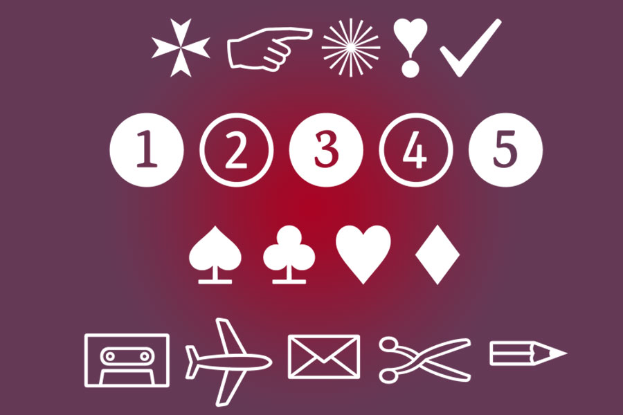
12 fonts | FREE
Dingbats have been aching for an update of this caliber for decades. In 800 glyphs, the creators of Erler Dingbats give us the arrows and pointy-fingers we’re used to and more than a few refreshingly modern shapes as well. There’s a Nintendo Wii controller in there, for chrissake. These quick-and-dirty glyphs make sweet U.I. elements for icons, maps, forms, infographics, and even logos. Note to Photoshop purists: You’ll need to use a Glyphs window (such as appears in InDesign) to access the full Dingbat character set.
Best skinny slab: Gleegoo
1 font | FREE
Gleegoo’s name is just about as awkward as it gets, but what it lacks in elegant nomenclature it makes up for in svelte slab serifs and delicate letterforms. It’s a single-font typeface, so don’t look to Gleegoo for all your typesetting needs. Still, as the web rides out the slab serif trend to its faux-Old West grave, it’s nice to see screen-appropriate additions such as this friendly face.
Best new script: Sofia

1 font | FREE
Also available as a Google Web Font, Sofia is a flirty girl with a retro vibe. This upright script is unapologetically feminine, with enough curlicues to confound even the most sadistic roller-coaster designer. And its numeral set is a treat unto itself. Great for logotypes and headlines.
Best hand-lettered face: Oregano

2 fonts | FREE
If you want your site or app to recall the golden age of advertising, look no further than Oregano. This typeface of two fonts (regular and italic) is based on the work of Rand Holub, the guy who literally wrote the book on hand-lettering for commercial design and hand-lettered logos. Oregano is casual and fun without being cartoonish.
Best weird sans for poster-style headlines: Londrina
4 fonts | FREE
This hand-lettered oddball is based on the poster art of São Paulo. “I saw at the start some potential for a typeface that could recall the feelings of the writing used day-to-day in my city’s informal communication and developed it into a typeface family,” writes creator Marcelo Magalhães. The solid font can be combined with shadow, outline, and “sketch” versions of the typeface for different effects; we like it best in all caps. Reminds us of Rocky and Bullwinkle.
Best Art Deco throwback: Montserrat
6 fonts | FREE
Vintage is the new modern, and old-timey type is everywhere on the web these days. Montserrat will feed your need for old-school type. This geometric sans takes its inspiration from signs in the historic district of Buenos Aires. It’s available in regular and bold weights with lowercase alternates and an uppercase underlined version.
Best face for diddling around with code: Source Code

6 fonts | FREE
Adobe knows you designers are forcing yourselves into development, and with Source Code, it’s making it a more pleasant experience for everyone. This legible monospace has distinct glyphs for capital I, lowercase l, and the numeral 1. We cannot stress how awesome that is for those who work with code; that announcement alone got an applause break at the Adobe developer conference.
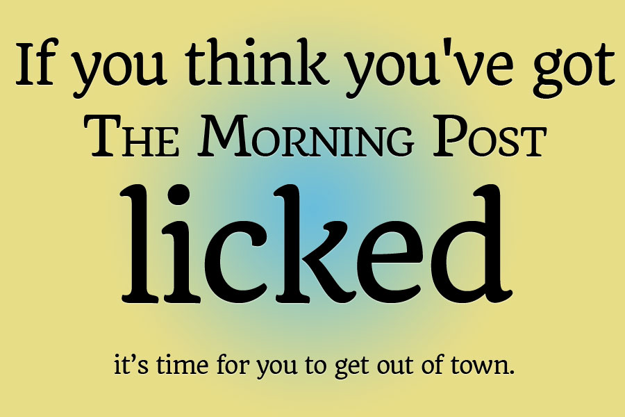
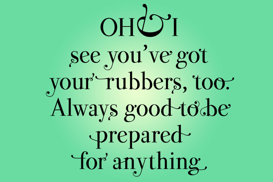
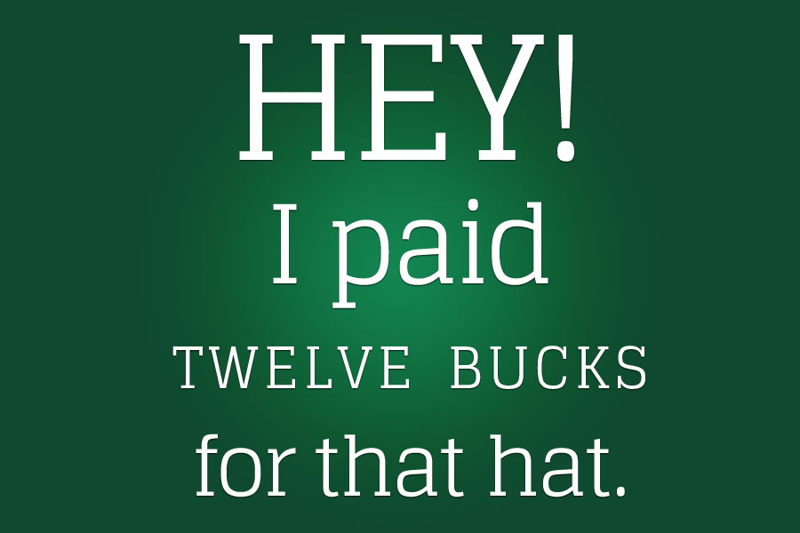
Colophon: All type samples use quotations from the classic newspaper film His Girl Friday, starring Rosalind Russell and Cary Grant.