Over the past year, something must’ve clicked in the minds of Bloomberg’s editorial designers. They realized that if they make their magazine covers as jarring as possible — if the design breaks convention in a way that makes the reader uncomfortable — they’ll sell more magazines.
The Businessweek arm of Bloomberg has long published intriguing print covers (not New Yorker-level intriguing, but I digress). Take the publication’s Tim Cook profile, for example, when it scrawled the words “Tim Cook’s Apple” in a neon all-caps script across Cook’s awkward grin.
Neon.
The above cover is harsh on the eyes, but its quirkiness packs a strange allure. It’s so ugly that it rockets past uglyville and somehow becomes beautiful again. Our eyes are trained to like the sort of designs we see the most. Our eyes like normalcy; this cover plays against those expectations in a wicked way.
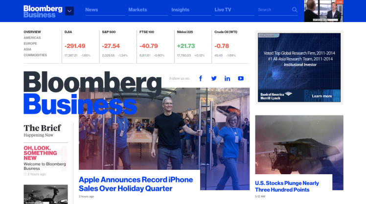
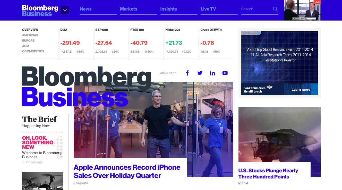
And now, as of this evening, Bloomberg has managed to recapture these emotions on the Web, with a vibrant, responsive design relaunch for Bloomberg Business that pulls you in as much as it spits in your eye. Yet, for some reason, I want more. Bloomberg could have ripped off Medium, like everyone else. They could’ve ripped off Quartz. But no, the site manages to stand on its own, while conforming to convention when necessary. Here’s the homepage, in full form.
Note the pinkish overlays. The strange, overlapping logotype. The pushy, flat hues. This error page. Scroll down and you’ll find a Web 1.0 gradient behind an exposé on the Islamic State.
I’m a fan. Sure, I don’t really get it. Actually, I’m annoyed that I like it, but I can’t help myself.
It’s great — seriously great.
VentureBeat's mission is to be a digital town square for technical decision-makers to gain knowledge about transformative enterprise technology and transact. Learn More


