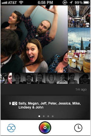
If, like me, you’re starting to feel a bit of a mobile social overload, here’s a different reason to pay attention to Color: It has raised $41 million in funding. That’s an extraordinary amount for a product that hasn’t even launched yet, and it comes from Sequoia Capital, one of Silicon Valley’s top firms, along with Bain Capital Ventures and Silicon Valley Bank.
[aditude-amp id="flyingcarpet" targeting='{"env":"staging","page_type":"article","post_id":250550,"post_type":"story","post_chan":"none","tags":null,"ai":false,"category":"none","all_categories":"business,mobile,social,","session":"C"}']One more reason Color stands out: Its leadership team includes co-founder and chief executive Bill Nguyen (founder of Lala, the music service acquired in 2009 by Apple), co-founder and president Peter Pham (formerly CEO of BillShrink), and chief product officer DJ Patil (formerly chief scientist at LinkedIn).
Okay, so there’s a lot of money and an all-star team. What does the app actually do? The goal, Pham told me today, was to create a social experience that’s “native” to mobile and really takes advantage of smartphone technology rather than simply transferring a Web-based experience to the phone.
AI Weekly
The must-read newsletter for AI and Big Data industry written by Khari Johnson, Kyle Wiggers, and Seth Colaner.
Included with VentureBeat Insider and VentureBeat VIP memberships.
Users share photos and videos on Color, and they see all the media shared by other users at the same location and time. Photos and videos (again, not just the ones you took) from all those experiences are stored in “diaries” — users can look back at their own diaries to remember their past experiences, and they can look at friends’ diaries to see what they’ve been up to.
For example, Pham, Patil, and I had lunch across the street from Color’s Palo Alto, Calif. offices today, and as the two of them took pictures and videos during our conversation, everything showed up under a single event. Then we could look at the diaries of their co-workers and see what was happening back at the Color office.
The obvious points of reference are photo-sharing apps like Instagram, but with a focus on location rather than personal identity or networks. On Color, the content you see isn’t delivered based on who you follow, as it is on Instagram, but rather where you are. That approach can lead to serendipitous discoveries — so if another Color user had been taking photos in the same restaurant, Pham, Patil, and I would have seen their photos too. You could also compare Color to location-based apps like Foursquare, but in Color, photos are the central experience, rather than a sidebar to check-ins.
Patil said Color is doing a lot of work behind the scenes to make the experience as simple and automated as possible. So users never have to tell Color where they are or who they’re with — the app figures that out for itself, and it dynamically adjusts the size of a single event or location based on users’ activity. Does that mean your photos and videos could get “automatically” grouped with a completely unrelated set? There could definitely be some mistakes, Pham acknowledged, especially early on, but the app will get better based on user activity and feedback.
And instead of requiring users to become friends or followers of other users, Color just points to other accounts that users may want to check out, based on their activity. So if I’m constantly using the Color app at the same time and location as someone else, Color will figure out that I probably want to see that other users’ photos and videos.
One important point about Color: All of the content is public. Does that mean a user’s embarrassing keg stand picture will be visible to everyone? Yes, but Pham said he’s hoping to avoid those situations by being completely clear about Color’s policy. Users don’t have to wonder who can see what, or adjust a bunch of different privacy settings, because everything’s public. He added that more people are beginning to understand, “When you’re in public, you’re in public.”
[aditude-amp id="medium1" targeting='{"env":"staging","page_type":"article","post_id":250550,"post_type":"story","post_chan":"none","tags":null,"ai":false,"category":"none","all_categories":"business,mobile,social,","session":"C"}']
I haven’t had a chance to play with the app in any meaningful way; I’ve just watched the demos from Pham and Patil. But I was pretty impressed with what I saw today. Over and above any individual feature, it’s a beautiful, responsive app, and its interface looks intuitive (and fast) enough to eliminate any technological barriers to the oversharing that Color wants to encourage.
VentureBeat's mission is to be a digital town square for technical decision-makers to gain knowledge about transformative enterprise technology and transact. Learn More
