Data visualization is one of the most delightful trends in media. It’s perfect for skimming and can turn a boring economic analysis into a work of art. Many practitioners are looking for inspiration in this quickly evolving field. A (relatively) new Reddit, DataIsBeautiful, aims to collect the best of the Web in a daily rounded up of gorgeous data visualizations.
Lately, this Reddit community has really picked up steam and is unearthing the best ways to visualization thought-provoking and topical stories.
History
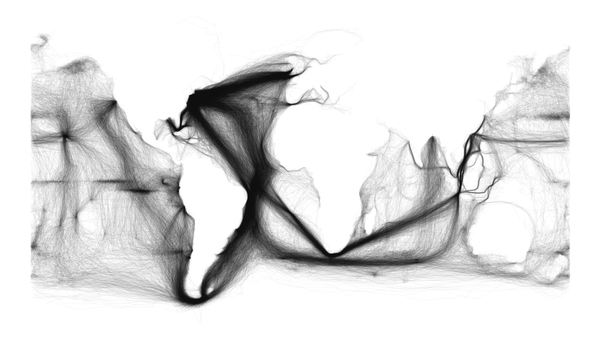
This smoke trail of ship-log entries from the 18th and 19th century is a wonderful retelling of history through exploration. Notice the super-dark band between western Europe and New York, in what would become a pre-cursor to the transfer of power from Britain to the United States.
AI Weekly
The must-read newsletter for AI and Big Data industry written by Khari Johnson, Kyle Wiggers, and Seth Colaner.
Included with VentureBeat Insider and VentureBeat VIP memberships.
Partisanship
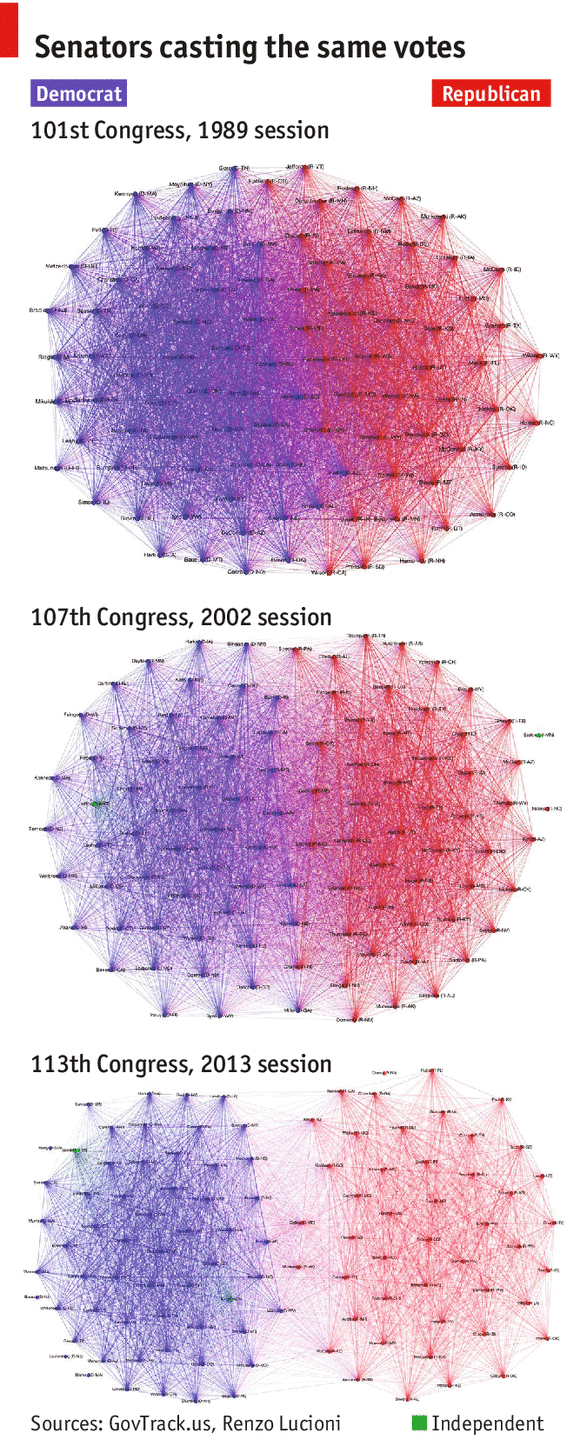
Congress really is more polarized than ever before. The Economist did a nice network graph of senators’ votes from each party shows how the U.S. Congress slowly ebbed into partisan silos in the ’90s then just tore apart in the new century.
Digital nightlife
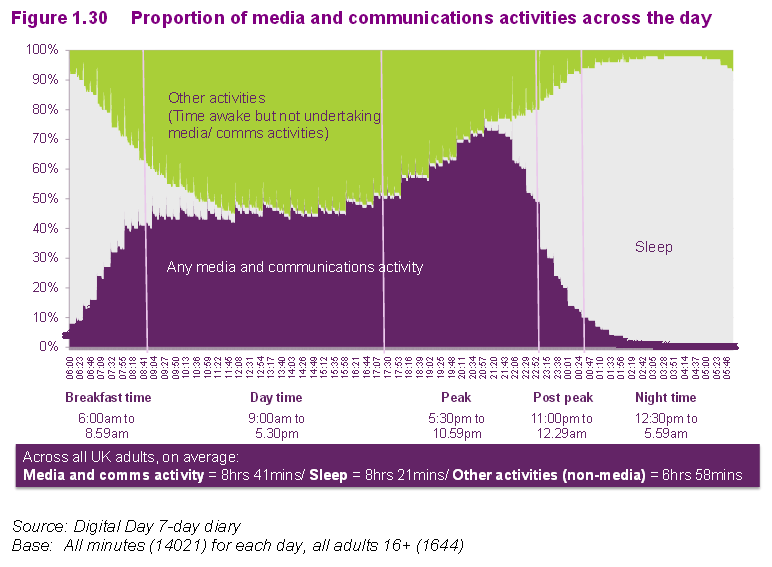
While not as pretty, I really dig this technique of stacked colors over time to visualize how we increasingly rely on digital communications at night. That’s a lot of late-night email (and Tinder).
Inequality
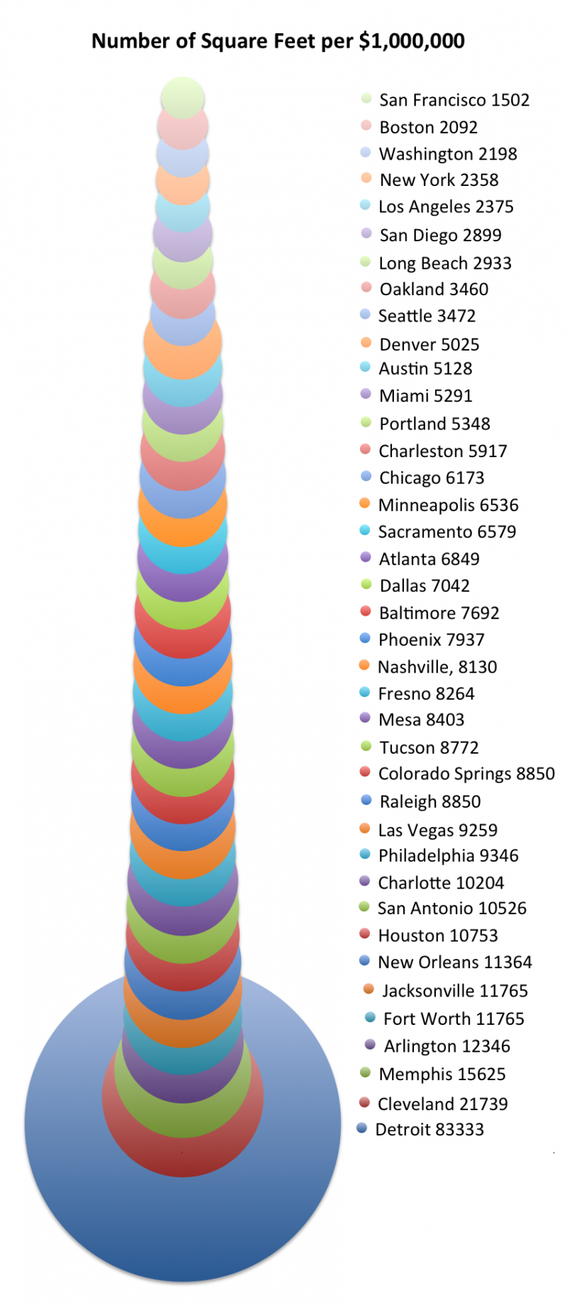
This graph of city real estate hits close to home. San Francisco is over $1,000 a square foot in some parts of my neighborhood, the Mission District. For the costs of a tin can in Silicon Valley, I could buy enough space in Detroit to host a football game.
Budding Social Media Love
This nice graph shows the increasing flirtations of budding lovers on social media and the quick dip as they (most likely) move their relationship offline.
Local Universities Feed Employers
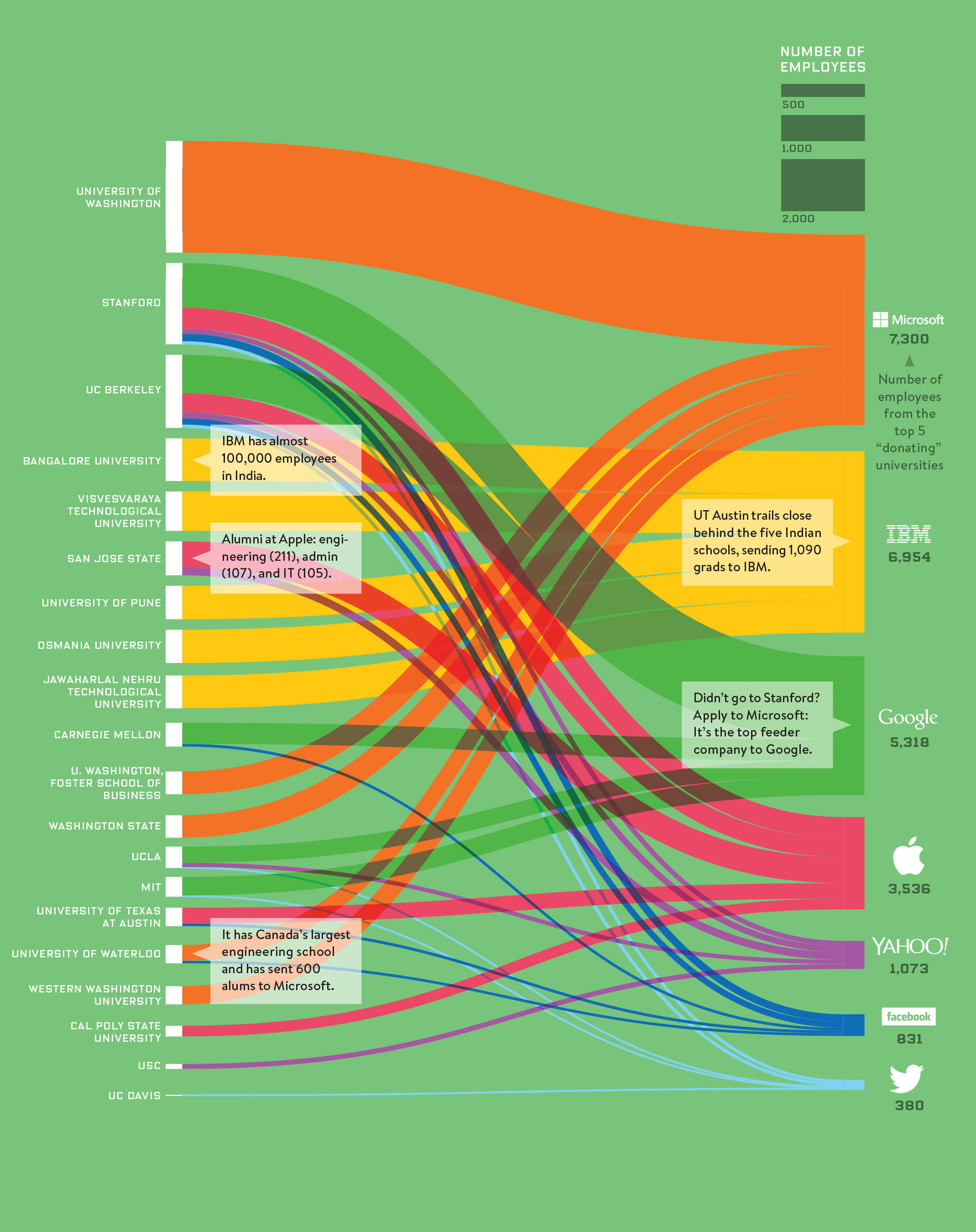
Wired has a nice flow graph of how local universities feed the nation’s top technology companies. University of Washington provides an enormous chunk to Microsoft, while Stanford feeds straight into Bay Area neighbor Google (click on the image for a large version).
For more inspirations, check out DataIsBeautiful here.
VentureBeat's mission is to be a digital town square for technical decision-makers to gain knowledge about transformative enterprise technology and transact. Learn More

