

As we play taps for 2012, let’s take a look at what developers and designers got into over the past 12 months, aesthetically speaking.
[aditude-amp id="flyingcarpet" targeting='{"env":"staging","page_type":"article","post_id":587878,"post_type":"story","post_chan":"none","tags":null,"ai":false,"category":"none","all_categories":"business,dev,","session":"C"}']Web (and tablet and smartphone) design this year was more than ever characterized by relatively new technological capabilities. Advances on the dev side made tricks and conventions on the design side simpler, faster, or just plain possible.
Also, in many ways, mobile design, and especially tablet design, had a huge influence over web design. We started seeing more touch interface-friendly navigation, even in situations where touch navigation was unlikely. Which, as you’ll see, drove us freakin’ bonkers.
AI Weekly
The must-read newsletter for AI and Big Data industry written by Khari Johnson, Kyle Wiggers, and Seth Colaner.
Included with VentureBeat Insider and VentureBeat VIP memberships.
But hey, at least Comic Sans and Flash sites are on their way out, right?
Most of these trends got their start in years past, but we feel they came into their own in 2012. We’ve organized them into a few groups on a love-to-hate scale. If you disagree with our admittedly subjective analyses, go right ahead and tell us what you think in the comments section. And come on, this is web design; if you don’t disagree with some of it, you might be dead.
The Best
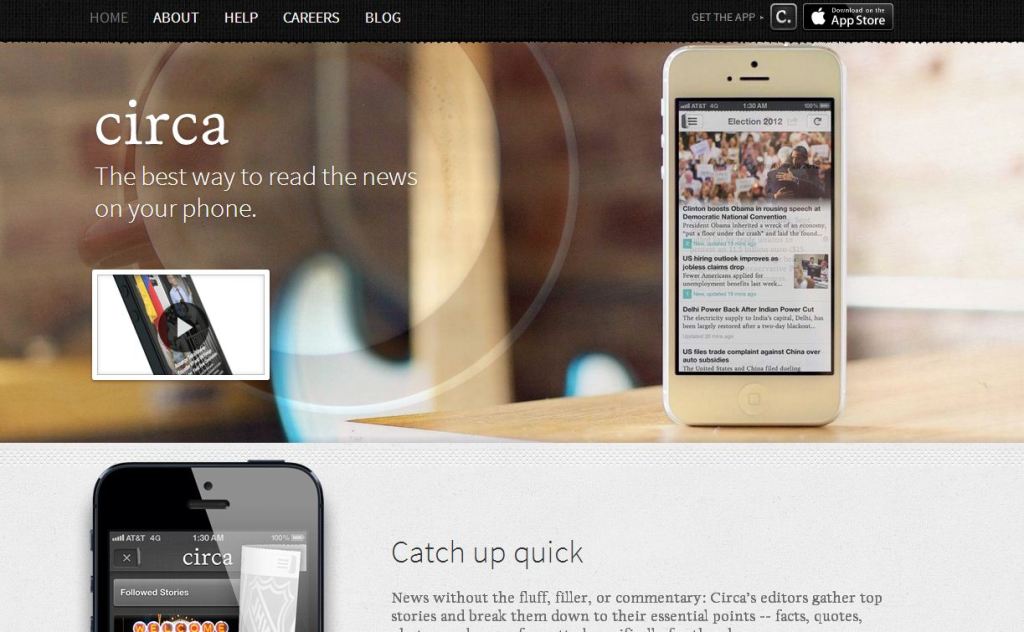

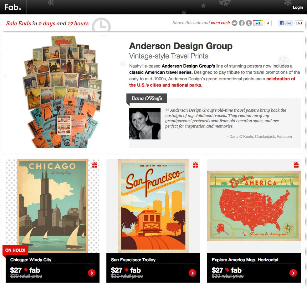
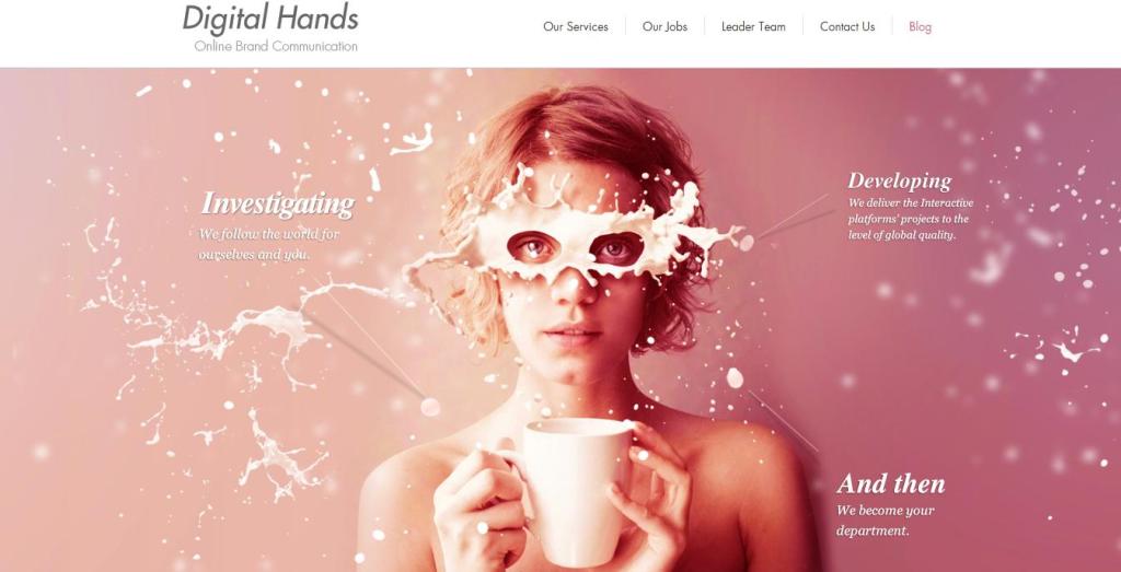
Larger-than-life images
We see this as a subtrend of the magazine aesthetic (see below), but boy, do we ever love how huge images are getting these days. They look great as page backgrounds, in lightboxes, or as full-page masterpieces in a tablet app. If you’re letting pictures go way outside the envelope, we appreciate what you’re doing and hope you’ll keep up the good work.

[aditude-amp id="medium1" targeting='{"env":"staging","page_type":"article","post_id":587878,"post_type":"story","post_chan":"none","tags":null,"ai":false,"category":"none","all_categories":"business,dev,","session":"C"}']
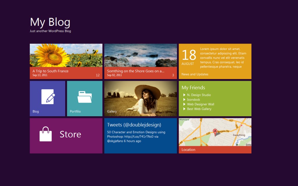
The Metro grid
Microsofties can call it whatever they want, but we know a Metro mosaic when we see one. For the longest time, we were mimicking Apple and iPhone design. Now it’s Windows’ turn to shine. The flat tiles in vibrant colors, the mosaic of constantly refreshing content, and the slick sans serifs were all the rage this year, whether seen on a Windows phone or on a designery knock-off page.

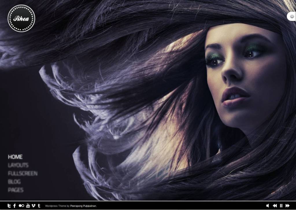
The print-mag aesthetic
[aditude-amp id="medium2" targeting='{"env":"staging","page_type":"article","post_id":587878,"post_type":"story","post_chan":"none","tags":null,"ai":false,"category":"none","all_categories":"business,dev,","session":"C"}']
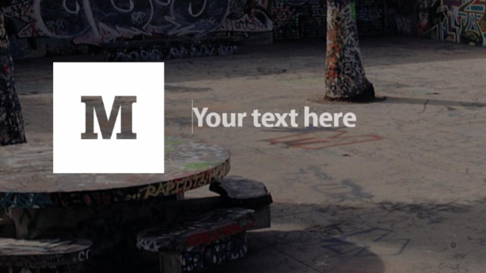
More than ever, the web is starting to feel a lot like the glossy magazines of (what is quickly becoming) another era. Swipe-friendly navigation lets readers flip languidly or rapidly through content. Full-bleed photos take over the page, and elegant serif web font families let running text remain readable.

And speaking of web fonts, with more than 600 specimens in Google’s directory, headlines content have seen a massive upgrade as well. With sexy Didones, aggressive slabs, and retro scripts, typography is finally entering its online heyday. (Want more proof? Check out our list of the best mobile and web fonts of 2012, now with 900 percent more out-of-the-box web compatibility!)

[aditude-amp id="medium3" targeting='{"env":"staging","page_type":"article","post_id":587878,"post_type":"story","post_chan":"none","tags":null,"ai":false,"category":"none","all_categories":"business,dev,","session":"C"}']
The Good
Responsive design
With champions like Mozilla and Adobe (and to a lesser extent, the behind-the-scenes nerds at Facebook), responsive design* held its own in 2012. Barely. This trend is still emerging, and designers still face many challenges to getting one page to look good on an innumerable cornucopia of devices. We may not have the technology — especially agreed-upon mobile browser standards — just yet, but responsive design looks like it’s shaping up to be the future of how we build for the web, wherever the web is found.
*Responsive design is the practice of designing a site to resize and adapt automatically to function well across multiple screen sizes.
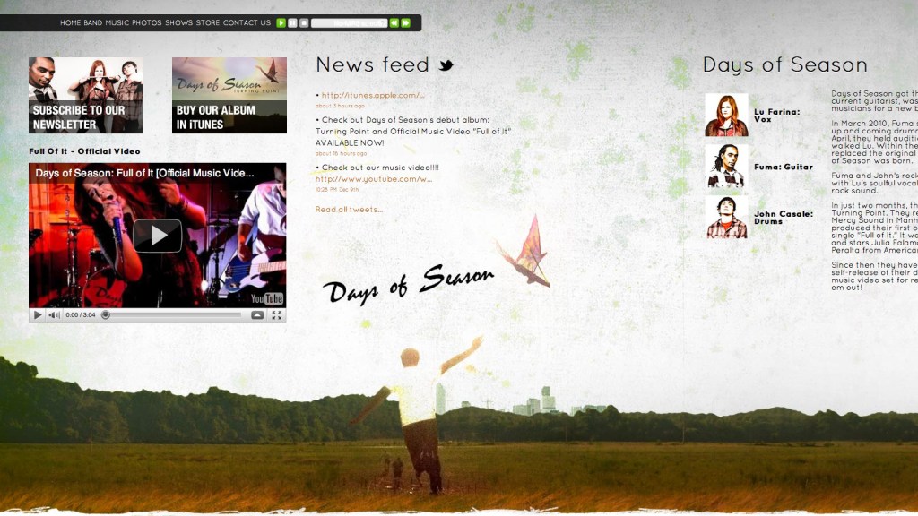
The Pinterest/Timeline grid
[aditude-amp id="medium4" targeting='{"env":"staging","page_type":"article","post_id":587878,"post_type":"story","post_chan":"none","tags":null,"ai":false,"category":"none","all_categories":"business,dev,","session":"C"}']
A splash of thumbnail images and a smattering of text! Highlight the algorithmically determined “important” stuff by doubling its size. What do you get? Pinterest! Or Facebook’s Timeline. Or something in between
The Pinterest clones and also-rans of 2012 featured this trend to a fault. It’s gorgeous for commercial and retail purposes or for displaying image-heavy content with a diverse array of sources and subjects. And it works great for social content, too, where image quality varies and large image sizes can make programmatically generated pages look cheap.

Rounded typefaces
[aditude-amp id="medium5" targeting='{"env":"staging","page_type":"article","post_id":587878,"post_type":"story","post_chan":"none","tags":null,"ai":false,"category":"none","all_categories":"business,dev,","session":"C"}']
Museo is sooo 2009, you guys. You know what’s so right now? Rounded sans-serif fonts*.
They’re structured but friendly, lean but distinct, casual without being childlike. If you’re looking for an alternative to the same old slabs and scripts and hand-lettered faces, check out some of the more modern rounded families.
*It is what it sounds like: A sans-serif with rounded edges instead of hard corners at the ends of the letterform.
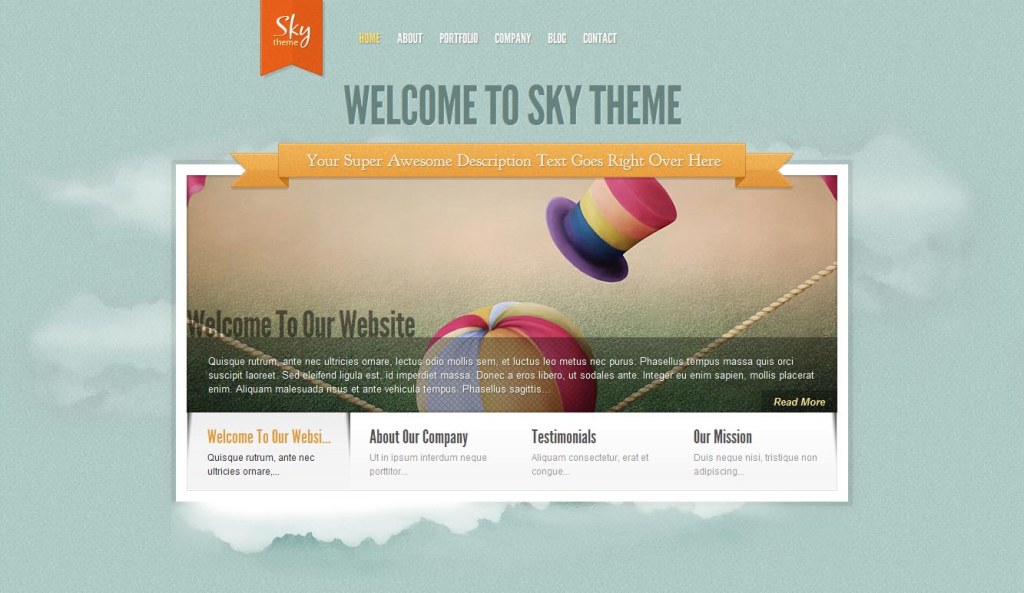
WordPress Premium
The slider menus, the sticky content, the glossy images prominently displayed. … We know we’ve seen this look somewhere before. From photographers to doctor’s offices to cupcake shops to extreme body modification enthusiasts, everyone is using this design trope around the web. As as an accessible, populist aesthetic goes, the web could do worse (see: Geocities circa 1998).
What we love about the “WordPress Premium” look is that although it’s becoming ubiquitous, it’s the good kind of ubiquitous, like clean drinking water is ubiquitous in the States but no one’s complaining about it. And when the bar is raised for the workaday standard, creating truly standout designs for sites becomes even more of a challenge.

The Meh
Mouseover madness
We will always remember 2012 as the Year of the Mouseover. We just about choked on the panoply of tooltips, thumbnails, and mega-menus that popped up every time our fingers hesitated a little too long over the trackpad. It made us twitchy.
Mouseover tricks are great for a lot of things — quickly offering an explanation, giving a brief preview of content to come, or showing options. But brevity, dear designers, is the soul of your users not hating you and getting frustrated and confused when your belabored tooltip obscures every other bit of content on the page.
Kid stuff: Cowboys, cartoons, and crap
It was cute when GitHub and Forrst did it; now, it’s more likely to be annoying. We get that you’re a 28-year-old, hoodie-wearing genius who still eats Froot Loops on the daily and longs to return the entire adult world to a happier place, but you’ve got to stop shoving this Saturday morning aesthetic down our throats. That goes for the kawaii-illustrated-character logos, the cartoonish fonts, and the “Hi, we’re Super App. We make walking fun” copy.
The Internet is in its 30s. We can take a little elegance, and so can you.
Single-page design of doom
Single-page sites can be amazing, beautiful in their simplicity. But in 2012, we saw a lot of single-pagers that strove too hard to cram too much content into one unnavigable, infinitely scrolling jumble.
Also, the single-page aesthetic isn’t right for every project. If you’re building a site to sell a single product, show a portfolio, or introduce a concept, sure. Go single-page. But if you’re building a website for an enterprise-level business application, give yourself a break and give your end users the information design they expect and deserve.

The Not-So-Good
Modal pop-ups
You know what makes pop-ups less annoying? Rounded corners, lightboxing, and cute fonts! Right?
Wrong. Your jQuery tricks are bad at hiding your annoying navigation flow and/or advertising, Mister Designer Man. At least try to limit your use of modal pop-ups in 2013. The Internet thanks you.

The We Hate You
I can’t get no navigation
Is this a test? Are you seriously testing our rage limits? Or are you just showing off all the neat-o tricks you learned in Internet 410: Stupid Navigational Bullcrap Senior Seminar?
Look, unless we’re browsing your site on a tablet or smartphone — and your site should know whether or not we are — we don’t want swiping-style navigation. There we are, scrolling happily down a page of lovely images and enlightening text, and in one slightly diagonal finger-twitch on the ol’ trackpad, we’re pulled kicking and screaming from the page we were on to the next page in the feed.
And while we’re talking about show-off navigational bullcrap, let’s talk about horizontal scrolling. Are you designing an art gallery website? OK, then, are you showing off some kind of timeline-linked portfolio or info-design case study? Then you do not need horizontal scrolling.
Designers, before you do some complicated, unexpected navigational bullcrap, ask yourselves: “Am I doing this just because I can?” If the answer is anything close to a yes, take the high road of elegant simplicity, and make your users happy. Design isn’t just art, after all; it’s function.

Top image courtesy of Hasloo, Shutterstock
VentureBeat's mission is to be a digital town square for technical decision-makers to gain knowledge about transformative enterprise technology and transact. Learn More