 Mobile apps must continually seek new ways to differentiate in a competitive market that is only getting fiercer by the second. Brought to you by Skyhook, this post is part of a series called “Apptitude” looking at how app owners can reduce friction, boost user engagement, monetize, and get to the user’s home screen. See all the posts here.
When you’re building an app, one of the best things you can do for your users is to make the experience easier. Reduce friction. Improve speed. It often comes down to reducing the number of steps it takes for users to get to what they want. When you save users clicks and gestures, you save them time — and by giving a user what they want quickly, you have another chance to engage with them.
But that needs info up front. In order to deliver this simple and vital experience you first have to know a lot about what your user does. Collecting, analyzing, and using contextual information like sensor data, third-party data, location behavior, and social content are the keys to this reduction in friction.
But what if users turn off the stream of data? For instance, what if they turn off location services, leaving gaping holes in their behavior profiles and essentially ending your ability to create place-specific experiences? Turning off the data tap can greatly affect your ability to differentiate and make it to users’ home screens..
Before that happens, try these tips. They’ll make the difference between users enable location services or turning them off. They’ll even get them to turn them back on if they’ve already declined them.
First Time User Experience
As part of the First Time User Experience (FTUX), tell them what kind of data you collect and why you collect the data. I know it’s crazy! Transparency coupled with paying off the use of the data with an insanely awesome experience tells them not only to keep location on, but to let it run in the background.
 Once they turn services off, it’s hard to get them to turn them back on. As an example, the way iOS asks now makes it easy for the user to select “no” because the notification screen is generic and gives no real information. It is more like the query of location data death. So you want to make sure you let your users know why you would like them to keep location on when you are asking them to do so. Just follow the recommedations below.
Ask for location permission at the right moment
To avoid your user’s finger constantly clicking the “Don’t Allow” button, give yourself the best chance. You’ve now trained them on why they should keep location on with awesome use cases showing them the value of the data you can provide them, but make sure you ask them at the right time.
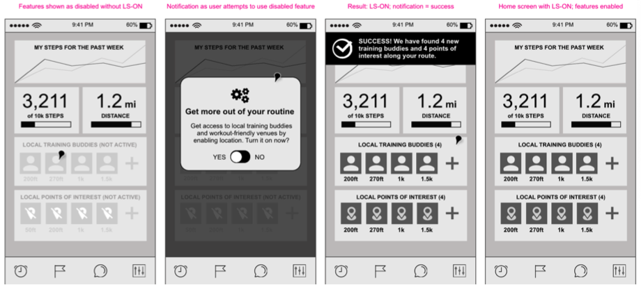
Instead of asking for location permission right at the time of download, consider waiting until the user clicks on a feature that requires location. At this point it will be more clear to them why turning on location is useful and they will already be more acquainted with your app so they might be more likely to grant you permission to use their location.
![]() Learn more about building a dynamic user experience in this eBook, Making the 5%: Your App’s Guide to Surviving with Dynamic UX.
Learn more about building a dynamic user experience in this eBook, Making the 5%: Your App’s Guide to Surviving with Dynamic UX.
Getting them back
Chances are you have some kind of newsletter, in-app communication, or you send users notifications. Segment users by ‘location = on’ and ‘location = off’ in order to send each group different messaging. Make sure you always put a creative message about the value of having location services on and a specific call to action that shows them how to turn them on.
Measure the effectiveness of the communications by watching the split of users like a hawk and optimize for ‘location = on’. Obviously you don’t need to bother the people who already have it on with messages about why it’s awesome.
Suggested channels for these communications are:
- A section of your email newsletter
- An in-app notification
- A call from your product guy
- A card to give your users at an event
Bottom line
Make your communication simple — first try stressing the benefits to your users. If that doesn’t work, then try telling them what they are missing. Give them reasons to open the app and make it a vital part of their daily lives.
Mike Schneider is VP Marketing for Skyhook.
Sponsored posts are content that has been produced by a company that is either paying for the post or has a business relationship with VentureBeat, and they’re always clearly marked. The content of news stories produced by our editorial team is never influenced by advertisers or sponsors in any way. For more information, contact sales@venturebeat.com.


