 Lifestreaming service FriendFeed is launching the most intuitive interface I’ve seen yet for sharing information with your friends. It’s like the new Facebook but with simpler filters for seeing only the Flickr photos, Twitter tweets, and much more from the friends that you care about. And, as Facebook intends to be but isn’t yet, the new FriendFeed is entirely in real time. Nearly every page on the new FriendFeed site updates in real-time (unless you hit the pause button at the top).
Before I get too far into looking what’s different between the old and new versions of FriendFeed, the big takeaway here is that the company has created something that may be very hard for its larger rivals to copy. It lets you filter more of the web than Facebook or Twitter.
Making feeds simple
 FriendFeed’s first goal with this redesign was simplicity. Having launched privately in the fall of 2007 and publicly in February of 2008, the product has seen near-countless iterations that, in the words of co-founder Bret Taylor, make it “like a house with a lot of wings built on to it.”
The original idea behind FriendFeed was to let you easily aggregate feeds of information from other sites — not just Flickr and Twitter, but scores of others, from feeds about your Netflix movie rentals to your bookmarked songs on Pandora. But as Taylor says, it had developed a lot of “knobs and dials” for sharing filtering feeds. You were able to create rooms for private feeds, lists of just feeds that you wanted to track, and much more, but the interface got steadily more complicated and harder for new users to understand.
Now, all of the personal and room feeds that you’re subscribed to have been moved from the left-hand side of the site (like what you see on the Facebook homepage) to the right-hand side (like what you see on Twitter). Personal and room subscriptions now appear listed within a “Subscriptions” window.
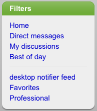
Above it, a new “Filters” window provides you with a catch-all list of links to non-personal ways you may be filtering your feeds, like a link to the homepage for seeing all the feeds you follow.
Filters — useful for things like real-time search
 But this “Filters” window could prove powerful because of how it brings together some new features.
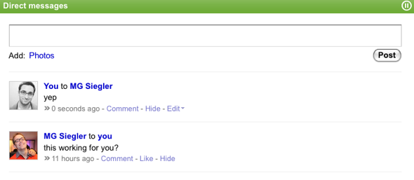
One of those features is direct messages — like what Twitter has. You can enter direct messages, which won’t appear in your public feed, through FriendFeed’s revamped shared box (more on the box further down) by entering people or group names and typing in a message. You can view all of your direct messages by clicking on “Direct messages” link in Filters.
The Filters window also shows you feed lists, including existing lists from the old redesign like “Favorites,” “Personal” and “Professional,” as well as any others you created yourself. These lists let you manually filter only people and groups that you want to follow — similar to a feature that Facebook has emphasized in its new redesign.
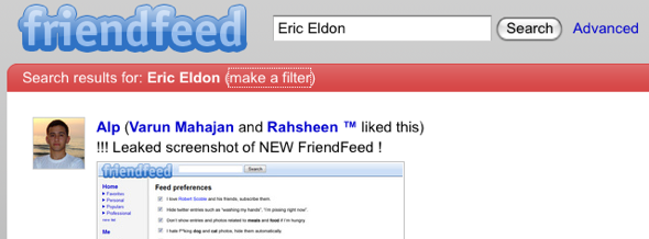
In the new redesign, FriendFeed offers a clever way to help you make filtering even easier. Any time you search for anything on the site, you’ll see a link that lets you make your search term into a filter. Click on “make a filter” next to your search term and you’ll be taken to a page that lets you pick how you want the filter to work. For example, you can only filter mentions of your own name as it is mentioned on FriendFeed by your friends and groups. In the new interface, you see a drop-down menu for searches — including people and rooms you’re subscribed to — to help you pick them out more easily.
This feature could be hugely valuable for anyone trying to track what’s being on FriendFeed — or any part of the web — that they care about. One of Twitter’s most valuable features is search, because you can see keywords that people are tweeting about in real time. FriendFeed now lets you do the same, but not just for tweets — which many, many FriendFeed users import into Twitter — but for anything else they’re sharing on the site from elsewhere on the web. Or it will soon, as the real-time component hasn’t been turned on for this feature yet.
Sharing is about conversations
But as the site has grown, users have shown that they’re more interested in talking about what they’re sharing than aggregating as many different feeds as possible. The feed items that users prefer to comment on, or “like” (a way to put a smiley face icon next to an item), tend to be anything that users share manually, FriendFeed co-founder Paul Buccheit tells me. This is because a user will only manually share something they think will be interesting to other people — a random tweet, on the other hand, might not be.
To encourage more willful sharing, the company has made its message box for sharing anything on the site more similar to Facebook’s. Formerly, FriendFeed had you click on one of a set of buttons — “Message,” “Photo” or “Link” — and then opened up an interface for adding the information, as well as letting you choose which people or group to share it with. Now, everything appears within a single box at the top of the homepage. There’s a field for adding any person or group that you want to send the information to, as well as a way to add Photos and also send the message to Twitter.
The personal nature of sharing is also encouraged through a couple other tweaks. Now, you’ll see a user’s profile picture next to the item they share — previously it showed the logo for the shared service. You can also click on a user and see a one-line biography about them (if they choose to provide it), as well has how many people they’re subscribed to or have subscribed to them, and the number of likes and comments they’ve left.
For a detailed walk through redesign, watch this FriendFeed-created video:
[youtube https://www.youtube.com/watch?v=N7AaCD94II0&hl=en&fs=1&w=425&h=344]Can FriendFeed stay different enough from Twitter and Facebook?
FriendFeed is more and more a combination of publishing and instant messaging, as it describes itself — but that’s more or less what Facebook and Twitter are doing, too. Facebook’s latest redesign in some ways copies long-time FriendFeed features, such as a way to filter your feed based on friend groups. What will stop Facebook from copying FriendFeed’s newest features? Despite the symbiotic relationship between FriendFeed and Twitter (you can import tweets to FriendFeed and repost FriendFeed comments back to Twitter), FriendFeed now offers direct messages. So if you’re a Twitter user on FriendFeed and you want to send a private message to someone on FriendFeed as well as Twitter, you can now cut Twitter out of the picture.
But nobody’s quite figured out what the right interface is. Twitter is apparently hoping that third parties develop sufficient ways of letting users filter tweets, so it doesn’t have to build that extra interface into its site on its own. Facebook, for its part, is trying to find the right balance between letting you share information on Facebook with your real friends, and opening itself up to the web. Within Facebook, you can import feeds from other sites — it just doesn’t provide many options (yet) for letting you filter them.
So what FriendFeed has created here is something better than either of the other companies. It lets anyone bring in any information from the web via its feeds and its message box, it lets you subscribe to that information with a few clicks of a button, and it lets you search everything through easy-to-create filters.
On the one hand, FriendFeed sees the confluence of publishing and IM as a trend that goes beyond any one company — like blogging software. But blogging software itself has a few winners, like WordPress, Blogger and Movable Type. Meanwhile, there may be a sweet spot between broadcasting on Twitter and filtering your real life on Facebook, as Taylor puts it.
But Facebook has more than 200 million monthly active users and Twitter has an unknown amount in the millions. FriendFeed doesn’t publish its numbers (it has around a million monthly actives if you believe Compete). Facebook and Twitter are both trying to be main ways that people share information on the web. At this point, FriendFeed’s best asset is that it is more focused on the web than Facebook and better at filtering than Twitter (or any other service that users Twitter). This redesign keeps it in the lead — and perhaps long enough to carve out a substantial portion of the market for this sort of product.
The new redesign is available at beta.friendfeed.com and the company says it will be in testing for a couple of weeks.
VentureBeat's mission is to be a digital town square for technical decision-makers to gain knowledge about transformative enterprise technology and transact. Learn More


