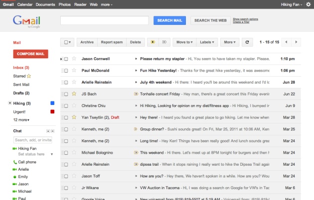
 The Google team is gaga for Google+. Or at least that’s what the company’s recent tweaks and redesigns would suggest, including the new black toolbar that floats above all Google products. Next up: a makeover for Gmail.
“We’re embarking on a series of interface updates to help strip out unnecessary clutter and make Gmail as beautiful as it is powerful,” wrote Jason Cornwell, a user experience designer at Google, in a Thursday blog post. “This is part of a Google-wide effort to bring you an experience that’s more focused, elastic and effortless across all of our products.”
Google+ is a new social networking initiative that the company hopes will fare better than its earlier efforts like Google Buzz and Wave, keeping the company relevant in the age of Facebook. Some of our staff members, including me, have tested it and we think it has more promise than Buzz and Wave.
So it’s no wonder Google is redesigning its products to better coordinate with Google+. Gmail will take on a more minimalist look with the redesign, with more white space and a less cluttered layout.
Take a look below:
Google account holders who want to try out the redesign can test it out now by going into their mail settings and select “Preview” or “Preview (Dense)” to give it a whirl.
Have you tested the Gmail redesign? Are you liking what you’re seeing so far?
VentureBeat's mission is to be a digital town square for technical decision-makers to gain knowledge about transformative enterprise technology and transact. Learn More


