The bad: News feed and people search
Anyone who has used Google+ for a significant length of time will tell you that the service’s news feed can get a bit unwieldy. Neeman agrees: “Every time someone replies or comments on a post, that post goes to the top of the feed. This is just annoying, and contributes to the (Robert) Scoble effect (he’s at top of my feed all the time). I don’t really want to block Scoble and Chris Brogan, but I almost have no choice. “
He suggests a filtering model for tech celebrities and other high-profile users that will only show their posts when viewed inside of Circles. At the moment, you can mute individual posts that get too noisy in your news feed, but this is only available post-by-post.
Since the news feed is one of the most prominent features in Google+, it’s imperative that Google ensures this feed doesn’t make the service too intimidating to use.
Neeman notes that Plus’s algorithm for finding people is sort of useless at the moment since not everyone has access to the service. “Facebook has an advantage because they have years of data about the friends and looking at patterns,” he wrote. “That’s why they have been hiring Google engineers: to analyze all that data.” Eventually, he predicts that Google’s algorithm will improve once Plus opens up to the broader public.
The fact that Google+ is still fairly closed off makes it difficult to truly compare the service to competitors. Neeman suggests that Google should just “swing for the fences” by making Plus fully open.
Mobile apps and Sparks
In addition to the above, there are two aspects of Plus’s usability worth focusing on: mobile apps and Sparks. On the mobile side, Google delivers plenty of usability. The company didn’t waste any time in delivering a native Android and mobile web version of Google+, and these mobile versions let Google+ users do just about everything on their phones that they could on their computers. And only a few weeks after the service launched, Apple approved Google’s native iOS Google+ app.
The mobile offerings are slick and offer some nifty features of their own, such as the automatic photo uploading in the Android app. The iOS Google+ app, in particular, can hold its own against other well-designed iPhone apps. The attention to detail on the mobile side shows that Google is thinking about all aspects of usability on the Google+ ecosystem. Other Google services, like Gmail and Google Calendar, still have to rely on web apps on the iPhone, instead of more functional native apps.
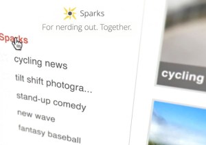
 Then there’s Sparks, which for the most part is an innocuous bundle of links that sits on the left side of your Google+ interface. It’s populated with interests you plug in when you sign up for Google+, and you can also add more at your leisure. The feature is meant to serve as an easy way to follow news and generate conversation with friends on Google+, which sounds worthwhile until you realize they’re just a poor excuse for RSS feeds.
Usability-wise, it’s unclear what users are supposed to do with Sparks, as well where the links its generating are coming from. For me, it’s the weakest aspect of Google+, and I’ve yet to find someone who can champion the feature. Google needs to be more clear about what users need Sparks for — otherwise it’s just a distraction from other, more useful, Google+ features.
Overall, and despite its quirks, Google+ seems to be a significant step forward for Google in terms of design and usability. We’re already seeing similar design changes in Gmail, Google Calendar, and Google search. I’m hoping Google keeps its eye on design for other upcoming products, and that some of Google+’s playful design will rub off on the future of Android.
After landing 20 million visitors in less than three weeks, it’s clear that something is driving consumers to Google+. It’s too early yet to tell how much an increased focus on design and usability has helped the service — but at this point, it seems clear that it certainly didn’t hurt.
VentureBeat's mission is to be a digital town square for technical decision-makers to gain knowledge about transformative enterprise technology and transact. Learn More
