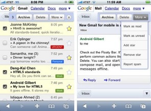
I’ve played around briefly with the new features, and my first impressions are very positive. In the same way that the standard web version of Gmail convinced me to switch from my desktop email program, I can feel myself being tempted to access Gmail through my mobile web browser, rather than Apple’s iPhone email application. After all, as I’ve become more dependent on my iPhone, the limitations of the app — particularly the fact that I can’t search across all the emails in my inbox — have become more apparent. (The improved search capabilities in version 3.0 of the iPhone operating system should address some of these issues.) At the same time, I haven’t been willing to switch over to the browser-based Gmail interface because it can be such a slow, hard-to-navigate experience.
[aditude-amp id="flyingcarpet" targeting='{"env":"staging","page_type":"article","post_id":106023,"post_type":"story","post_chan":"none","tags":null,"ai":false,"category":"none","all_categories":"business,","session":"D"}']The new version of Gmail for iPhone and Android mobile devices includes several improvements that make the experience much more palatable. For one thing, it’s just a lot faster, and it uses Google’s Gears technology to open recent messages even if you lose your connection. It’s also easier to interact with messages by archiving them, deleting them, and so on. Previously, you had to select the emails in question, then scroll back to the top of the screen to choose the correct option. Now, whenever you select a message, a floating bar appears at the top of the window, presenting all the standard options without requiring you to scroll. Labels are also easier to read, and the search option (which is what I use most frequently) has been moved from to the top from the bottom of the screen.
In the last few weeks, I’ve been muttering impatiently about the wait until iPhone 3.0. It looks like a great mobile email interface has arrived a lot sooner than I expected, and not from Apple.
AI Weekly
The must-read newsletter for AI and Big Data industry written by Khari Johnson, Kyle Wiggers, and Seth Colaner.
Included with VentureBeat Insider and VentureBeat VIP memberships.
VentureBeat's mission is to be a digital town square for technical decision-makers to gain knowledge about transformative enterprise technology and transact. Learn More
