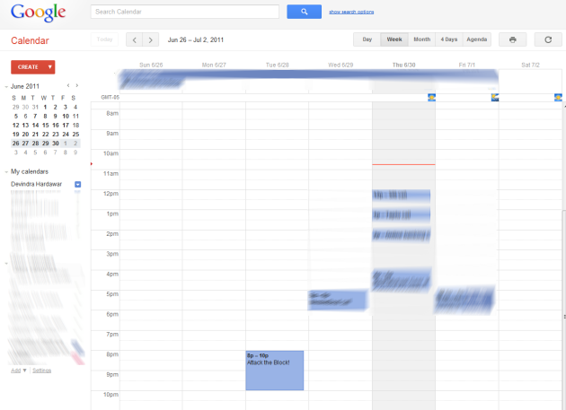
 Google Calendar just got a lot less ugly. The web calendar service was revamped this morning as a part of Google’s new focus on user experience.
Judging from what we’re seeing in the new Calendar today, I’m excited to see what Google comes up with for other services, especially Gmail. Now that Calendar’s refresh is rolling out, we can expect other Google services to be coming out soon.
In addition to an overall visual change, Google streamlined other aspects of Calendar’s interface. Among the changes, calendar lists on the left side of the screen are now collapsed by default (which just looks neater), visual indicator icons only appear when you hover over calendar events, and the Print and Refresh buttons are now icons instead of links.
Google offers the ability to jump back to the classic Calendar look — but why would you want to?
The company says the design changes were made with its three new design principles in mind: focus, elasticity, and effortlessness. Google announced its new design imitative on Tuesday following Google+’s launch. Basically, the company is now focusing on making its interfaces less cluttered, easily transitioned from desktop and mobile devices, and combining power with simplicity. The latter may not sound too different from the minimalist Google interfaces that we’ve grown used to, but judging from the visual flourishes in Google+ and the eye-pleasing changes in Calendar, it seems like Google is finally paying more attention to aesthetics rather than being completely pragmatic in its designs.


