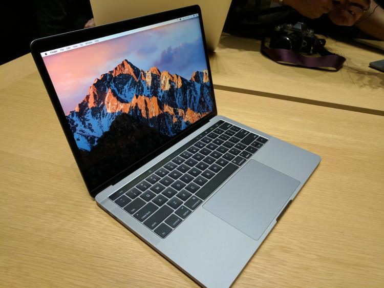
The new MacBook Pro, available in 13- and 15-inch versions, looks like Apple’s 12-inch MacBook. It borrows the extra-springy keyboard and the reflective Apple logo on the back. And it’s slim and light like the MacBook. But as you would expect, the Pro is beefier inside. It is built for challenging computational work. And with the Touch Bar, the Pro has been given spunk.
Some people will like it, and some people won’t. Me, I’m willing to give it a shot. I want to like it. I want to embrace change!
It could be brighter, but whatever. I’m going to leave that aside. I want to focus on the experience you can have with a second display on your laptop.
The benefits of vertical integration from software to hardware are obvious on the new MacBook Pro, because several native desktop apps take advantage of it, while lots of web-based apps don’t, at least at this point. Perhaps Google will find a way for apps like Gmail, Google Calendar, Docs, Sheets, and Slides to take advantage of the Touch Bar, but until then, they, and other web-centric apps, will be functionally handicapped. MacBook Pro users who get addicted to the Touch Bar may gravitate away from those apps and toward native apps. Maybe.
I found myself feeling nervous about hitting the wrong virtual key on the Touch Bar. I guess that’s because the physical keyboard is so much bigger — and the Touch Bar is very narrow. On mobile devices, apps are expressly optimized for touch gestures, and maybe I’m just used to that.
The funny thing is, the Touch Bar actually made me yearn for a full touchscreen. Apple is now getting closer to that.
Go ahead, remind me that Steve Jobs once said that touchscreen laptops would be “ergonomically terrible.” I will respond by reminding you that Steve Jobs once said — in the context of the iPad — “If you see a stylus, they blew it,” and still Apple came out with the Apple Pencil for the iPad Pro. And the Pencil is great, by the way.
Back to the MacBook Pro. I think I feel a little more comfortable with the smaller one, primarily because it’s lighter. But I’m uncomfortable with that because I know that with the heavier one I can get potentially better graphics, more RAM, and more storage, even if I would have to pay more.
On both models, the display is ohmygosh gorgeous. The Force Touch trackpad is huuuge. The new space gray colorway is different enough from the standard MacBook Air/Pro aluminum that you do a double take when you first see it. Which I like.

Above: Touch Bar on the 2016 MacBook Pro.
Gone are MagSafe, the SD card slot, the HDMI port, and a USB-A port. Bah. At least there are four USB-C ports. You’ll just have to load up on adapters and bring them wherever you go with the new Pro. And yes, it has a headphone jack, thank goodness.
The lack of a real physical escape key may be a bummer at first sight, but so long as you have the regular set of options displayed on the Touch Bar, you will have a virtual escape key waiting for you to hit at any time.
So. I’m left wondering. I am trying to figure out if the best laptop from Apple will be good enough for power users, considering its $1,799 starting price.
Some MacBook Pro devotees among us will just order the latest model, I guess. But others may well start looking elsewhere. You remember Windows, right?
Basically … I’ve got mixed feelings. And I hate to say that about the nicest laptop from Apple. But that’s what I’m saying today. I’ll see what happens after I spend more time with it.


