Google has gone from a company that approached design through cold, hard data to one that’s employing gorgeous, user-centric interfaces.
Design was a big theme at this year’s Google I/O developer conference, with over a dozen sessions exploring design in some fashion. And you can see Google’s new aesthetic focus in plenty of its products — like Gmail’s slight redesign and the upcoming Google Maps refresh — but Android serves as the fastest example of Google’s design turnaround.
Perhaps it’s because design matters all the more on a small smartphone screen. With Android, Google also had to do something about Apple’s head start with iOS. To get Android to look as good at the iPhone, Google had to radically reshape how it thought of design, and fast. Android 4.0 “Ice Cream Sandwich,” released in 2011, was Google’s first attempt to emphasize design in its mobile OS. Its aesthetic has only become more refined since then.
Google being Google, it’s also obsessively focused on the function of its design. Unlike of the old days, where Google went with the design most people liked through rigorous testing, usability is front and center now, with a new focus on cognitive science and user empathy.

Designing to delight on Android
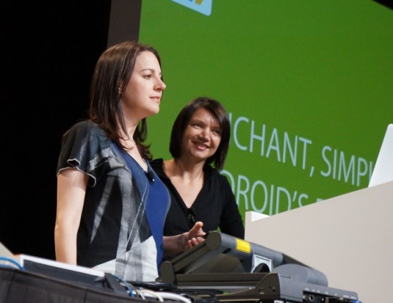
Users brought up a slew of design issues in Android’s first few versions, and Google saw the need for a new direction. Enter Android’s new design principles, co-authored by Google’s Rachel Garb, head of interaction design for Android apps, and Helena Roeber, who previously headed up Android’s user experience research team.
“We thought, what if we turned this long list of shortcomings that bum us out into something that actually inspires us to create beautiful and usable designs,” Garb said during a Google I/O panel yesterday.
Enchant. Simplify. Amaze. With Android 4.0 two years ago, those three seemingly simple principles became the cornerstone of Android’s design.
“We all respond emotionally to every moment we experience, and we experience around 20,000 of these moments every waking day,” Garb said. Negative emotions are so powerful they have the ability to shorten your lifespan, while positive emotions are essential for daily life.
Garb’s goal: to make sure Android serves as a fount of positive experiences. That was a big departure from Android’s earlier days, when it was complicated, technical, and far from user friendly.
As one example, Google developed a subtle animation in the Android home screen to tell users when they’ve reached the end of their available screens. If there was no indication, users could get frustrated. The new animation delighted users so much that they ended up playing around with it just for fun.
“Not only did it tell them they did everything right, it also kind of helped establish the virtual spaces and provided the feedback in an elegant, subtle, and non-disruptive way,” Roeber said.
Google also added a full-time writer to the design team to take charge of all of the user-viewable text in Android. With short words, active verbs, and common nouns, the writer helped transform Android into an environment more suited for typical, non-technical users.
For example, a setting that used to read “Use tactile feedback” was changed to the more human-readable “Vibrate on touch.” Similarly, a warning that used to read “You didn’t insert a SIM card” now simply prompts “Insert SIM card now.”
You can see all the new design principles at work in Google Now, Android’s predictive search virtual assistant. Enabling it simply takes one click on your Android phone (Simplify), and afterwards it simply presents relevant information when you need it (Enchant). Its interface is sparse, consisting of only the cards you need to see at any particular time. Google Now also learns from your behavior to get better over time (Amaze).

Better design through science
“All of our evolution has been optimized for the types of things we’re likely to see,” said Alex Faaborg, a Google designer with a background in cognitive science and machine learning. Speaking at an I/O panel focused on cognitive science and design, he discussed a few examples of how tiny decisions take advantage of human perception to create a better user experience.
Gestalt psychology principles play a significant role in Google’s designs. For example, Google is using white space more liberally across its products to group items (consider that bit of space between Google search results). In Android, it’s taking advantage of our ability to automatically complete shapes for things like form entries (boring rectangular boxes are out, now you just see the bottom portion of a text entry line). Similar objects, like the stars and check boxes in Gmail, are grouped together to make them easier for us to scan.
Even those small notifications you get in Google Docs along the side of the edges of your screen are backed by cognitive science. Faaborg pointed out that we see peripheral motion faster than what we’re looking at directly, so it makes sense to keep your notifications along the edges of the screen.
About half of Faaborg’s talk focused on vision, while the other half focused on attention, focus, and memory. Google learned that repetition may be a better way to teach simple concepts to users, instead of just offering a single tutorial up front. For example, a repeated alert in new Android phones tells users where they can find all of their apps. Previously, users would skip through the short introductory screen.
“Consistency is not critical — you don’t need to build products identical to what’s on the marketplace,” Faaborg noted at the end of his chat, in a takeaway that also tells us a lot about how Google views design now. He urged developers to build innovative designs and trust that their audiences will be able to understand them. “People are smart,” he said.
Is it enough?
While Google’s design breakthroughs have led to some major changes internally, its competition hasn’t been sitting still.
Apple, a company practically synonymous with excellent product design, will likely see a major style evolution now that Jony Ive is in charge of design company-wide. According to rumors, this year’s iOS 7 could be a major overhaul more in line with Ive’s aesthetic (a love of simple and flat designs).
With Windows 8, Microsoft made a radical design shift as well, bringing elements from its slick Windows Phone operating system to the desktop. Microsoft just announced that it sold 100 million Windows 8 licenses in its first six months on the market, which is in line with Windows 7 sales. With its support for tablets and traditional computers, Windows 8’s design could continue to pay off for Microsoft as personal computing trends change over the next few years.
No matter what Google does, it can’t please everyone. But now, at least, Google is trying.
Photos: Devindra Hardawar/VentureBeat: Top image: Google

