We’ve tumbled headlong into the era of infographics.
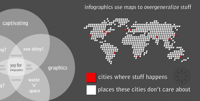
Visual presentations of data are everywhere, popping up on every type of online publication (even VentureBeat). There are so many infographics on the Internet that some bloggers are lashing out against the trend, and there’s even a subset of infographics mocking the uselessness of infographics.
“I think you’re going to see infographics on the side of milk cartons, if you haven’t already,” said Visual.ly co-founder Lee Sherman. Visual.ly is a 500 Startups company that recently raised $2 million to build data visualization tools for the masses. It is creating a library of tools for journalists, publications and everyday people to easily tell beautiful, engaging stories through data. Visual.ly and its investors Crosslink Capital, SoftTech VC and Anthemis Group are banking on infographics completely changing the way we communicate.
Infographics are incredibly useful for cutting through today’s data overload, but their proliferation puts them at risk of being overused, and their impact diluted.
Why we need infographics
The infographic is a picture painted with data. Take a quick look and a story emerges from numbers. Look more closely, and a complex narrative emerges from dense clusters of information. At least, that’s the ideal.
We live in an era of big data, where our every action spins off gigabits of information, both meaningful and mundane. Our computers, phones, and browsing habits leave behind trails of data exhaust that can be sifted and recombined to give us better search results, improved movie recommendations, or ways for marketers to serve up more relevant advertisements. But at the end of the day, it’s still just data. For those of us who don’t actually enjoy gazing at columns of digits, we need someone to make sense of it all, preferably in soothing colors and with non-threatening images. That’s why data visualization can be so comforting, and why it has become so popular of late.
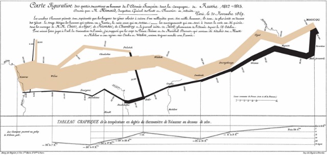
 The image above is arguably the most famous data visualization of all time, representing French Emperor Napoleon’s 1812 invasion of Russia with 400,000 soldiers of the Grand Armeé. The graphic shows the size of the combined French forces, the distance they traveled, what rivers they crossed, the temperatures through which they marched and, ultimately, the wisp of defeated and traumatized soldiers who returned at the end of the campaign.
What designer Charles Minard depicts in this 1869 infographic is still remarkable and influential in an era when powerful tools such as Adobe Illustrator, R and ArcGIS can digitally turn millions of data points into something digestible.
Google’s Susan Wojcicki recently revealed a new interface for Google Analytics at the Web 2.0 Summit in October, which she said was based explicitly on Minard’s work. The new Google Analytics visualization tool follows a similar design philosophy, and lets the webmaster track all site visitors from the time they arrive on the page until they reach a conversion point. The result is a funnel, which is wide at the top and narrow at the bottom, so you can see how your army of visitors dwindles as it marches through your site.
More important than its reference to a famous French historian, Google’s new interface masks the sheer volume of information under the surface and makes it accessible.
Good visual stories don’t necessarily need to dive as deep as Minard did. For example, here’s a visualization of demographic information about Occupy Wall Street participants from Fast Company, which was created by firm JESS3.
An infographic can breathe life into something that would otherwise be boring on its own, as Column Five co-founder and creative director Josh Ritchie points out. “Good design seeks to solve problems,” he said. “This is often achieved by making things more intuitive and appealing, both of which can be aided by design and visualization.”
The need to tell stories has been with us since the beginning of time, so it’s only fitting that as our technology changes, so too do the ways we tell stories.
Telling the good from the bad
The Internet is a visual environment, and because infographics are visual before all else, even bad ones, they fit perfectly with the way we use the Internet. The human eye can take in much greater volume of information, more quickly than can our other senses. But this has also made infographics prime targets for overuse or abuse. Where do they go wrong?
“[Of] all methods for analyzing and communicating statistical information, well-designed data graphics are usually the simplest and at the same time most powerful,” says Edward Tufte in the introduction to his classic work The Visual Display of Quantitative Information.
Tufte, who is widely held as the foremost thinker in information design, says excellence in statistical graphics consists of complex ideas communicated with clarity, precision and efficiency. Successful graphics should do the following:
- Show the data.
- Induce the viewer to think about the substance rather than about methodology, graphic design, the technology of graphic production, or something else.
- Present many numbers in a small space.
- Make large data sets coherent.
- Encourage the eye to compare different pieces of data.
- Reveal the data at several levels of detail, from a broad overview to the fine structure.
- Serve a reasonably clear purpose: description, exploration, tabulation or decoration.
- Be closely integrated with the statistical and verbal descriptions of a data set.
Many online infographics don’t accomplish the above, usually because they are based on flawed or incomplete datasets.
A dataset could be as simple as the tally of houses on a street that end in odd numbers, or as complex as the daily electrical consumption of a ZIP code over a 10-year period. The true art of the infographic isn’t to make a beautiful design, but in the words of Washington Post graphics director Hannah Fairfield-Wallander, to “Let the data speak.”
And too many infographics seem to be gagging the data.
The most egregious examples of bad infographics are simply pictures with a few numbers attached, or a chronology of events peppered with commentary. They’re disappointing, contain minimal insight, and offer little that you couldn’t get from a simple text timeline. They are also hard to avoid. And this is why many feel the Internet infographics trend has run amok.
The infographics bubble
“A trend feeds on itself; people copy what they see without thinking,” says Nigel Holmes, a British graphic artist and illustrator who has been producing explanation graphics and, data-focused print work for magazines since 1966. “Folks have latched onto what they see as an easy way to make a splash, and they call it infographics. Most of it has no information in it.”
Just how popular have infographics become? Job search site Indeed.com lists 229 jobs for infographics designers nationwide, with everyone from startup Runkeeper to L.A.’s Good Samaritan Hospital seeking out a talented data scientist who can communicate numbers visually.
One Elance posting for a freelance infographic design gig, entitled, “Research and create a viral infographic for website” reads:
I publish a U.S.-focused website about fly fishing.
I want someone to research and create an infographic about trends within a certain fly fishing niche. You should be skilled at finding compelling data, conceiving an organization for it, and presenting it attractively as a graphic.
The work pays less than $500. An insurance company seeking an “out of the box designer” says on PeoplePerHour that its ideal candidate has “a passion for transforming data and research into compelling visual stories,” for which he or she will earn $20-$55 on a recurrent basis.
In other words, infographics are in danger of becoming just another item in the toolkit for search engine optimization (SEO) and marketing.

Flowing Data creator Nathan Yau says that he lives and breathes data. He’s a Ph.D candidate at UCLA, and says his trash folder is full of egregious examples of bad infographics from SEO marketers, who will do anything they can to capture a few seconds of people’s precious attention, and perhaps a click through or two.
One way Yau says infographics have changed is that they now take a narrative that was once told in a text post, and arrange it visually, in a way that follows the layout of a blog post. “Infographics have gotten longer to fit into the blog format,” says Yau. “Posts that used to be long lists of favorite things and best methods have shifted to something more visual.”
Can the infographic be saved?
Sherman of Visual.ly counters out that the infographic is an ideal form of communication for a our busy times, where attention spans have diminished, and there is more content than ever for us to consume.
“It’s not like the old days where you read the New York Times all the way through, and threw the paper away when you were done,” says Sherman. “A lot of times people don’t even know where the story is coming from.”
 “I think the world is a confusing place, especially online,” says John T. Meyer, the chief executive officer of Lemon.ly, a firm that has produced infographics for clients such as startups Zaarly, and IWearYourShirt. “We as a humans are creating so much content and so much noise online. That being said, people are doing amazing, incredible things and we know more data and information about our world then we ever did.”
The infographic has certainly enjoyed a recent swell of popularity thanks to social media and digital communications technology. But the same forces that have brought this communication tool to such a broad audience may be the ones that end up killing it off.
We’re floating in data. Our phones, computers and devices are spinning off more data than anyone knows what to do with. At the same time, however, we’re living in an attention economy where eyeballs are a currency, and enticing people to click on links or forward content through their social networks is the key to success. The result is an endless stream of half-baked infographics from marketers who could care less about the art and the science behind true data visualization.
Can these competing forces continue to coexist?
“What I think people are going to get bored of are infographics that don’t have a narrative, or don’t tell a story,” says Visual.ly’s Sherman.
Of course, he wants to help deliver tools to make that happen.
“This is a great climate from the tools perspective. It’s really, really, really early days,” says Sherman. “We’re out in front, and we’re making this market. It is going to happen, and it is going to be huge.”
[Image Credits: Napoleon’s March: Wikimedia Commons, Who is Occupy Wall Street: JESS3, Infographic about Infographics: Think Brilliant, Six Degrees of Kevin Bacon: Lemon.ly]
VentureBeat's mission is to be a digital town square for technical decision-makers to gain knowledge about transformative enterprise technology and transact. Learn More

