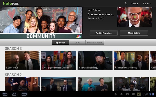
Streaming video service Hulu has finally launched its Hulu Plus app on a handful of tablets that run Android OS, the company announced today on its blog.
[aditude-amp id="flyingcarpet" targeting='{"env":"staging","page_type":"article","post_id":410054,"post_type":"story","post_chan":"none","tags":null,"ai":false,"category":"none","all_categories":"business,media,mobile,","session":"A"}']The app is available for free in the Google Play store, but users must subscribe to Hulu’s premium Plus service to watch anything. The Hulu Plus subscription costs $7.99 per month and gives you access to recent TV shows from four of the five big networks (ABC, Fox, NBC, and CW). You’ll also be able to watch (most) content on a variety of supported devices, such as set-top boxes, smart TVs, and tablets.
Hulu Plus has already been available on Apple’s iOS devices for some time.
AI Weekly
The must-read newsletter for AI and Big Data industry written by Khari Johnson, Kyle Wiggers, and Seth Colaner.
Included with VentureBeat Insider and VentureBeat VIP memberships.
Initially, Hulu is offering the service for just seven Android tablets: Asus Eee Pad Transformer Prime, Asus Eee Pad Transformer, Motorola Xoom, Motorola XYBoard 10.1, Toshiba Thrive, Acer Iconia and LG G-Slate. Noticeably absent is Samsung’s line of Galaxy tablets, which accounts for a large portion of the overall Android tablet consumer market. But fear not, avid VentureBeat reader, Hulu said this is just the beginning of its Android app rollout. (My guess is that the Nexus tabs will be the next to get support.)
The app itself comes with a shiny new user interface that’s far more functional than its iPad counterpart. It’s a lot like the UI from Netflix’s tablet applications.
At the top of the screen is a familiar slideshow of the most recently featured programs. Just below that is a navigation bar for the type of videos (TV, Movies, Clips, etc.). Videos aren’t “clumped” together like they are in the iPad app. Instead, users are given horizontal rows of videos that are arranged by a specific behavior or action, such as recently watched shows, recommended videos, popular clips, etc (see image below). Show pages also get the same horizontal rows treatment, as you can see in the image above.
Let us know what you think of the new app in the comments.
VentureBeat's mission is to be a digital town square for technical decision-makers to gain knowledge about transformative enterprise technology and transact. Learn More