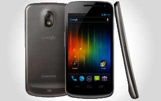
For too long, Android has been the ugly cousin to Apple’s iOS in terms of design. But with the release of Android 4.0, a.k.a. Ice Cream Sandwich, all that is changing.
For perhaps the first time, “The way things look and make people feel are just as important as the speed and features,” said Matias Duarte, the Chilean-American designer who currently serves as Google’s director of Android user experience, in an interview with VentureBeat.
“Every time I unlock the phone and I see how it’s been transformed, it really makes me smile,” he continued.
“In previous generations, when I look back, they look dated, like a Windows 3.1 machine you found in your parents’ garage.”
Duarte took some time yesterday to dive deep into the new design language of Ice Cream Sandwich, which is a radical departure from the utilitarian Android UI many consumers are used to seeing.
Duarte came to Google about a year and a half ago, shortly before the release of Android 2.3, a.k.a. Gingerbread. The designer has a lot of mobile experience, having worked at Palm, where he was VP of user experience and helped to create the webOS platform, at Helio as VP of design, and at and Danger, the startup that created the Sidekick and was acquired by Microsoft.
The “ugly cousin” stigma
Coming into Google, Apple’s main competitor in the world of smartphones, Duarte said he was well aware that Android had been cast in the public imagination as an ugly cousin for years. But whether that perception was true or pure FUD, Duarte knew it needed to be aggressively countered.
“Ugly cousin, country bumpkin — we’re intimately aware of that characterization, and it’s something we wanted to tackle head-on with this release,” said Duarte.
“We did a lot of foundational research on people’s perceptions of Android. … Hearing it in the words of everyday people helped tell the story of why we needed to make a change and how big a statement we wanted to make.”
He said that most consumers have some sense that Android was “utilitarian, a tool, a task, associated with burdens, complications and additional effort. … We weren’t hearing the kind of joy and thanksgiving that we wanted to hear.”
To get to that point, Duarte saw a need to shift how Google thought about and communicated about mobile design. He said the company’s goal is now “to make Android respected as a design leader.
“There is a PR problem there. There is a perception, however ill-founded, that Google doesn’t care about or understand design and that Android is a place where design isn’t valued. We’re trying to show that’s no longer the case.”
However, much of the Android-related marketing from carriers and OEMs still glorifies the utilitarian, technical aspect of the Android OS while downplaying its new, rich aesthetics. Particularly with the Verizon-powered line of Droids, you see commercials featuring post-apocalyptic scenes with robotic arms, lasers and female models who could kick Lara Croft’s ass — hardly in line the user-friendly design language Google is trying to project these days.
“There’s clearly a market segment that revels in the joy of tech,” said Duarte. “They want to be Tony Stark, and that’s great. But what I really want to see as well (and I hope Ice Cream Sandwich enables this) is that it’s easier to make more kinds of products with a broader, emotional appeal, and we’ll see that reflected in [manufacturer and carrier] marketing and customization.”
Ice Cream Sandwich’s new design language
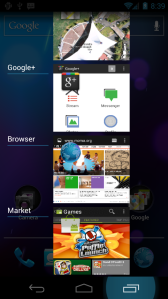
 Beautiful design is one of the three core tenets of the new Android philosophy — or at least, the new Android marketing for Ice Cream Sandwich. And getting from the engineering-focused principles of the original open-source mobile OS to this new, Apple-competitive, consumer-friendly, multimedia-rich interface took a lot of work.
We talked to Duarte about how the design language evolved and the kinds of decisions he and his team had to make to get a beautiful smartphone design out of a hacker’s UI.
“With Honeycomb, we started the move away from the illustration style of fake wood, fake leather, fake buttons,” he said. “But it was still very technical, very cold. It reveled in its digital roots.”
When it came to Ice Cream Sandwich, Duarte said, the team continued to get away from the faux-materials aesthetic, which he called encumbrances, and also got away from a lot of the structure of previous Android iterations.
“We removed dividing elements, bevels, unnecessary UI junk,” he said. “We started using more white space and a variety of visual elements to create clear structures.”
Another big change with Ice Cream Sandwich is the color. “We expanded our palette, so there’s quite a range of light and dark,” Duarte said.
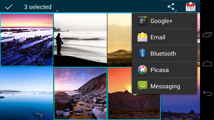
“We’ve introduced two types of palettes that are based on the kind of content you’re consuming. The media content retains a lot of the dark palette that Android used in the past,” he said, noting that the darker colors are still great for videos, photos and other content where you want a visual pop.
“Our other palette is light,” he continued. “Gmail, Google Talk, text messaging — all of these have a lighter color pallette that’s more closely aligned with what Google is doing with the web itself. It’s easier to read text on and is simply more approachable.”
Overall, the guiding principle was glossy magazine design, an approach that placed more emphasis on beautiful, large images.
“We look at each screen and think about the primary experience, then lay it out like a beautiful magazine cover with big pictures, big headlines,” said Duarte. “We make each screen custom so the pages speak to that individual use case.”
Duarte said that the new look and feel of Android also involves more transparency in the UI in general. That is, not philosophical transparency, but being able to literally see through various design elements to get a glimpse of the photo or other content behind it. “Very little of the UI imposes a theme on your homescreen,” Duarte concluded.
An iOS killer?
 While Duarte acknowledged early on that Apple’s iOS was the product to beat in terms of design, he also didn’t have that constant competition in mind while creating a new look and feel for Android.
“We ask ourselves, when we come to design, how much are we setting ourselves against the competition?” Duarte said. He went on to tell us that question had to be silenced initially.
“We put that out of our heads, understand what our design goals are, and aggressively pursue those.”
Another reason Duarte isn’t obsessing over iOS is because he feels better mobile design, even from competing companies, lifts all the boats in the harbor and creates better experiences for everyone.
“I don’t want to measure us against the competition because there’s so much great work out there. … There’s a lot of terrific options for consumers,” he said.
“And I’m thrilled that the industry as a whole is taking design so seriously. They get it. That’s great for designers and great for customers.”
In the end, Duarte said, “I’m really proud of what the entire team has accomplished. When I look at the history of Android, we set out to turn a corner with Ice Cream Sandwich. It’s a significant milestone where a new look and feel has been introduced.”
Stay tuned later this week for a deep dive into Roboto, Ice Cream Sandwich’s new typeface.
Check out DevBeat, VentureBeat’s brand new channel specifically for developers. The channel will break relevant news and provide insightful commentary aimed to assist developers. DevBeat is sponsored by the Intel AppUp developer program.


