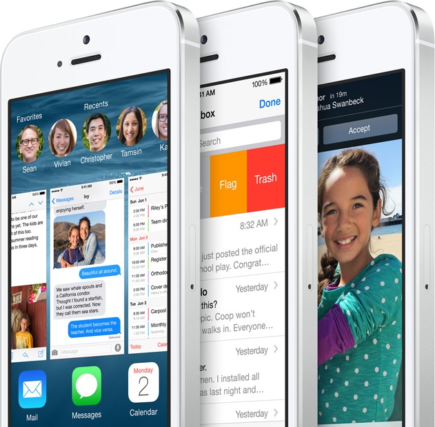
While last year’s iOS update splashed a fresh coat of paint on Apple’s mobile operating system, this year’s revision is a massive interior renovation.
You’d be hard-pressed to see a big difference between iOS 7 and iOS 8, which is being released later today, at first glance. (If you’re not a fan of the new iOS candy-coated aesthetic, tough cookies.) But dig a bit deeper and the changes become obvious. Eventually, you’ll find many of the upgrades indispensable.
Apple encapsulated what iOS 8 represents pretty well on its website: “Huge for developers. Massive for everyone else.”
There is a smattering of new features in the new OS — a revamped keyboard, smarter Siri, and more — but what’s most important about iOS 8 is Apple’s fundamental shift toward opening up to developers. That allows for things that you could previously only get on Android, like widgets and alternative keyboards.

This old OS
Looking at the most obvious changes in iOS 8 first, it’s almost as if Apple has methodically checked off many of the common complaints iPhone users have had over the years.
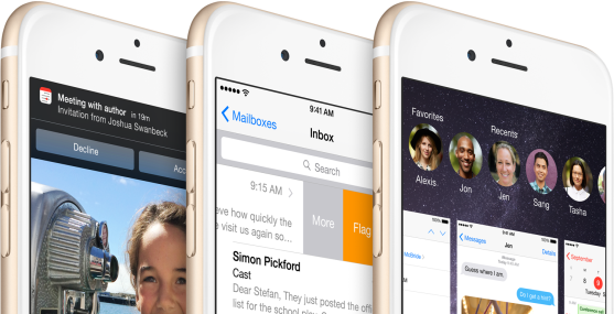
For example, Apple has once again upgraded its notifications experience: Now you can reply directly to incoming texts, manage mail, and more as they appear at the top of your screen. By handling incoming notifications like this, there’s less of a chance you’ll need to stop what you’re doing in a current app to deal with them.
For the most part, the new interactive notifications made it easier to multitask in iOS 8. I especially liked the ability to quickly reply to texts, and it’ll be interesting to see how developers take advantage of it eventually. Apple has certainly come a long way from iOS’s original notifications implementation, which took over the middle of the screen and brought whatever you were doing to a halt.
Speaking of notifications, Apple has also made its Notifications Center (that messy tray of notifications you get when swiping down from the top of your screen) a lot more useful. Now third-party developers can build their own widgets for the Notification Center — again similar to Android, though with far more restraint — which could give you more of a reason to glance at it. I didn’t get a chance to test out any widgets at the time of this review, but the potential is there for developers to craft some truly interesting experiences.
Apple has also streamlined the Notifications Center’s design by removing the “Missed” notifications column — something that always seemed a bit confusing and out of place (especially because it never seemed to display actual notifications that I’ve missed). Now there’s only a “Today” column, which houses widgets, and a “Notifications” column, which serves as a catch-all tray for app alerts.
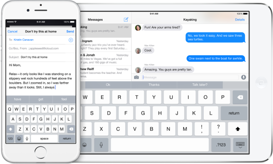
The new keyboard in iOS 8 looks similar to its predecessor, but there are several significant improvements that makes typing on a touchscreen much simpler. There’s now a small window in the keyboard that suggests contextually relevant words as you’re typing. It’s a feature made famous by the alternative keyboard maker SwiftKey (which also has an iOS 8 app of its own launching today), and it basically makes it easier to peck out quick messages without typing every letter.
Apple says the suggestions are smart enough to detect your tone depending on the app and recipient, but I didn’t see any clear examples of that. If you don’t want the suggest words, you can swipe down on that tiny window sliver to hide it. The keyboard is also smart about when it offers contextual word suggestions. You won’t see any suggestions when you’re typing in a URL in a web browser, but you will when you’re writing a tweet or mail message.
And if you still don’t like the new keyboard, you can replace it entirely in iOS 8, as Apple is finally allowing third-party keyboards into its platform. SwiftKey, Swype, and Fleksy have all announced that they’re bringing keyboards to iOS 8, and you can be sure that plenty of others will follow up as well.
Autocorrect in the iOS 8 keyboard is also much smarter than in the past. There’s still the occasional autocorrect glitch (it’s inevitable with every touchscreen keyboard), but there were far fewer annoying corrections for words I was actually meaning to type.
Heavy texters will likely appreciate the many changes to Apple’s Messages app in iOS 8, which now includes permanent group messaging and the ability to quickly send short audio messages, photos, and videos to your iOS-equipped friends. The latter feature is particularly fun: Just hold down the microphone or camera icon, record a short message or snap a pic, and it’s instantly sent to your friends. (It’s a bit dangerous though, since there isn’t any sort of prompt before the media gets sent. Watch out, drunk texters.)
Siri is also much smarter this time around, with faster speech recognition and a useful new hands-free mode. When your phone is plugged in you can just say “Hey Siri” to start issuing commands. It’s not as innovative as the Moto X’s always-on voice commands, but it’s useful if you’re in the car or charging your phone by your desk.
Also, somewhat Siri-related, Apple has massively improved iOS 8’s voice dictation. It’s almost as good as using a dedicated recognition app like Dragon Naturally Speaking, and I wouldn’t be surprised if some users end up using it for long-form writing.
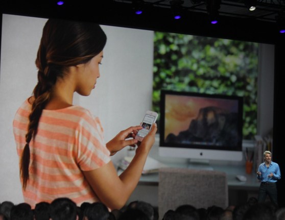
Above: Apple AirDrop demo at WWDC 2014
Continuity: Marrying iOS and OS X
One of the more intriguing reveals Apple made this year was the announcement of new Continuity (https://venturebeat-com-develop.go-vip.co/2014/06/02/apple-builds-seamless-continuity-between-iphone-and-mac/) features, which basically help iOS and OS X devices work together better. If you’ve got iOS 8 and a Mac with OS X Yosemite, you can accept calls on your computer and continue working on documents between devices (a feature dubbed “handoff”). Starting next month, you’ll be able to send and receive text messages from anyone with your computer as well (the Mac Messaging app could previously only communicate with other iMessage users).
With my MacBook Air, which is currently running the latest Yosemite public preview release, I was able to take a few calls easily. The handoff features were a bit more finicky to get working consistently, but it’s tough to judge them since OSX Yosemite is still in beta. When the handoff features worked — I was able to continue working on an e-mail and read a long article between devices — it felt magical.
Apple’s new Continuity focus, perhaps more than anything it’s announced this year, offer a glimpse into the future of computing. Plenty of us have smartphones, tablets, and computers — but how well do they all work together? Likely, not very well.
Since Apple has total control over its hardware and software, it has the potential to implement some truly amazing Continuity features down the line. Just imagine what HomeKit, Apple’s smart home platform, will be able to do when it’s linked with all of your devices.
And, of course, the Continuity features will also serve as a way to keep consumers locked into Apple’s ecosystem. But, like many utopias, it’s a closed ecosystem many people will be eager to jump into.
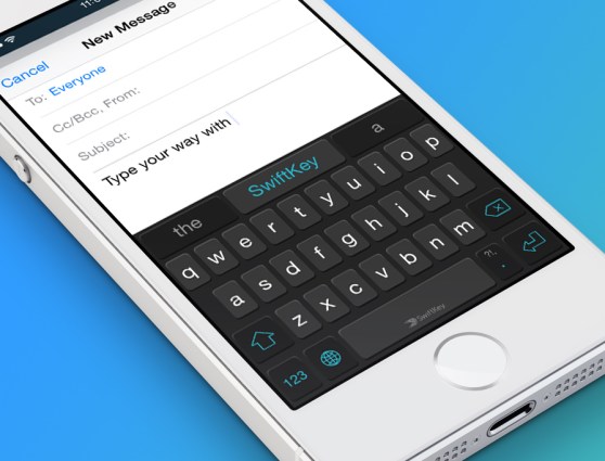
Above: SwiftKey’s iOS 8 keyboard
Huge for developers
While all of iOS 8’s new features are welcome, its biggest upgrade is something that I couldn’t easily test: A far more open platform for developers.
Apple has traditionally held an iron grip on what developers were allowed to do in iOS, while Android served as a more open alternative. But now, as Apple is racing to catch up with many of the innovations Android has introduced, it has no choice but to give developers more leeway.
The widgets and third-party keyboards I mentioned above are just some examples of Apple’s new open attitude. But Apple is also now letting developers share their data between apps, take advantage of its TouchID biometric sensor, and get full access to the camera API.
The new HealthKit, HomeKit, and CloudKit platforms were created specifically to court developers into entirely new Apple ecosystems. They’re an admission by Apple that it can’t do everything on its own. And it’s easy to see the lesson Apple has learned from the rise of the iPhone and iPad: A platform is only as strong as the developers building for it.
Odds and ends
We’ve already covered Apple’s big health focus with iOS 8 extensively, but there wasn’t much for me to test at the time of this review. The app did a fairly accurate job of counting my steps, but its real purpose will be to consolidate health data across multiple apps and services. We’ll be taking a deeper look at Apple’s Health app once more compatible apps are released.
iOS 8 also makes it easier for families (and close friends) to share iTunes purchases with up to six people. I wasn’t able to test this out, but the concept definitely sounds useful.
Verdict: A solid upgrade
As with every major new iOS release, iOS 8 gives a new jolt of life to Apple’s most recent hardware. I tested the OS out on my iPhone 5S, and while I couldn’t detect any massive performance or battery life improvements, the new features I mentioned above were all welcome additions.
While there may have been some compelling aesthetic reasons for consumers to stick with iOS 6 (I’m not in that camp), there’s no reason you wouldn’t want to upgrade to iOS 8.
But of course, iOS 8 will shine best with Apple’s new iPhone 6 and iPhone 6 Plus. I’ll be receiving some devices to test out later this week, so check back for full reviews soon.
As I wrote when iOS 8 was announced, Google needs to think hard now about what else Android can do to keep its users. Now that Apple has finally caught up with key Android features — not to mention offering bigger phone displays with the iPhone 6 and iPhone 6 Plus — Android’s main selling points all of a sudden seem less compelling.
