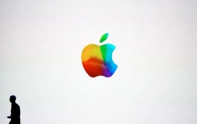
At the end of today’s iPad 3/Apple TV event announcement, Apple CEO Tim Cook strolled off stage while a colorful version of the company logo appeared on the screen. Keep in mind, this wasn’t an original “rainbow” Apple logo used from 1976 to 1998, but rather an updated version of it.
[aditude-amp id="flyingcarpet" targeting='{"env":"staging","page_type":"article","post_id":400420,"post_type":"story","post_chan":"none","tags":null,"ai":false,"category":"none","all_categories":"business,media,","session":"B"}']Our first thoughts were “is that the new Apple logo?”
VentureBeat’s Jolie O’Dell later commented, “Why is the Apple colored like a Windows logo?,” referring to the colorful, wavy windows logo and perhaps more colorful MSN butterfly. Microsoft recently ditched that logo in favor of a new super bland version, which leaves companies like Apple free to resume using the rainbow without fear of having it confused with the competition.
AI Weekly
The must-read newsletter for AI and Big Data industry written by Khari Johnson, Kyle Wiggers, and Seth Colaner.
Included with VentureBeat Insider and VentureBeat VIP memberships.
My guess is that it’s not an official logo, since the logo wasn’t displayed everywhere during the event. However, the current monochrome Apple logo came into view just as Apple founder Steve Jobs took back the reigns of the company. A new logo may be in order now that Cook is in the captain’s seat for a whole new era of Apple.
We’ve embedded the photo from the event below as well as past versions of Apple’s logos. Is this Apple’s new logo? Should the company change its logo now that the Steve Jobs era is over? Let us know what you think in the comments.
Top image by Heather Kelly
VentureBeat's mission is to be a digital town square for technical decision-makers to gain knowledge about transformative enterprise technology and transact. Learn More
