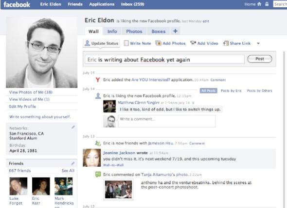
There’s a large school of thought in the Facebook application developer community that believes the majority of Facebook users actually like to do what most MySpace users also do — express themselves. And by that I mean decorate their user profiles with glittery slideshows, quizzes, lists of favorite bands, and plenty of other features that both MySpace and the old Facebook profile offered, that the new Facebook design de-emphasizes. Developer Stanislav Shalunov wrote perhaps the best thought piece on this reality, a month ago. As he puts, it there are two types of users:
[aditude-amp id="flyingcarpet" targeting='{"env":"staging","page_type":"article","post_id":95387,"post_type":"story","post_chan":"none","tags":null,"ai":false,"category":"none","all_categories":"business,","session":"A"}']Giggly 75% like pokes, quizzes, pic forwarding, fun games, selling friends, glitter on profiles. They express themselves through style and interact with friends using the mouse
Serious 25% like bookmark import, utility apps, discussions. They express themselves with text and pictures containing them and interact with friends using the keyboard. Because you’re reading this, and made it this far, you’re serious. (Giggly users tend to not read much at all, certainly not blobs of text, and quite certainly not my blog)
AI Weekly
The must-read newsletter for AI and Big Data industry written by Khari Johnson, Kyle Wiggers, and Seth Colaner.
Included with VentureBeat Insider and VentureBeat VIP memberships.
Facebook’s new design, as many of us have been noting since the company began testing it months ago, seems to emphasis features also seen in trendy new web services favored by us self-styled “early adopter” types. While Facebook offered status updates before messaging service Twitter existed, Facebook now features a box at the top of its users’ profile pages that asks each user to broadcast what they’re doing — similar to Twitter. Facebook also just launched an iPhone application built around its status message service, not its more general profile features.
In fact, many “early adopters” have been gleefully speculating that Twitter and Friendfeed will eventually kill Facebook because those services more openly enable the flow of information between other sites and their own.
Maybe Facebook employees should stop reading us Silicon Valley blogs, and our constant chatter about Twitter and Friendfeed.
Facebook employees have been pondering why only a fraction of its users don’t seem to actually share that many links to other web sites using its “share” feature. The new profile seems to confront this perceived problem.
The new profile emphasizes sharing by making the options to share photos, videos, notes and links really obvious — at the top of “news” feeds and right above the Twitter-like status update box on the profile mini-feeds.
Clearly, Facebook thinks that if it forces users to share stuff, then they’ll really start sharing stuff. I wouldn’t be surprised if Facebook product managers are thinking “phew, now we’ve cut off the threat of Twitter and Friendfeed taking our users!”
So where does this leave us? I’ve long argued that the value of Facebook is in the fact that it has convinced millions to share real information about themselves — versus the fake information you see on MySpace and many other social networks. But the thing is, it seems Facebook users want to share real information along the lines of glittery photos.
It wouldn’t surprise me if Facebook sees a sustained protest from millions of users who don’t care about publishing, in the first place, who just want to decorate their profiles to show off to their friends. After all, the redesign seems to require a tour for many people, as Svetlana Gladkova notes over at Profy. Maybe, though, Facebook can educate the masses on the joys of publishing.
VentureBeat's mission is to be a digital town square for technical decision-makers to gain knowledge about transformative enterprise technology and transact. Learn More
