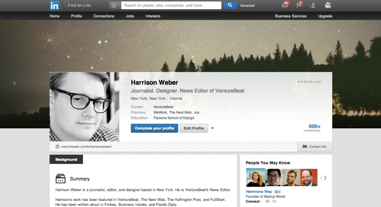
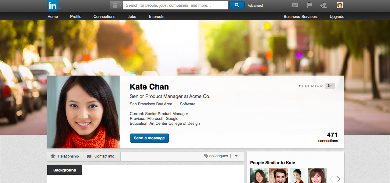
LinkedIn just redesigned its profile pages with a new image-centric layout — but only paying users get the new look (for now).
Following in the footsteps of Facebook, Twitter, and Google+, LinkedIn’s new profiles feature cover photos, cleaner typography, and larger profile pictures. The new design was launched side-by-side with LinkedIn’s new $10 per month premium membership tier — dubbed ‘Spotlight’ — a significantly more accessible price point than LinkedIn’s previous fees, which ranged from $30 to $440 per month.
LinkedIn told VentureBeat that its new cover photos “felt like a natural next step in helping members to build a more unique professional identity. … [We] wanted to give profiles a more personal feel and this new visual component also helps members to stand out.”
Here’s another look at the new design:
Unfortunately, only paying users can access LinkedIn’s new cover photo design immediately; the rest of us have to wait “a few months” for the feature to roll out, LinkedIn said. This, of course, was intended to make LinkedIn’s new starter package all the more attractive.
LinkedIn shares that its Spotlight membership was created for “members looking to get their foot in the door by enhancing their own professional brand.”
Although the new design is only a temporary benefit, it’s not a bad way for LinkedIn to lure in new paying users. Still, we can’t help but wonder: Are the masses really willing to pay for features they already get for free on other social networks?
VentureBeat's mission is to be a digital town square for technical decision-makers to gain knowledge about transformative enterprise technology and transact. Learn More


