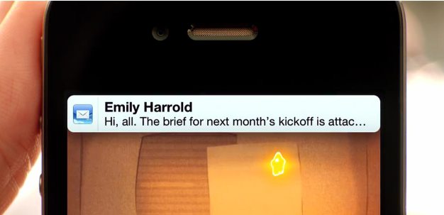
Much has been written about the slick jailbreak app MobileNotifier, which replaces Apple’s clunky iOS notifications on jailbroken devices. The app was clearly an inspiration for the notification upgrades in iOS 5 Apple announced yesterday — the company even went as far as to hire the developer of MobileNotifier, Peter Hajas.
[aditude-amp id="flyingcarpet" targeting='{"env":"staging","page_type":"article","post_id":297344,"post_type":"story","post_chan":"none","tags":null,"ai":false,"category":"none","all_categories":"business,mobile,","session":"D"}']But Hajas wasn’t the only one behind MobileNotifier. Kyle Adams, a Nashville-based designer, spearheaded the user interface work for the app since late January. So you can imagine his surprise when Apple unveiled its revamped iOS 5 notifications yesterday, which sported quite a few similarities to MobileNotifier.
AI Weekly
The must-read newsletter for AI and Big Data industry written by Khari Johnson, Kyle Wiggers, and Seth Colaner.
Included with VentureBeat Insider and VentureBeat VIP memberships.
Adams was understandably a bit annoyed when the news first hit yesterday. He published a series of tweets pointing out the LOL-worthy similarities between his and Apple’s designs. Adams went on to say that he wasn’t mad at Apple or Peter Hajas, he just wanted to “set the record straight.”
Many iOS developers likely felt the same yesterday, as some of the new features in iOS 5 step on the toes of established apps and services like Instapaper, Remember the Milk and GroupMe (the New York Times has a great compilation of affected apps).
Adams tells me that he was particularly focused on bringing an Apple aesthetic to MobileNotifier. “I wanted to have a notification that fit right in with the existing look and feel so that it felt completely native. No learning curve, no “what does it do when I do this”… it would “just work” as Steve would say,” he wrote.
It’s worth pointing out that Apple, Hajas and Adams were likely all inspired by the drop down notifications that Android has been sporting for some time. It looks like mobile interfaces will be a repeat of the desktop arena, where Microsoft, Apple and other companies lifted design inspirations from each other without a second thought.
With MobileNotifier’s future now up in the air, Adams tells me that he’s working on bringing his design skills to an iOS instant messaging client. He’s aiming to develop something with the simplicity of Verbs IM app but with the slick aesthetic of TweetBot. Surprisingly, MobileNotifier was Adams’ first try at developing an app interface. With such a strong first showing, he’ll definitely be a designer to look out for in the future.
[aditude-amp id="medium1" targeting='{"env":"staging","page_type":"article","post_id":297344,"post_type":"story","post_chan":"none","tags":null,"ai":false,"category":"none","all_categories":"business,mobile,","session":"D"}']
VentureBeat's mission is to be a digital town square for technical decision-makers to gain knowledge about transformative enterprise technology and transact. Learn More
