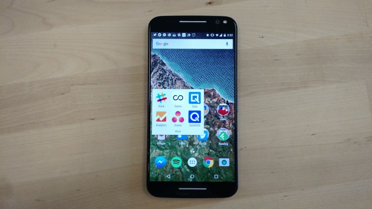
When you pick up Motorola’s new Moto X Pure Edition, you think to yourself, “This isn’t a bad phone.” It’s got some weight to it. It certainly feels like a dependable companion. The bright screen seems to render every detail of a picture. Apps respond to input quickly. Sound from the front-facing stereo speakers comes out big and bold.
In the daytime, pictures made with the 21-megapixel back camera look sharp right until you zoom in all the way. You can even get fairly good quality if you zoom in a bit, which is one of the phone’s improvements over the Moto X (2nd Gen). At night or in low-light settings, though, you’re still out of luck if you want a focused, aesthetically pleasing shot. The five-megapixel front camera works all right at close range, but getting detail from far away is a challenge. So on the camera front, the recently unveiled Nexus 5X and 6P might well outperform the Moto X Pure Edition (known in some countries as the Moto X Style).
The Pure Edition’s user interface is crisp and modern, just like the previous Moto X. It’s running near-stock Android Lollipop, and Motorola has said it will provide the phone with Marshmallow. Like the Moto X, the Pure Edition isn’t burdened with a bunch of bloatware. There’s Motorola’s speech recognition system, the gesture detection that turns on the camera at the flick of your wrist, and that’s about it.
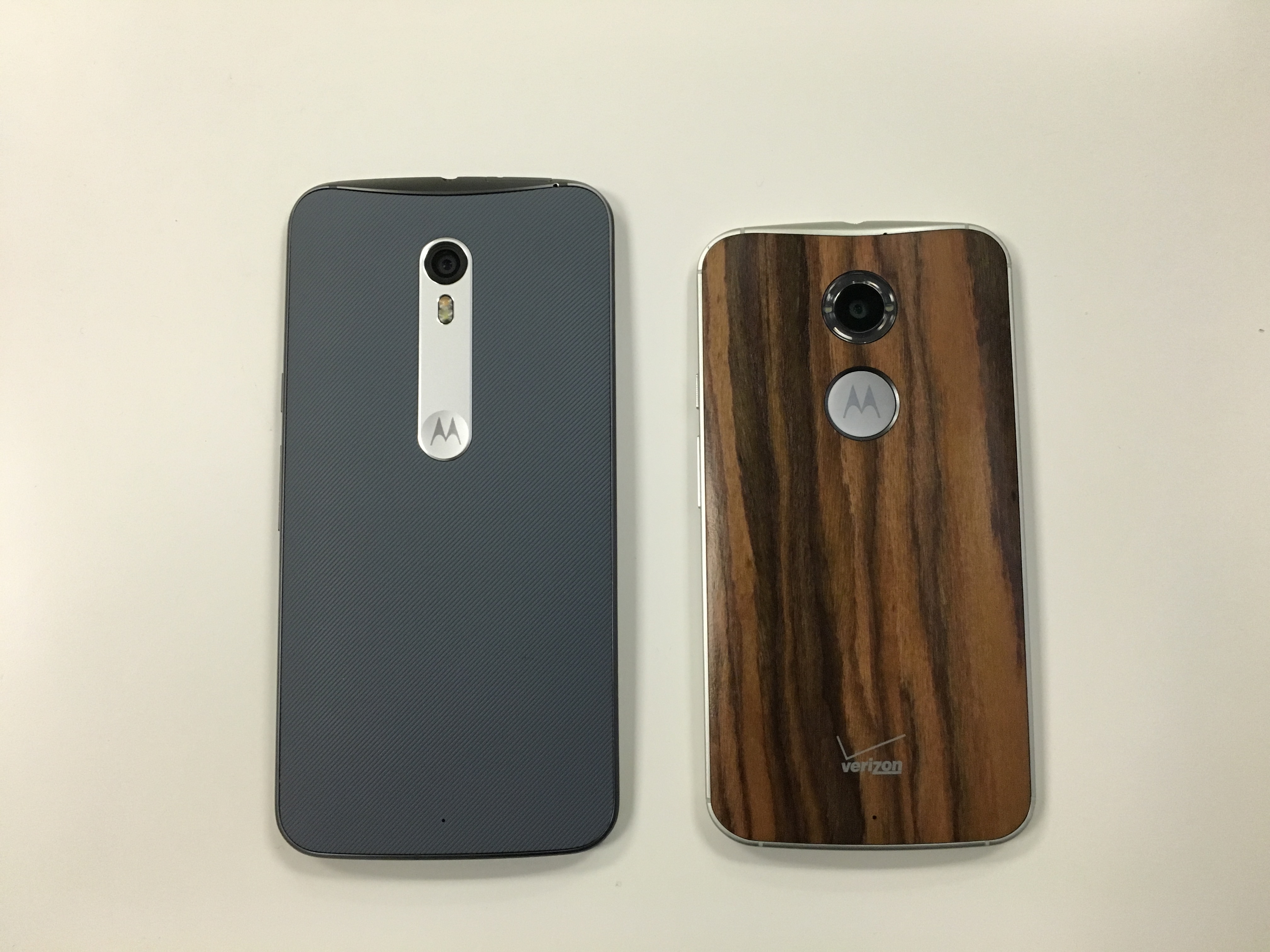
On the back of the phone, the plastic covering, with thin grooves running diagonally, feels cheaper than the smooth wood on my old Moto X (2nd Gen). Fortunately the grooves haven’t collected much dirt. The plastic looks contemporary, but I personally like the wood better. I could have bought it for $25 extra on Motorola’s Moto Maker site, but I wanted to see what you get if you don’t pay that premium.
Pure living
That metal piece in the middle on the back? It seems like a capricious change from the Moto X. The older one had a larger and more deeply indented circular area with the Motorola logo where you could rest your finger while you were using the phone, making it easy to hold the thing in place. Now the camera is connected to the little Motorola circle with the sliver of metal. With both models, I’ve accidentally covered up the camera with my finger because the indentations for the camera and the Motorola circle are similar. If anything, this is a design problem that Motorola could have solved with the new Pure Edition, but didn’t.
Still, any dimple is probably better than no dimple, because it helps you hold the phone in place with one hand.
One welcome change is the feel of the thin metal bars above and below the screen. On the Moto X (2nd Gen), you feel very narrow vertical lines cut into the metal when you rub your finger over it. This time, the lines have been taken away, leaving even surfaces you can glide your finger over. The buttons on the side are just slightly lower down on the phone, and it’s now easier to take screenshots when you hold the buttons down.
This is a small point, but I’ll say it anyway, because it’s something you discover when you actually live with the phone: The Pure Edition doesn’t effortlessly spin around on a flat surface when you flick it with your finger while the screen is facing up. The Moto X (2nd Gen) does do that, and it’s amusing for some reason. I think the lack of spin has to do with the vertical metal plate on the back of the Pure Edition.
What happens when you flick the Moto X Pure Edition on a flat surface with your finger https://t.co/wKhd9M9yeF
— Jordan Novet (@jordannovet) October 9, 2015
The Moto X (2nd Gen) spins way more when you flick it. https://t.co/nJYCVbE2ee
— Jordan Novet (@jordannovet) October 9, 2015
And it might sound stupid, but I like playing with this phone. Because it responds so damn fast, it’s fun to unlock the Pure Edition and just tap and swipe and open apps and close apps and check tweets and check Snapchat — especially when I don’t have anything to do. With 3GB of RAM and Qualcomm’s Snapdragon 808 chip, the Pure Edition comes with a perceptible speed boost over the Moto X (2nd Gen), which has the Snapdragon 801 and 2GB of RAM.
And I know some people don’t like it, but I love being able to hit anywhere on the screen in the Motorola camera app in order to take a picture. Unlike the new Google camera app, you don’t have to worry about hitting the screen at just the right spot when you need to shoot.
Photos and videos look stunning on the Pure Edition’s Quad HD (2,560 x 1,440) screen — definitely a step up from the phone’s predecessor. Even in bright sun, the display comes through if you give it a couple of seconds to adjust to the light.
In my testing the battery usually lasted all day. Which is nice. It might even be an improvement over the Moto X (2nd Gen). When you need more juice, the TurboPower charger works as prescribed: I found I could get out of low-battery territory in no more than 15 minutes. With around 30 minutes, I could be about 50 percent charged up.
That size, though
Now, about the size. It’s 5.7 inches across diagonally — larger than the 5.2-inch Moto X (2nd Gen) but smaller than Motorola’s 5.96-inch Nexus 6 from last year. It’s taller (it might stick out of your back pocket), wider, and thicker. Compared with its predecessor, the Pure Edition feels rugged, if that’s possible for a nice smartphone.
Sure, you do notice it more after sliding it into your front pocket, especially when you’re sitting down in some positions. But it’s not that much bigger than the Moto X (2nd Gen) — just a little.
It is definitely heavier. My pinky often gravitated to the bottom of the handset while I was using it with one hand, I guess because I was subconsciously concerned that it might fall. I don’t generally do this with my Moto X.
And yes, this might be a little bit hard to operate with just one hand at all times. A few friends who have played with it have found that to be a deal breaker. As for me, I find myself sometimes adjusting the phone in my hand to reach something on the top, And on a few occasions I’ve accidentally rubbed the edge of the screen with the bottom part of my thumb while trying to reach the other side of the phone with the tip of my thumb. But still, I think it’s not too big for me. (I’m a couple inches shy of six feet tall, for what it’s worth.)
So should you buy the Pure Edition?
Well, it starts at $399.99 unlocked from Motorola’s Moto Maker. Considering the phone’s strengths, the current price makes it a good deal.
Just make sure you try out the Pure Edition before you buy it. You’ll need to put up with imperfect cameras, and if you’re the skinny jeans type, you’ll want to check that this beast can actually fit in your pocket.
VentureBeat's mission is to be a digital town square for technical decision-makers to gain knowledge about transformative enterprise technology and transact. Learn More


