Mozilla today revamped its “brand identity”: a new logo, font, color palette, language architecture, and imagery. This is the first time the company, first founded in February 1998, has done such thorough brand refresh.
The project began in June 2016 as an open source design process that asked the public to submit and vote on different designs. The goal was to ensure the company’s purpose (championing a healthy internet) was better understood by more people — given that Mozilla is a not-for-profit organization that builds products, technologies, and programs to keep the internet open and growing.
[aditude-amp id="flyingcarpet" targeting='{"env":"staging","page_type":"article","post_id":2154137,"post_type":"story","post_chan":"none","tags":null,"ai":false,"category":"none","all_categories":"business,dev,marketing,media,","session":"C"}']Here is the company’s explanation of the new design, which was developed in collaboration with its London-based partner Johnson Banks:
We want to be known as the champions for a healthy Internet. An Internet where we are all free to explore and discover and create and innovate without barriers or limitations. Where power is in the hands of many, not held by few. An Internet where our safety, security and identity are respected.
Today, we believe these principles matter more than ever. And as a not-for-profit organization, we’re uniquely able to build products, technologies, and programs that keep the Internet growing and healthy, with individuals informed and in control of their online lives.
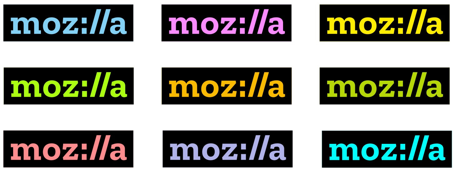
The biggest change is of course the logo (see the old one here). The biggest standout is the inclusion of “://” in place of “ill” to emphasize the company’s ties to the internet. Mozilla says it is “committed to the original intent of the link as the beginning of an unfiltered, unmediated experience into the rich content of the internet.” Its color palette is derived from the highlight colors used by Firefox and other browsers.
AI Weekly
The must-read newsletter for AI and Big Data industry written by Khari Johnson, Kyle Wiggers, and Seth Colaner.
Included with VentureBeat Insider and VentureBeat VIP memberships.

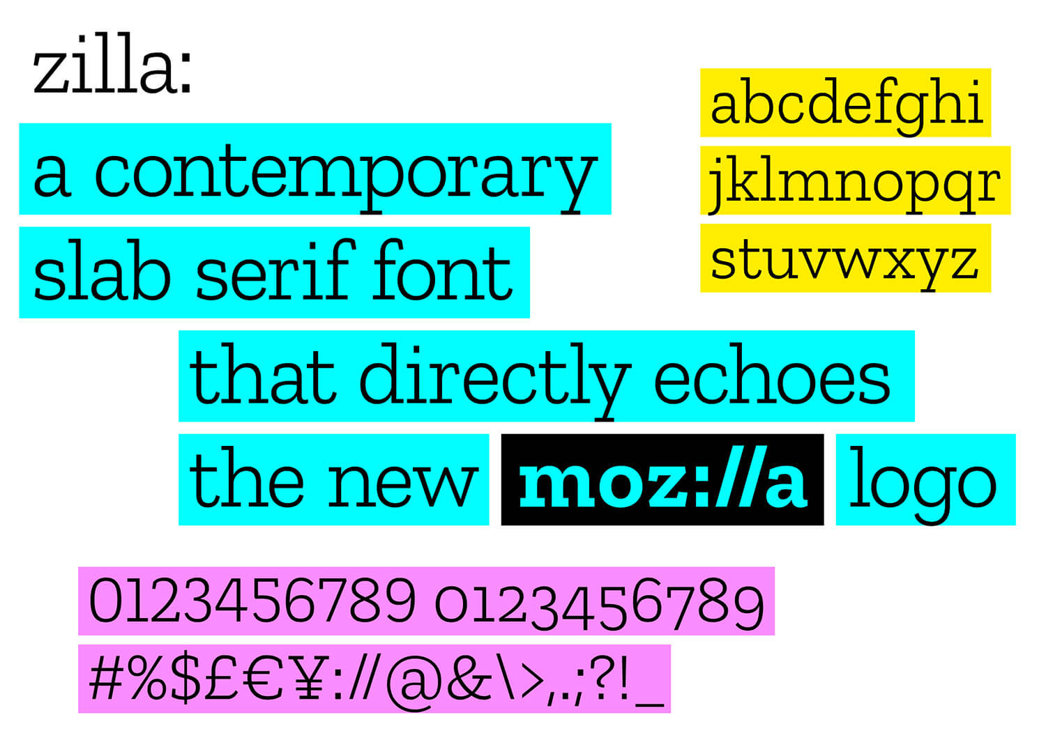
The new font, called Zilla, is free and open to all. It was created by Typotheque, a historic Mozilla partner that was the first type foundry to release web-based fonts. Mozilla chose Typotheque because of the firm’s “deep knowledge of localization of fonts, and our commitment to having a font that includes languages beyond English.” The font is meant to evoke the Courier font used as the original default in coding as well as a journalistic feel that reinforces Mozilla’s commitment to participate in conversations about key issues of internet health.

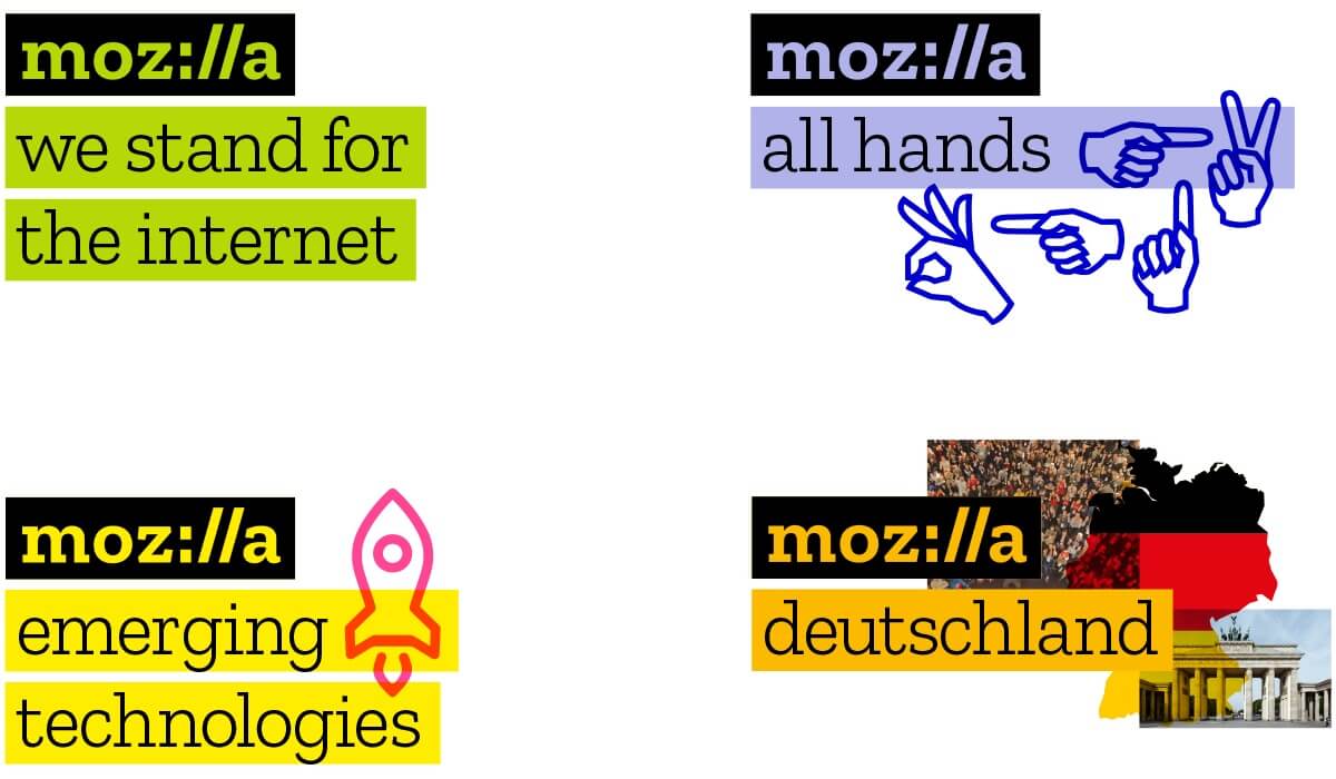
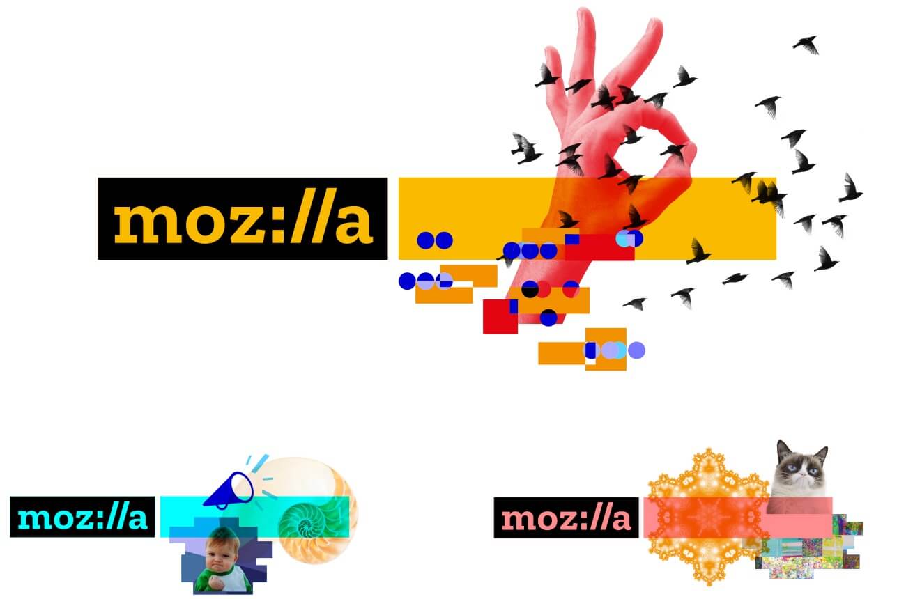
Mozilla also focused on the copy lines to the right or below its logo, which hold core messages or general program, event, and team names. The company wants this system to enable its various volunteer communities to create their own identity by selecting color and choosing imagery. Speaking of, the company decided that the concept of one image or icon standing for the whole of Mozilla, and the entirety of the Internet, was anachronistic. Mozilla thus chose to use dynamic imagery so that its identity “can evolve with the Internet itself.”

To do this, Mozilla plans to invite artists, designers, and technologists to build out an imagery collective. From there, the company will curate animations and still images available under Creative Commons.
[aditude-amp id="medium1" targeting='{"env":"staging","page_type":"article","post_id":2154137,"post_type":"story","post_chan":"none","tags":null,"ai":false,"category":"none","all_categories":"business,dev,marketing,media,","session":"C"}']

It’s been a long time since I’ve seen a new design and logo that doesn’t immediately scream redesign for the sake of redesign. Then again, Mozilla spent seven months engaging with its community to dream up this new look — well worth the effort.
VentureBeat's mission is to be a digital town square for technical decision-makers to gain knowledge about transformative enterprise technology and transact. Learn More