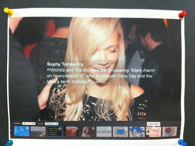
We’ve just received photos that supposedly show MySpace’s upcoming redesign. They look legitimate, and they include the new logo that MySpace has already unveiled, but it’s not clear whether these are the final designs.
[aditude-amp id="flyingcarpet" targeting='{"env":"staging","page_type":"article","post_id":221713,"post_type":"story","post_chan":"none","tags":null,"ai":false,"category":"none","all_categories":"business,media,social,","session":"D"}']The redesign, which was reportedly scheduled for mid-October (I assume it has hit some delays), has been described as the News Corp-owned social networking site’s last stand to stop the loss of users and ad revenue. (comScore reports that Twitter recently passed MySpace in traffic for the first time. And the company has seen a number of executives leave.) Chief digital officer Jon Miller said last month that the redesign is “a full swing of the bat” that will initially scare some users away.
After all that buildup, I find the images kind of underwhelming. I mean, they look fine, and the slideshow interface for updates seems slick, but I’m not seeing anything radically different. Then again, I’m not a MySpace user. If you’re more familiar with the site than I am, please let me know what you think in the comments.
AI Weekly
The must-read newsletter for AI and Big Data industry written by Khari Johnson, Kyle Wiggers, and Seth Colaner.
Included with VentureBeat Insider and VentureBeat VIP memberships.
I asked MySpace whether these pictures are an accurate representation of the redesign, and the company responded: “The redesign is coming; stay tuned.”
VentureBeat's mission is to be a digital town square for technical decision-makers to gain knowledge about transformative enterprise technology and transact. Learn More
