Netflix looks a little different today.
The popular streaming media service boasts a new, flatter logo and a slightly redesigned site, which folks on Reddit noted last night. The core categorization remains the same, but Netflix has tweaked some small details, including the top headers and background color, which appears lighter than before.
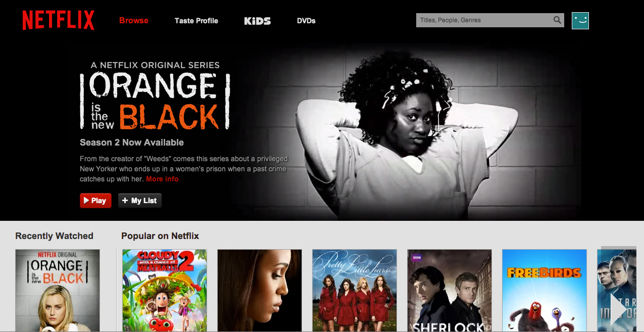
Above: The redesigned Netflix site.
Additionally, videos on the site no longer start up with a loading bar. Instead, a red buffering symbol spins around and around until Orange is the New Black is adequately prepared for your eyeballs.
These changes only affect the service’s main website; Netflix apps appear unchanged, for now. “The updated logo is gradually appearing in more places,” a company spokesperson told Engadget.
VentureBeat's mission is to be a digital town square for technical decision-makers to gain knowledge about transformative enterprise technology and transact. Learn More
