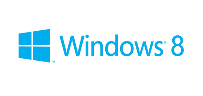
The Microsoft team has created a new logo for its upcoming Windows 8 operating system, and the results aren’t pretty.
[aditude-amp id="flyingcarpet" targeting='{"env":"staging","page_type":"article","post_id":392339,"post_type":"story","post_chan":"none","tags":null,"ai":false,"category":"none","all_categories":"business,","session":"A"}']You might say this is Microsoft’s Gap moment, that uncomfortable situation in which a company chooses a new logo that takes away from its history and chooses blandness over anything striking.
Windows 8 will be one the most important products this year, so it makes sense that it will take on new branding to help separate itself from the Windows 7 operating system. Microsoft’s new OS will attempt to bridge the gap between desktop and mobile devices and experiences with the ability to support touch screens and switch between traditional apps and touch-friendly Metro apps.
AI Weekly
The must-read newsletter for AI and Big Data industry written by Khari Johnson, Kyle Wiggers, and Seth Colaner.
Included with VentureBeat Insider and VentureBeat VIP memberships.
Sam Moreau, Principal Director of User Experience for Windows, said today on the Windows Team Blog that Windows 8 is a “complete reimagination” of the Windows OS. With that in mind, the company thought it was time for a new logo.
“The Windows logo is a strong and widely recognized mark; but when we stepped back and analyzed it, we realized an evolution of our logo would better reflect our Metro-style design principles. And we also felt there was an opportunity to reconnect with some of the powerful characteristics of previous incarnations,” Moreau wrote.
Ultimately, Microsoft chose Pentagram to redesign its logo. While Pentagram has a history of creating compelling work, what the firm has created for Windows 8 looks like it was sketched in MS Paint. It’s a simple one-color logo that emphasizes Windows 8’s simple design, but it’s so bland that it doesn’t convey anything important about the new OS.
Windows 8 is lively and exciting, and it merges the traditional desktop past with the incredibly mobile future. It deserves better.
Graphic designer Armin Vit of UnderConsideration opined that the logotype with the window design is a “real loser”:
It’s a fine font, but pretty it is not. It’s a kind of middle-of-the-road sans serif without any memorable attributes and with a very peculiar “Default” aesthetic to it. It works best as a user interface ingredient, but as the typography on a logo, it’s extremely underwhelming — pair it with the worst rendition yet of the Windows window and you have a real loser. I’m not saying the previous Windows icons were good, but they had enough abstraction (and gradients and shadows and highlights) to at least look techie and Microsoft-ey. But this “minimal” approach looks like, well, a window. A window in a $400-a-month studio apartment rental with beige carpeting and plastic drapes.
And here’s another thing: I actually quite liked the logo that was used for Vista and Windows 7. It was an upgrade that emphasized the new “Aero” concept and it had different colors, giving it it more life. Look at this logo and then look at that bland monstrosity above:
[aditude-amp id="medium1" targeting='{"env":"staging","page_type":"article","post_id":392339,"post_type":"story","post_chan":"none","tags":null,"ai":false,"category":"none","all_categories":"business,","session":"A"}']
And now we turn to you, our awesome readers. Can you design a better Windows 8 logo? If so, please post them below in the comments and we can show Microsoft how lame this is by comparison.
VentureBeat's mission is to be a digital town square for technical decision-makers to gain knowledge about transformative enterprise technology and transact. Learn More

