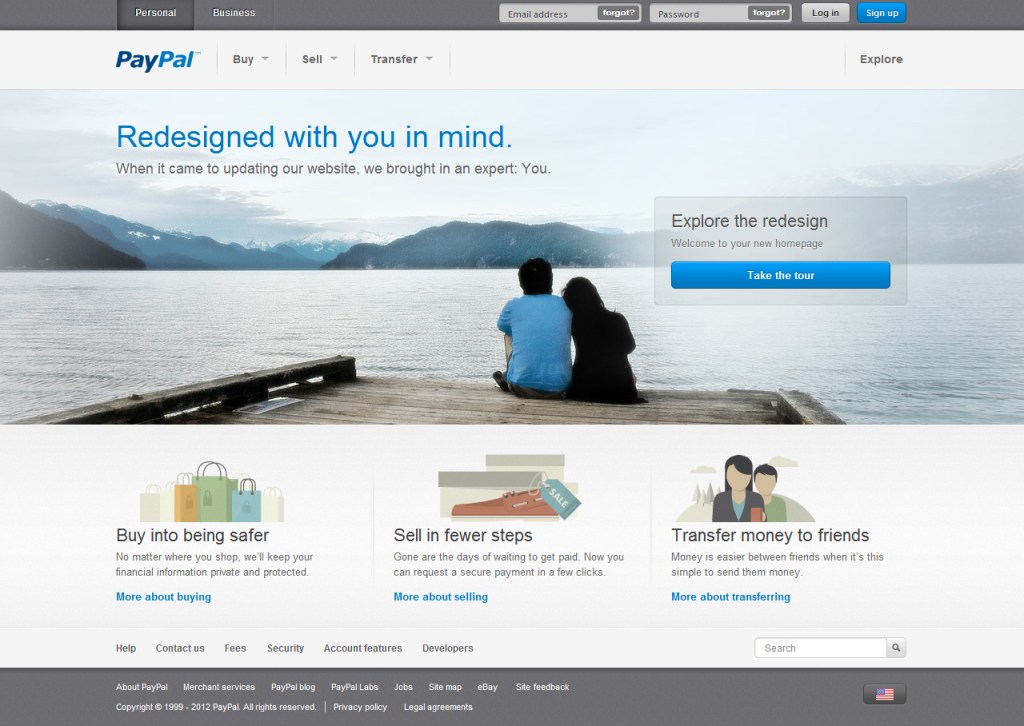
Digital transactions leader PayPal has started rolling out a brand new design to its main website for some users Tuesday. [See update below.]
[aditude-amp id="flyingcarpet" targeting='{"env":"staging","page_type":"article","post_id":477169,"post_type":"story","post_chan":"none","tags":null,"ai":false,"category":"none","all_categories":"business,","session":"B"}']Unfortunately, I wasn’t one of the lucky ones to see the updated site, but I can say for certain that it’s long overdue. If I had to put the old site into a metaphor, I’d say it was sort of like an extremely useful accountant friend who is out of touch with fashion from the previous two decades — smart, but always goofy looking. Like an above-average Dreamweaver template from the late ’90s, it has tons of tabs along the top navigation with really obscure descriptors that force you to click through each one when you can’t find something.
By contrast, the screenshots I’ve seen of the new PayPal website design show a full makeover worthy of the hard-earned money you spend through its transaction service. The top title is a hokey message that reads: “When it came to updating our website, we brought in an expert: You.” Obviously this is a lie, because most people (including the folks in charge of the previous design) are not design experts. But I’ll swallow the cheesy marketing line just this once since the site does look very clean, as you can see above.
AI Weekly
The must-read newsletter for AI and Big Data industry written by Khari Johnson, Kyle Wiggers, and Seth Colaner.
Included with VentureBeat Insider and VentureBeat VIP memberships.
Much of the cluttered mess of the old site is now gone. The navigation now consists of three very distinct options: Buy, Sell, and Transfer. It’s also got a pleasant image of a happy couple sitting at the edge of a dock, which I’m assuming will change over time.
PayPal is scheduled to officially announce the site redesign tomorrow, the company confirmed to TechCrunch. We’ll be sure to give it a full walk through once everything does go live.
Update 6/20/2012: PayPal has confirmed the redesign in an official blog post, as previously anticipated. Most of the post goes over the methodology for why the design was needed, and if you’ve ever taken a design theory class its kind of restating the basics. However, it is nice to see the company paying as much attention to its website as it did with its PayPal Here launch.
The new design should roll out to all U.S. customers within the next few weeks, with a global roll out to follow soon after, according to the company.
From the blog post:
Our old site focused more on the products and less on the way that our customers wanted to use our products. As part of this renewed focus on the customer, we are making the login process as easy and intuitive as possible and have reworked the overall navigation of the site to ensure users can get to what they want quickly. We’re also dramatically simplifying our menus and label solutions to showcase our most popular offerings, and now have an “explore” link that will highlight the newest and most exciting innovations we’re working on.
[aditude-amp id="medium1" targeting='{"env":"staging","page_type":"article","post_id":477169,"post_type":"story","post_chan":"none","tags":null,"ai":false,"category":"none","all_categories":"business,","session":"B"}']
Screenshots via Sean Ludwig & Meghan Kelly
VentureBeat's mission is to be a digital town square for technical decision-makers to gain knowledge about transformative enterprise technology and transact. Learn More

