With 10M users and a new Android app, EyeEm is out to build a community of real photographers on mobile.
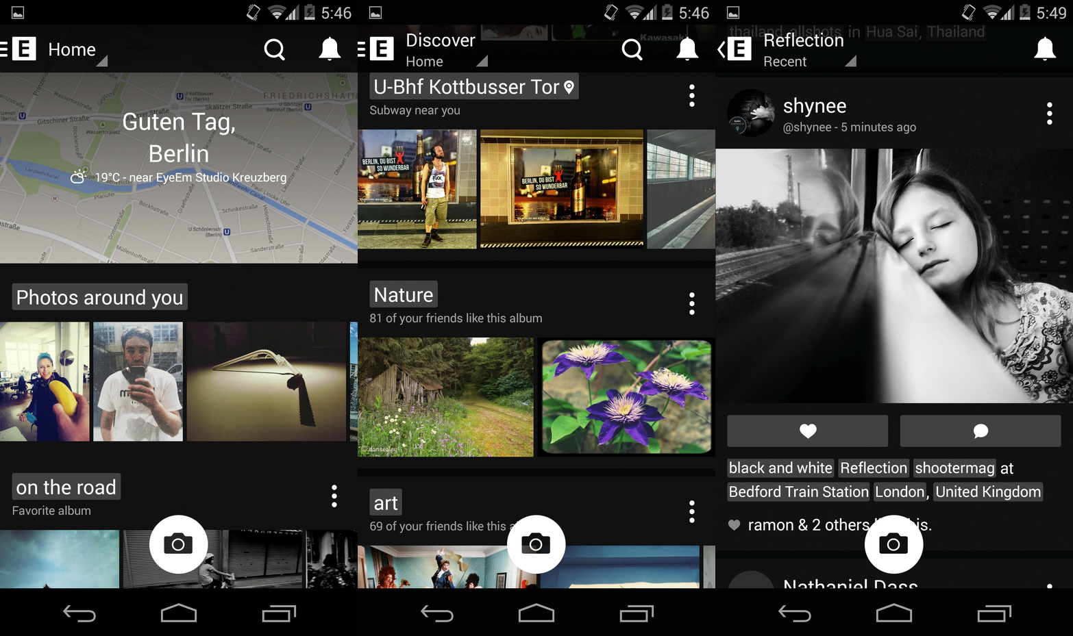
EyeEm is the anti-Instagram. Where Instagram excels in selfies and food, EyeEm strives to connect people around photography itself. Today’s update adds much-needed polish; it’s an aesthetic boost that rids the app of last year’s Android design guidelines.
Here’s a look at the new design:
Among photo sharing apps, the efforts of EyeEm somewhat mirror Hipstamatic — an app that failed to compete with Instagram and shifted focus towards more serious mobile photography.
But EyeEm’s Markus Spiering challenges this comparison. Spiering, who left Flickr as “product chief” to join the company, describes EyeEm as “a mobile photography platform” and counts the app’s ability to help photographers sell photos via Getty Images as a differentiator.
EyeEm tells VentureBeat that its users have uploaded 40 million photos and created 9 million public albums to date.
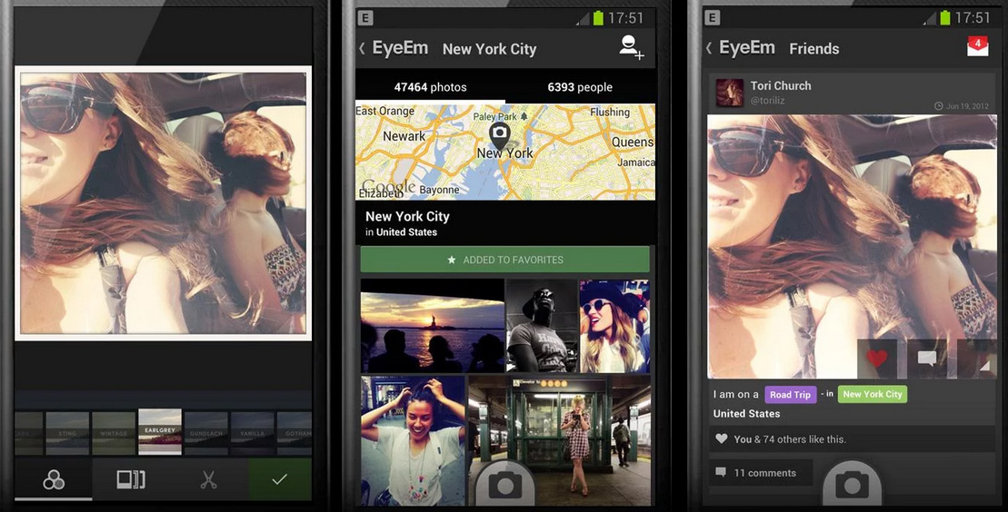
The app’s old design [below] was certainly clunkier.
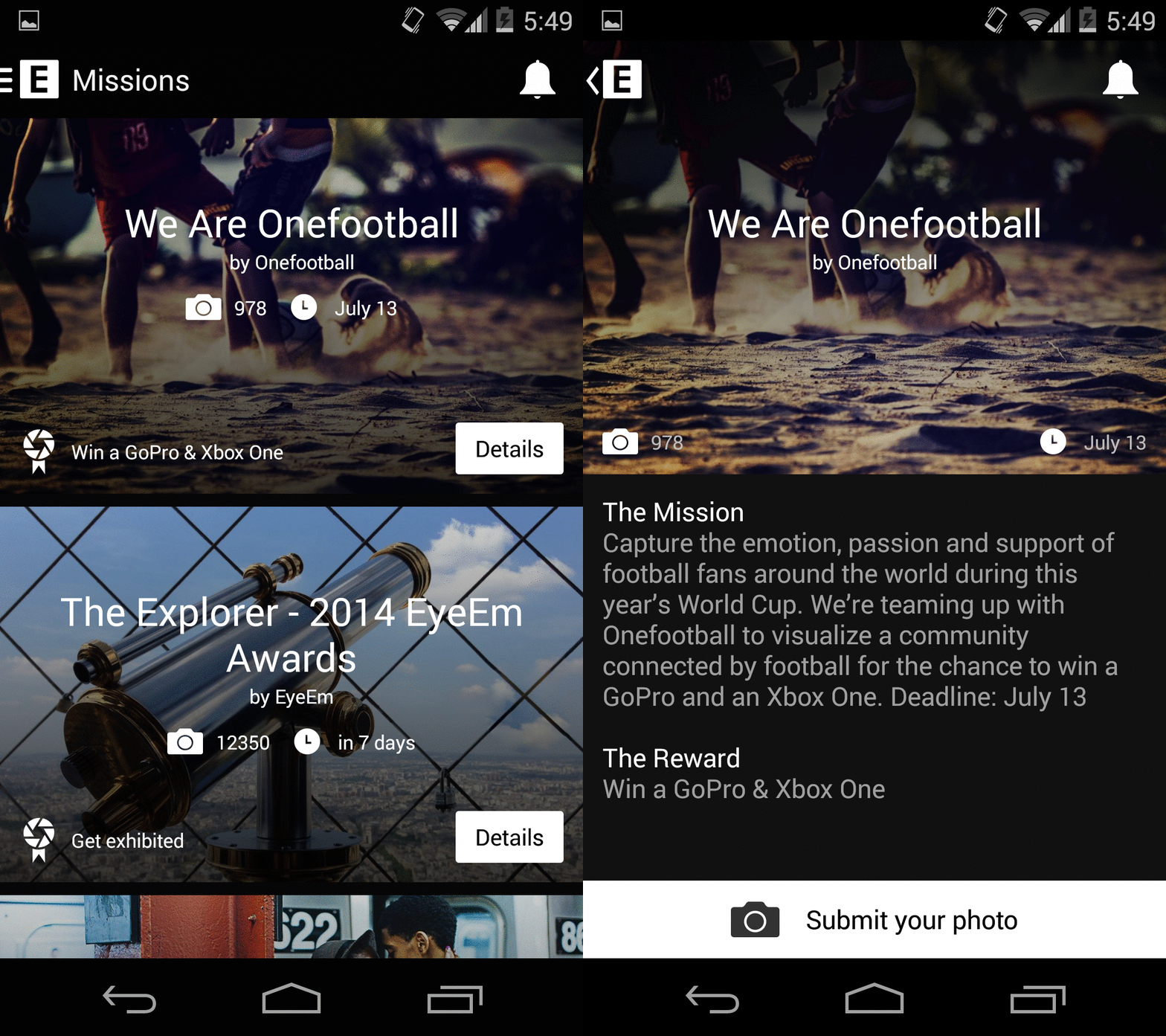
In addition to a design refresh, the Android EyeEm app places new emphasis on “Missions,” which EyeEm describes as “a way to win prizes by submitting your best photos into categories.” EyeEm tells us that a similar update is heading to iOS soon.
VentureBeat's mission is to be a digital town square for technical decision-makers to gain knowledge about transformative enterprise technology and transact. Learn More


