
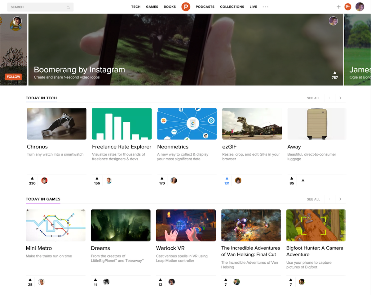
Product Hunt has undergone a redesign, creating a new experience on its homepage to offer users more personalized products and a comprehensive view of the latest in tech, books, podcasts, and games.
Codenamed Product Hunt 2.0, this comes two years after the launch of the company. Previously, the site focused on products, offering you a Hacker News/Digg-like style of voting on the latest offerings from companies. But with the introduction of more segments like books, games, podcasts, and its Ask Me Anything-style service, Product Hunt felt that the time is now to make its homepage more appealing to its newly widened base.

AI Weekly
The must-read newsletter for AI and Big Data industry written by Khari Johnson, Kyle Wiggers, and Seth Colaner.
Included with VentureBeat Insider and VentureBeat VIP memberships.
Calling its current incarnation “limiting” and insufficient for where it was heading, Product Hunt sought out new ways to make using the site more interesting. As chief executive Ryan Hoover said, people visit the site to find out what the latest products in the market are. Thus, the update personalizes the homepage for you, based on Collections you follow and what your friends like.
In looking at the refreshed design, one can’t help but think that with its carousel elements, it resembles the App Store, where you cycle through products in categories. Instead of having to jump to a subsection to find out the latest book, game, or conversation, however, the new stuff will all be pulled right into the homepage for you to quickly glance at.
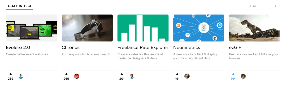
Each item on the homepage features not only the ability to upvote, but also to see which friend has endorsed the product, carrying over what has been a staple of Product Hunt since the beginning. The company is also working on other improvements, including an advanced search engine that will let you sort based on category, platform, tags, posting time, and more.
When contemplating this redesign, the Product Hunt team laid out what they thought users would like. Over three-plus months, the company worked on different sketches and designs before presenting it to 3,000 early beta testers who provided input into the iteration that you’re seeing today. Some of the feedback included things like improving discovery, wanting that “whoa” effect, and finding “stuff that’s new, important, and relevant for me and my interests.”
When viewing the new Product Hunt in your mobile browser, the experience won’t be 100 percent the same, but the thumbnail images are larger than they used to be and the experience just flows. However, don’t expect the redesign to appear on its mobile apps now — those have not been updated yet, but the company promised a refreshed iOS app soon.
These changes only affect the homepage, so if you’re looking for a similar experience on internal pages, you’re going to have to wait. Hoover said his team is exploring some changes to the individual category pages, but they don’t have a timeline for updates.
Perhaps recognizing that change can be difficult to accept — look at Twitter and Facebook — Product Hunt said that the new homepage design is completely opt-in. If you don’t like it, you can revert back to the original state … for now.
VentureBeat's mission is to be a digital town square for technical decision-makers to gain knowledge about transformative enterprise technology and transact. Learn More