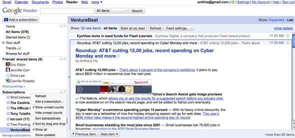
Google Reader, the search giant’s site for reading RSS feeds, unveiled its redesigned layout today. Most significantly, it’s just plain prettier and easier to navigate — the rounded corners have been squared, the page is colored with a softer palette and each section is now collapsible, meaning you can hide things that you’re not interested in.
Apparently, there were lots of folks who thought Reader’s old layout was a drag — hence the interest, for example, in Helvetireader, a skin that cleans up Reader’s design. I actually liked the old look, but even I will admit that the new design is a lot cleaner.
The new version of Reader lets you avoid that moment familiar to many users when you log in and feel a pang of guilt and terror as you see hundreds or thousands of unread news articles. Now you can turn unread counts off, so you won’t actually know how hopelessly behind you are on your reading. (Me, I prefer using the “mark all as read” button.)
Finally, the redesign improves a couple of Reader features that I haven’t actually used much: The “friends’ shared items” section is now more prominent because it has a separate navigation menu, and the suggested feed bundles, which were previously assembled manually, are now automated, allowing them to grow more quickly.
VentureBeat's mission is to be a digital town square for technical decision-makers to gain knowledge about transformative enterprise technology and transact. Learn More
