When United Way Bay Area (UWBA) and Morweb CMS teamed up to turn a simple website into an immersive user experience, the journey and the results were exactly what they’d hoped for.
About 90 percent of new online ventures fail within the first 120 days, according to economists and business experts. In today’s mobile world, a poorly designed website can make you just another statistic.
If a first impression is hard to shake, in the digital landscape, that first impression comes from your website. Even Google says so.
It’s pretty simple. Get your website done right, and users will reward you. Screw this up, and you’ll turn them away.
In the world of non-profits, the latter can reflect directly on your donations.
NOTE: VentureBeat will be discussing what fast-growth companies need to do to reach customers on mobile in our GrowthBeat conference in San Francisco, August 5-6. For tickets and to find out more about the event, head over to the GrowthBeat event site.
UWBA knew a bit about this. The organization’s mission is to generate funds through charity and provide support to communities through tie-ups with local businesses and government offices in the San Francisco Bay Area. The organization was operating on a WordPress site it launched in 2008 and hadn’t really upgraded since.
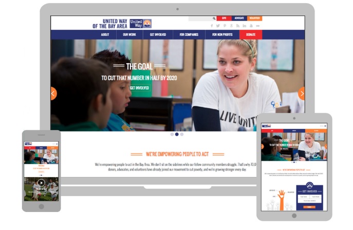
When it came to a home base online, the organization needed to transition to a responsive website design with the goal of improving its web performance and mobile presence as well as boosting online donations.
“Having a website that guides visitors through their intended activity is essential for non-profits,” reflects Murad Bushnaq, CEO of Morweb CMS. “The donation process needs to have few clicks, high ease, and bold dollar value suggestions to transact today’s busy, mobile user. This is why United Way of the Bay Area saw such a dramatic jump in donations from the very onset of the new responsive design site launch.
The key objectives or the redesign were:
- To keep costs low
- Increase online donations (revenues)
- Encourage individual contributions from the billions of people using the Internet
- Work for year-long contributions instead of relying on seasonal contributions
To do this, UWBA’s web and mobile site needed to:
- Feature fresh, interesting, easily digestible and relevant web content on a continuous basis
- Increase retention rate of visitors and reduce the bounce rate
- Maximize engagement on all screen sizes such as newer desktop resolution and mobile devices (smartphone, tablets, etc.)
- Eliminate third-party plugins that have become outdated, insecure, and inflexible
- Make donations easier to manage and process online with a reliable payment gateway
- Focus on image-prominent web design that triggers emotional connections
- Offer an easy-to-update publishing system
UWBA selected responsive design content management provider Morweb CMS as its new platform. Deemed “one of the coolest and most exciting exhibitors of SXSW,” by NewsWatchTV, the drag-and-drop platform requires no technical expertise in web design or coding. The intuitive, DIY page builder responsively renders websites to desktop, tablet, and smartphone screen sizes.
With Morweb CMS, UWBA moved into a new era of modern convenience for both site visitors and administrative staff.
“The bottom line is, a non-profit website needs to do two things well. First, it needs to properly communicate the soul of its cause with an engaging website design that is easy to navigate, uses images that emotionally connect, and has simplified call-to-actions for donations. Second, it needs to leverage technology that makes it easy for the organization to update, grow, and manage its website on the fly, all while maximizing mobile-ready users. Otherwise it risks uncollected donations,” Bushnaq said. “It’s never been easier to reach your constituents, but to do so effectively, a non-profit needs to go to where they’re at and simplify the process to accommodate today’s busy mobile users.”
The website became more relatable, responsive, and effective as the small, non-technical staff can complete updates within web developer resources. Morweb’s system makes it easy to do in-page edits, image and media placement, and optimization.
The UWBA team now has easily accessible online metrics on traffic, page views, and click-throughs via Google Analytics integration. The security of the website is greater, as it’s no longer necessary to handle platform updates at the client level — they’re all done on Morweb’s hosted servers.
The Proof Is In the Numbers
By adopting responsive design, United Way of the Bay Area was able to:
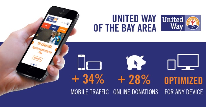
- Increase mobile sessions over 34 percent
- Increase tablet sessions by 21.5 percent
- Generate 28 percent growth in year-over-year online donations
John Swartz is an award-winning editorial and marketing professional. John spent 10 years in print and broadcast news media before joining Technorati as executive publisher, where he leads marketing communications, social and editorial strategies. Follow John on Twitter: @swartzdesk.


