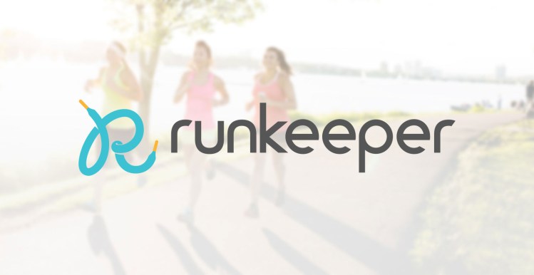
Runkeeper‘s got a new logo, and with it the company drops that hyper-fit dude icon and those Web 2.0 bubble letters.
The new design is part of a larger rebrand for the mobile fitness app centered around this tagline: “Everyone. Every Run.” Behind the somewhat demanding phrase is a brighter, friendlier design that Runkeeper hopes will speak to runners who aren’t into “elite athleticism, performance, competition, and testosterone” — the kind of traits most fitness brands embrace.
As a final hurrah, here’s Runkeeper’s original logo:
And here’s the new one:
The bubble letters were certainly friendly, but the trend behind them is awfully dated. And the awkward running man logomark screams: “This is an app for dudes.”
We bugged Runkeeper about that, and got this response from its chief executive, Jason Jacobs:
The running man icon was picked without much thought in 2008 when we were starting out. In the early days, the demo split was 80/20 M/F, but more than 50 percent of our new users are women. As we’ve grown, we’ve cultivated our voice as a supportive, collaborative, approachable brand that helps people of all fitness levels get out and experience the magic of running. We wanted to refresh our visual brand identity to better reflect who we are and what we stand for.
I’m not in love with the new logotype; the lowercase “r” and “k” make it ever-so-slightly difficult to read, and the typeface is a bit robotic.
But the laces icon is certainly more inclusive, and seems flexible enough — ![]() — to look good at any size. Undoubtedly, this is a strong step in the right direction for Runkeeper, especially if “more than 50 percent” of its new users are women.
— to look good at any size. Undoubtedly, this is a strong step in the right direction for Runkeeper, especially if “more than 50 percent” of its new users are women.
VentureBeat's mission is to be a digital town square for technical decision-makers to gain knowledge about transformative enterprise technology and transact. Learn More


