 Instapaper — a site that lets you quickly save what you’re reading to finish later — has unveiled its iPad version today, along with its plans for release.
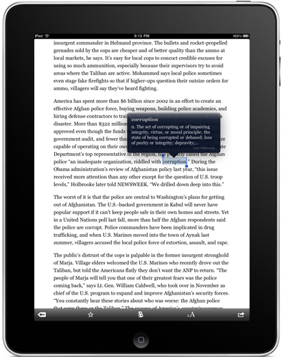
The site is developed by Tumblr developer Marco Arment, and it’s one of those rare services that you will find yourself unable to live without once you get started. Instapaper lets you save articles via a bookmarklet (a bookmark shortcut), or a variety of other sharing extensions and plugins like Shareaholic. You can then finish reading those articles anywhere — including other computers, Amazon’s Kindle (and other ebook readers), print (via a nifty print formatting interface), and of course the iPhone and iPod Touch.
Two versions of Instapaper are available on the iPhone — a free ad-supported version and the $4.99 Instapaper Pro. Arment is making the iPad version of the app universal, which means that users only need to purchase the app once to have access to it on both the iPhone and iPad platforms. Existing Instapaper Pro users will automatically have access to the iPad version come launch.
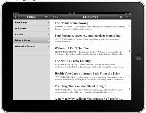
Feature-wise, the iPad version of the app is basically a bigger version of the iPhone app with some tweaks for the iPad’s interface. The biggest change is in the landscape orientation mode (see below) which offers a split-screened view of your folders and their contents.
Arment says he’s working hard to get the iPad version of the application ready in time for the device’s launch — primarily because he’s unhappy with the way the standard iPhone application looks on the device. The iPad can run iPhone apps in a pixel-doubled mode, which basically blows them up to twice the scale of the iPhone’s screen.
After viewing the iPhone app pixel-doubled on his iPad simulator, Arment writes:
It sucked, and it was completely unusable by my standards. I don’t think I’ll want to run any pixel-doubled apps on my iPad in practice.
As far as I’m concerned, Instapaper isn’t really available on the iPad until it’s native.
I figure his biggest aesthetic issue with pixel-doubling is that it makes text very fuzzy, which doesn’t make for the best user experience with such a text-heavy app. It’ll be interesting to see how many other app developers will be pushed to bring out iPad versions sooner because they’re unsatisfied with having their apps blown up.
VentureBeat's mission is to be a digital town square for technical decision-makers to gain knowledge about transformative enterprise technology and transact. Learn More
