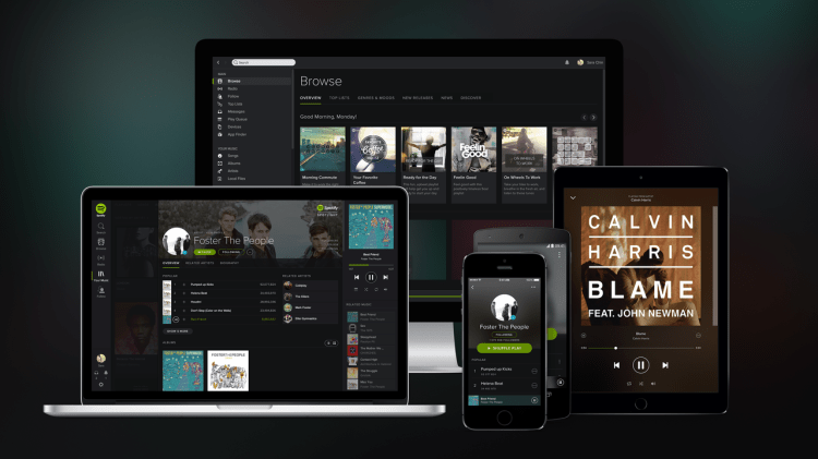
Today streaming music startup Spotify updated its iPad app with a new look and introduced additional curation features designed to help the tablet app rival the desktop in functionality.
This update arrives six months after Spotify announced its new, darker design and “Your Music,” a feature that lets users organize their songs in one place — like you’d do in the iTunes Library, for example.
Today’s release is a welcome change, but it’s strange that a redesign intended to unify Spotify’s apps took so long to roll out.


