 Twice in a recent week, I was told by merchants that they couldn’t take credit cards because Square was down. I know enough about Square to know this was unlikely. More likely the problem was related to something local to the device or a network issue.
Square could be “down” for a number of reasons that have nothing to do with Square. The real problem here is Square’s error messaging.
Unfortunately, too many companies leave error messaging to the end of product design and don’t spend the effort needed to help users out.
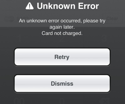
Consider this error that comes up when an iPhone is in airplane mode:
This message is entirely unhelpful. The error message should suggest alternatives like checking airplane mode, testing other sites, etc. Ideally, the app would test for network connectivity and say, “You don’t seem to be connected to the Internet, try these things…” Trying again later, as the error message suggests, won’t help unless the user has taken the phone out of airplane mode.
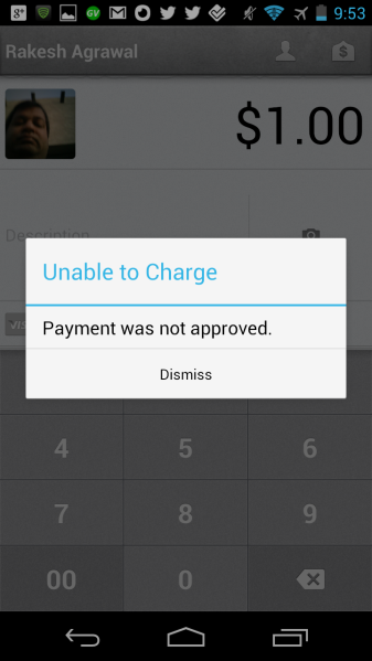
In the case below, the card was declined. (I had a card with a fraud hold on it.) Although the error message explains what happened, it doesn’t suggest an alternative. (“Ask customer if they have another credit card.”)
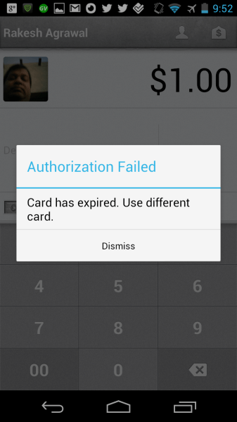
The following error message for an expired card, however, explains the problem and provides an alternative.
The merchant can figure out what happened and knows what to do next.
The difference between these last two is small but important.
The best error messages will:
- Provide context for the user on what is happening.
- Help the user figure out what is broken.
- Guide the user through fixing the problem.
- If the problem isn’t resolvable by the user (for example, a server outage), provide an ETA on when the problem will be resolved.
Good error messaging is important for all apps. But it’s especially important when you’re dealing with situations that either cost people money or keep them from earning money. If someone misses out on a $1,000 sale, you don’t want them to blame you if it really wasn’t your fault.
Spending time on error messaging helps you in a number of ways:
- It can improve a user’s experience at a time when they might otherwise be very frustrated.
- It reduces support costs. Many startups operate on bare-bones support teams. By providing the answers in software and right when needed, you can avoid emails or phone calls.
- It helps users accomplish their tasks faster and deflects blame where appropriate.
Good error messaging will become even more important as smartphone apps diffuse to ever less technically sophisticated user populations.
Square can take some solace in the fact that its error messaging is on par with VeriFone’s Sail and better than PayPal Here. In PayPal’s case, having no connection caused the app to hang. The expired card triggered a long error message that disappeared from the screen faster than I could read it. (Disclosure: I have stock in VeriFone and PayPal parent eBay.)
But that would be the wrong benchmark.
A friend recently told me that I have a tendency to compare things to the ideal state, not what other players in the market are doing. I agree. The right benchmark in product design is what is the best product for your customers, not what is marginally better than competitors.
I also picked Square because it’s widely known for having some of the best designers outside of Apple. If they missed these things, what are you missing?
VentureBeat's mission is to be a digital town square for technical decision-makers to gain knowledge about transformative enterprise technology and transact. Learn More


