It took several tries, but Microsoft has finally delivered a device that lives up to the bold promise of its Surface line.
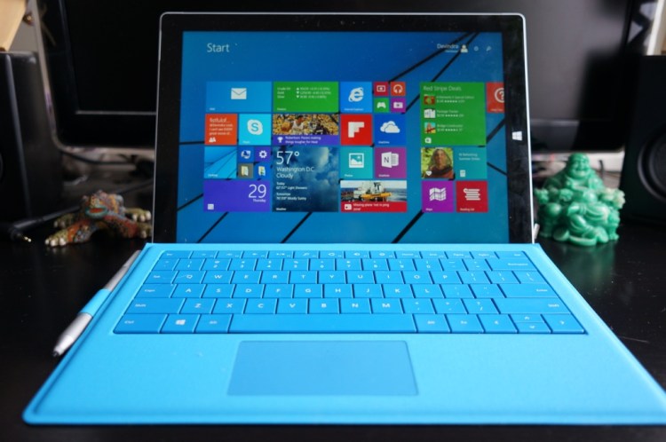
The Surface Pro 3 is Microsoft’s third try since 2012 at unifying tablets and laptops — but with some key differences from its predecessors. Its screen is bigger, so you can actually use it as comfortably as a laptop. It’s lighter and thinner than previous Surface Pro models, so you won’t mind lugging it around all day. And its distinctive hinge is far more flexible than ever before.
Microsoft is positioning the Surface Pro 3, which starts at $800, as a hybrid tablet that can completely replace your laptop. That’s something the company has pursued since the first Surface Pro, but it’s only now that all the pieces have finally come together to fulfill that ambition.
After using the Surface Pro 3 extensively for several days, I can say that Microsoft is closer than ever to creating a true laptop killer. It’s not hyperbole to say that this is the best piece of hardware Microsoft has ever produced.
And yet, I’m not sure if it’s enough.
The Surface Pro 3 comes after Microsoft has tried and failed to woo consumers to the Surface line over the past two years (this is technically the fifth Surface family member, counting two previous Surface devices and two Surface Pros). And despite the ambition of Windows 8, it’s a platform that’s still without a truly killer app — it still feels like a touchscreen OS and traditional Windows hobbled together with duct tape.
Microsoft has finally succeeded in creating its ideal hybrid tablet. But it still needs to convince consumers why they should care.
Good: Bigger screen, refined design, great stylus
In the process of writing this review on the Surface Pro 3, I used it for just about everything I would ordinarily have done on my 13-inch MacBook Air. And for the first time with a Surface, I didn’t miss anything. That’s saying a lot.
For the past few years, the MacBook Air has been my ideal laptop. It’s a device that’s been honed to near perfection after more than two decades of Apple’s laptop-design evolution. For Microsoft to even get close to the MacBook Air is a major achievement. And for it to best the Air in some respects should be a warning sign to Apple: Microsoft is finally a company to watch when it comes to computer hardware.
The Surface Pro 3’s 12-inch screen is only slightly bigger than the 10.6-inch displays of the previous Surface models, but it makes a world of difference. Now the Surface’s screen feels more like a laptop than a tablet. Previous Surfaces simply felt too cramped for me to find a decent workflow. With a screen resolution of 2,160 by 1,440 pixels, the Surface Pro 3 also offers 6 percent more screen real estate than the latest 13-inch MacBook Air.
Microsoft also wisely opted for a more square screen this time around, rather than the widescreen, movie-friendly aspect ratio from past models. The slightly taller screen makes the Surface Pro 3 better suited to editing lengthy text and complicated images. It also makes the device easier to hold with one hand (past models always felt a bit too long and unwieldy). The only problem? You’ll have to live with black bars when watching widescreen video.

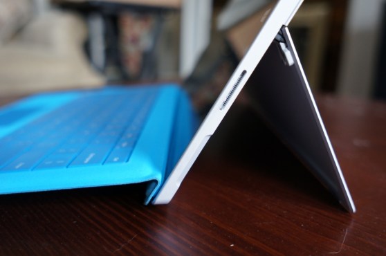
The Surface Pro 3’s iconic kickstand can now be opened almost 180 degrees from its closed position, and every step in between. At its widest setting the Surface resembles an artist’s easel.
That increased kickstand flexibility shows just how far Microsoft has come. The first Surface models could only open to one position, which made them unsuited for holding on your lap. Last year’s Surface 2 models added another kickstand position to increase their “lappability” (a term that Microsoft executive Panos Panay loves to use).
Now we have a Surface kickstand that works for almost any situation. Using the Surface, I was able to write comfortably on my couch, on a reclining chair at Manhattan’s Highline park, and at a cramped Starbucks table. My only nitpick this time around is that the kickstand still doesn’t feel very comfortable against bare skin, which could be problematic if you’re wearing shorts or a skirt.
The Surface Pro 3 also sports the best stylus I’ve ever used on a computer. Microsoft moved away from the Wacom technology in its past Surface Pros to a new touchscreen and stylus chipset from N-Trig (a company it actually invested in back in 2009). The new Surface Pro 3’s stylus grabs your pen strokes almost instantly, and it also features some realistic pressure sensitivity.
I’m not usually a fan of hand-writing notes on digital displays, but the Surface Pro 3 makes it so easy and comfortable I was compelled to doodle notes whenever possible. The tablet’s note-taking capabilities are also buoyed by some truly useful integration with its stylus. Tap the button on the top of the stylus once (just like clicking a retractable pen) and the Surface Pro 3 almost instantly launches OneNote — even if it’s asleep. Tap the stylus’s top button again and it saves your note to OneDrive’s cloud storage. It’s a tiny aspect of the Surface Pro 3’s workflow, but it’s clearly well thought-out.
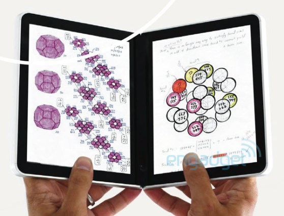
The Surface Pro 3’s stylus integration almost feels like Microsoft’s Courier project reborn.
I was also surprised that the Surface Pro 3’s larger screen didn’t harm its usefulness as a tablet much. It’s both lighter and thinner than the Surface Pro 2, though you certainly won’t mistake it for a dedicated tablet like the iPad Air. More developers are also jumping on Windows 8 now, so the platform no longer feels starved for apps (though it still doesn’t have anything I’d consider as a killer app).
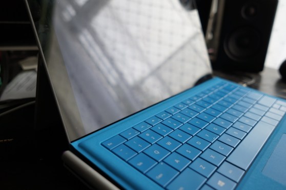
The Surface Pro 3’s new Type Cover ($130) has also seen significant improvements. It’s a bit thinner than past Type Covers, and Microsoft also reworked its touchpad to be more comfortable and accurate. It feels great for typing — it offers a decent amount of key feedback and it’s also far more stable than past Surface Covers. Microsoft reworked the magnetic latch that the Type Cover uses to attach to Surface, which keeps it secure even when typing on your lap.
Bad: Keyboard isn’t included, so-so battery life
Microsoft has no excuse for not including its new Type Cover with the Surface Pro 3. For a device that it’s positioning as a laptop replacement, the keyboard isn’t just an optional accessory — it’s an essential one. That brings the total price of the Surface Pro, with keyboard, to $930 and up.
After all, would you buy a laptop without a keyboard?
Microsoft was likely tempted by the idea of marketing the entry-level Surface Pro 3 at $800, which is $100 less than the cheapest MacBook Air. That’s something Microsoft wouldn’t have been able to do had it included the Type Cover, but it still feels like marketing spin.
Whatever calculus Microsoft used to keep the Surface Pro 3 and Type Cover separate seems flawed. It shows Microsoft cares more about beating Apple on perception rather than actually serving the consumer better. And given just how badly Microsoft needs the Surface Pro 3 to succeed, it can’t really afford to play games like this.
So, what’s the alternative? Microsoft could have just absorbed the cost of the Type Cover entirely to keep the Surface Pro 3’s current pricing. Or, if it’s worried about throwing more money away at a struggling product line, it could have started the Surface Pro 3 (with keyboard) at $900, just like the MacBook Air.
Another downside: Battery life. Microsoft claims the Surface Pro 3 gets around 9 hours of battery life — but in my use, it usually crapped out after 5 hours to 6 hours. That’s still a decent figure, but it can’t compare to Apple’s latest MacBook Air, which typically lasts me around 12 hours. (To be fair, the Air also weighs twice as much, which leaves room for a much bigger battery.)
Verdict: The ideal Surface. But is it enough?
When it comes to technology and features, the Surface Pro 3 is a winner. But Microsoft also has to fight against the perceived failure of past Surface models as well as Windows 8’s lukewarm reception and Windows Phone’s slow start.
Critics have always accused Microsoft of being too conservative and slow to innovate. But now that it’s finally trying to shake up its business, Microsoft is facing a new problem, which is the need to sell its new vision of computing to a reluctant public.
With a combination of smart marketing, hands-on opportunities with potential customers, and targeted deals for key audiences (college students, digital artists), the Surface Pro 3 may actually have a shot at carving out a sustainable market niche. But that may be expecting too much from a company that didn’t have the foresight to include a keyboard with its laptop killer.
Microsoft watchers expected the company to debut a smaller Surface tablet alongside the Surface Pro 3 last week, but reports say it was pulled at the last minute because it wasn’t appreciably better than the iPad Mini and small Android tablets. If true, that decision shows Microsoft is finally learning.
If you’ve been intrigued by Microsoft’s Surface vision, or if you’re just looking for a Windows 8 Ultrabook, the Surface Pro 3 is worth a look. It’s a bit more expensive than some Windows 8 laptop hybrids, but it’s worth it to have such a portable and fully capable Windows device.
While the first Surface was practically defined by its compromises, there’s little the Surface Pro 3 can’t do. Finally, Microsoft’s vision of a unified mobile and desktop computing experience doesn’t seem like a pipe dream. It’s a reality now. The question is whether anyone will buy into it.


