Monsters University, the new animated film from Disney’s Pixar division that debuts on June 21, will serve as light summer entertainment for most audiences. But the light-hearted, character-driven film is also a technological marvel, like most computer-generated movies that are years in the making.
It’s about 12 years since Monsters Inc. debuted in 2001. Animated movies can take a long time to make, but they’ve been a gold mine for movie makers and come with huge budgets that enable them to be forerunners in technological progress. Last year’s Brave, which generated more than $535 million at the box office worldwide, took more than six years to make on a $185 million budget. But Kori Rae, producer of Monsters University, said in an interview that her team of 270 people pulled together early in creating its story, which is a prequel to the first film. And that’s why the movie took a “short” four years to make.
Behind the tech magic: Monsters University
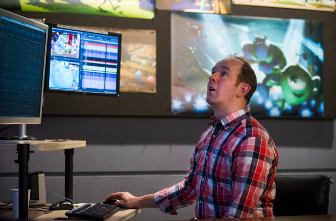
Technology is nothing more than a “big fat pencil” for animating a film and telling a story, the Pixar gang says. But the marriage of technology and art at the digital animation studio in Emeryville, Calif., goes to the very heart of the company and its efforts to entertain us. We took a tour of Pixar’s headquarters and sat down with the filmmakers, who over the course of a day and a half unmasked the technological process behind the making of the movie.
For sure, Pixar is always at its best when it focuses on story and characters. When you’re spending well over $100 million and putting hundreds of people to work for years, you have to have a solid foundation. Technology isn’t the driver of the films. It only makes it possible for the creators to do their work, said Dan Scanlon director of the movie, in a group interview.
In this film, the characters Mike (green) and Sully (big blue monster) return. Sully was the main character of the first film and Mike was his chatty sidekick. But in the prequel, the story is all about Mike and his lifelong dream of being a “scarer,” a monster who scares kids in their dreams, and his entry into college. He meets Sully, who at age 18 is really no more than an obnoxious frat boy, and they come of age in their attempts to make it at Scare School. Pixar showed the press the first 40 minutes of the film, and it seems like any other animated film. You pay attention to the story and characters, and only later do you consciously, if at all, think about the technology behind them. Our story will delve more into that technology to show how modern filmmaking has evolved.
 Big fat pencils
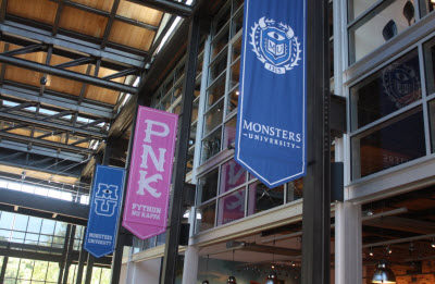
Pixar’s fabulous glass-encased headquarter has been redecorated with a Monsters University theme. There is an MU arch at the entrance to the campus, and there are solicitation tables for clubs, like you see on college campuses. Banners of Monsters University characters are everywhere. They are intended to put Pixar’s employees in the spirit of the movie that they are furiously finishing.
Inside the building is a data center full of humming servers — double the size that the company used in the past — that would be considered one of the top 25 supercomputers in the world. The 2,000 computers have more than 24,000 cores. The data center is like the beating heart behind the movie’s technology.
Even with all of that computing might, it still takes 29 hours to render a single frame of Monsters University, according to supervising technical director Sanjay Bakshi.
Rendering means that the computers build the 3D world in its full colors as the scene is meant to be viewed in a theater. The machines create the frame and it is then captured as one of thousands of frames in the movie. When you watch the movie, you see anywhere from 24 frames to 60 frames per second.
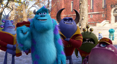 All told, it has taken more than 100 million CPU hours to render the film in its final form. If you used one CPU to do the job, it would have taken about 10,000 years to finish. With all of those CPUs that Pixar did have, it took a couple of years to render.
The reason it took so much more computing power is that the eyes of the audience have grown. Something that looked spectacular 12 years ago, like the fur on the monster Sully, doesn’t look so great today. Sully now has 5.5 million individual hairs in his fur, compared to a fifth of that in the original film. In Monsters Inc., it was impressive to create one simulated garment with realistic, cloth-like behavior: the shirt on the character Boo. The new film has 127 simulated garments, and the hair and cloth simulator had to be re-coded from scratch, said Christine Waggoner, the simulation supervisor on the film.
“We had to simulate blankets, sheets, mattresses and pillows,” Waggoner said. “In a jacket simulation, a jacket is removed from the shoulder and it has to appear natural as it moves. We even simulated the zippers on the backpacks. That’s Pixar’s level of attention to detail.”
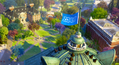
When you look at Monsters University, you’ll notice effects like the flag swaying in the wind. But you’ll also notice the blades of grass in the plaza, the swaying of the trees, the large numbers of student monsters roaming all over the school, and the lighting and shadows everywhere.
“With every Pixar movie, there is a technological breakthrough,” said director Dan Scanlon. “I was told early on that backpacks are hard to do.
Global illumination
One of the reasons that Pixar had to double the size of its “render farm” is that the technology team made a big change. It created a realistic system of lighting known as “global illumination.” That means that the sources of light, such as the sun, are accurately simulated, casting realistic light and shadows throughout a 3D animated scene. The sun serves as a perfect kind of global illuminator in a scene, as does a light bulb in a ceiling.
With global illumination, the light bounces around as needed. And it doesn’t just bounce once. It bounces around a scene over and over again, creating a new light source each time. Each scene is embued with more realistic details because the shadows and bright spots are all in the right place. The lighting and shadows are simulated and they naturally become part of the scene.
For instance, the simulators created six new lights with unique characteristics that created effects that the artists usually wanted in a scene. The “scare lights” combine blue, red, and green. Those lights can be used to create scary scenes.
The artists don’t have to worry about actually drawing those shadows in an accurate way on top of the scene that they’re creating. That requires a lot more computing power, but it removes complexity.
On the other hand, global illumination enables the team to push the technology envelope even more. It accurately captures the way that light bounces off of objects. In each scene, there are now 300 to 500 sources of light, all of them intersecting with each other. To manage all of that, lighting experts like Jean-Claude Kalache had to look at a special “lighting browser” that captured all of the lights shining in a scene at any given moment.
“You have to look at these lights from all angles to understand them,” Kalache said. “But the artist no longer has to engineer them. It was an unnecessary complexity. Global illumination creates a much richer world. It works with the trees, the grass, everything.”
While global illumination delivered a lot of benefits, it had to be approved at the highest levels at Pixar, because it drove the technology budget much higher. Rae said, “It was a studio wide decision that had to be made, and it reached beyond what we needed for Monsters University.”
Paging Pitch Doctor
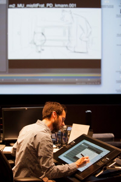
Fortunately for Pixar, there are a lot of short cuts that technology makes possible. Kelsey Mann, Pixar’s head of story, showed a tour of journalists at the studio’s headquarters that he could create a “pitch” for a scene in a matter of minutes using a combination of Pitch Doctor and Adobe Photoshop. With a stylus for inputting his hand-drawn sketches, Mann drew a scene and then brought it to life.
The software interprets his drawings and then creates a frame-by-frame cartoon that shows people what he means. As a team goes to work on the pitch, Mann can erase the animation and produce a new version in a matter of seconds. He changes the expressions on the faces of the characters or revises the way that they’re facing so that it draws the viewers eyes to a central point.
“There’s an art form to the pitch, like there is to telling a good joke,” Mann said.
Once a scene pitch is approved, there is a lot less chance for confusion. The animators have something that they can flesh out. And the director can see if it fits within the overall vision for the film.
At the same time, the actors, such as Billy Crystal, who plays “Mike,” the one-eyed green circle character who is the star of the film, work through the script with writers. They improvise and record voice sessions over and over until they feel like they have it right.
On a high level, the writers had the challenge of making sure that the prequel — where everyone knows how things turn out because of the existence of the first movie — isn’t predictable, said Rae. Having tools that make it easier for everyone to come together on a story and quickly work out the kinks can be invaluable to the large team.
“We want people to root for our character, even though we know how it ends,” Rae said.
Character design
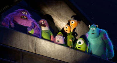
The character designers at Pixar were lucky because they inherited two popular characters, Sully and Mike. But because the movie is a prequel, they had to make the characters look younger. With an animated character like Mike, who is just a circle with a big eye and a mouth, that’s not an easy thing to do, said production designer Ricky Nierva.
The college-age characters are slimmer and their faces are slightly different.
“How do you make an eyeball look 18 years old?” said Jason Deamer, the character art director. “It’s a lot more subtle.”
Rae said, “We wanted to figure out who these characters really are. Who they are before they get to Monsters Inc. Who is Sullivan? Who is Mike? We wanted to dig in and find out more about them and go back to a time in life that everyone can relate to.”
Besides designing Mike and Sully, the team created more than 400 monsters to fill out the roster of students at Monsters University. There were six basic body types, including a fungus, and a slug. Still, each character had to be unique to live up to Pixar’s reputation of creating wonderful, believable characters. Besides, some of those characters would prove useful in ancillary merchandise, such as toys or game characters. Disney is putting together a Monsters University version of its toy-game product, Disney Infinity, debuting in August.
“The technological problem with this film is that there are so many students, because you have to sell the audience on the idea that this is a college,” Scanlon said. “But we chose the college years because we wanted to see these characters develop a relationship while they were becoming adults. College is so much about self-discovery.”
 The animator’s technology
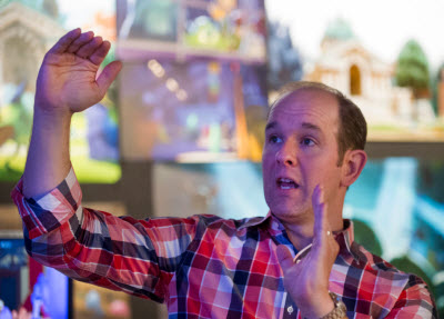
Once a scene is scripted and voice acted, it receives a series of approvals. At that point, it is supposed to be frozen. Then people like Scott Clark, the supervising animator, take over. One of hundreds of worker bees at the digital animation studio made famous by films like Toy Story and Up, Clark joined Pixar as an intern when Toy Story was coming out in 1995.
The Pixar way of creating an animated movie is a far cry from the hand-drawn art that Walt Disney’s artists used to create their first animated feature film, Snow White and the Seven Dwarfs, in 1937. Computers can automate the creation of 3D scenes and moving characters in a film. But even with a lot of computer automation, it still takes a long time to animate something because you have to create the animation frame by frame, crafting something from nothing on a computer. It still takes weeks to do a few seconds’ worth of animation.
Animators are the “actors and stunt people of this virtual world,” Clark said. That’s because animators have to make the same kinds of decisions actors and stunt people make. If the actors get 20 takes to perform in real-time, the animators take a lot longer to plan a scene, and they ultimately wind up with just one take.
That’s because it is expensive and time-consuming to render (or fully animate with the highest quality imagery) a scene. In fact, it took Pixar’s server farm about 29 hours to render each frame of Monsters University, the prequel to Monsters Inc., one of the studio’s most beloved films.
Clark uses Pixar’s own proprietary software, Presto (named after a 2008 short film), to create the skeleton of a scene. Clark can create something and then play it back at around 8 frames per second (a film runs at 24 frames per second or faster) just to see if it works. When the scene looks just right, Clark finishes and submits it for approval. If someone above doesn’t like it, they may revise the script or shorten the scene, wiping out weeks of labor.
Ripping everything apart
No one likes to make a change late in the movie. It’s costly — you wouldn’t believe how costly — and can throw a film off schedule. But Pixar’s creators are known for their ruthless editing and revisions, all in the name of creating a better film for the audience.
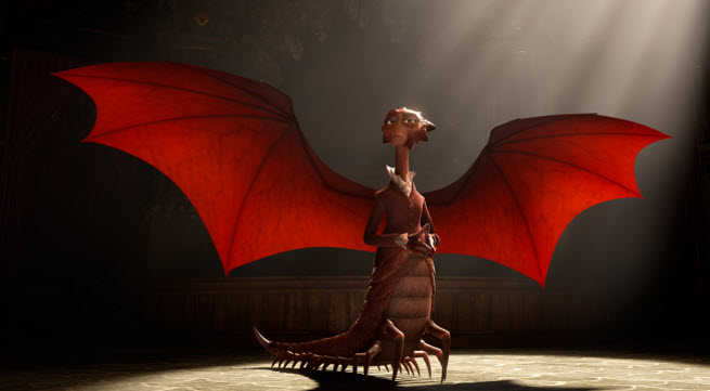
Pixar director of film Dan Scanlon had to balance those concerns when he made a major change to one character. The film had no strong female characters in it, as originally conceived. He decided to change the main “villain” of the film, the Dean of the Scare School, from a male to a female. Dean Hardscrabble, pictured above, is the product of many animation nightmares.
Because Scanlon put his foot down, the team had to find a new actress to replace the actor and record the script again. The character designers, such as Jason Deamer and Ricky Nierva, had to conceive of a brand new character. They did research on different kinds of creatures. Finally, somebody came upon a giant centipede, found in places like Peru, Vietnam, and Thailand. They brought one into the office to show to the artists. But a doctor warned them, “If you are bit by one of these things, you are not going to die. But you will wish you died.”
They morphed that giant centipede with bat wings and a lizard’s face. The wings are hidden in the back folds of the jacket, so they can be a scary surprise in the film.
 The buildings are alive
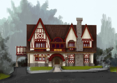
Robert Kondo’s job was the “monsterfication” of the university. The school resembles an Ivy League campus. But it had to be modified to fit within the story. So Kondo’s team had to become architects for a monster’s school, creating a monster-size drinking fountain, for instance, where there was a tall fountain for a tall monster and a short one for a small monster. Some of the doors have large openings and some have smaller doors embedded within them for the smaller characters.
The architecture had to serve monsters in other ways. Some of the monsters can fly, so they have perches or landing spots on the upper floors of buildings. And there are entrances to the buildings on the upper floors, so that the flying characters don’t have to go downstairs to enter or exit.
Kondo reused archetypal images such as a trapezoid, which conveyed the heft of a monster’s shoulders, over and over. He also used fangs and horns, putting the equivalent of monster faces into the facades of buildings.
“We had to stylize the buildings for the monster world,” he said.
In this landscape design, technology also had to play a role. One of the traditions at the university was that incoming freshmen would rub a spot on a statue for good luck as they entered the school for the first time. The tech team had to render that spot on the statue so that it was both worn and shiny, so that the viewers could see the effects of that tradition on the statue’s paw. It took considerable, realistic animation technology to make that part of the statue, which was visible only for a second, more realistic.
 Cheating in a believable way
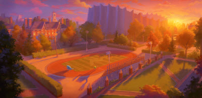
The team works extremely hard on making sure that anything Another way that Pixar saves time is by cheating. To fans, it might seem like Pixar has built a fully simulated 3D world, like the landscape in a video game, where you can go anywhere. In truth, Pixar has built whatever has to been seen in the movie. No more, no less.
If a fully simulated world existed, it would be easy to position the monsters so that the light source was behind them or in front of them. This was a big deal since the optimistic characters like Mike always faced a light source, so their faces were brightly lit. The positive characters were sunny. The negative characters, like Dean Hardscrabble of the Scare School, were shadowy. So Dean Hardscrabble was backlit, so that shadows crossed her face in every shot. Dice Tsutsumi, a lighting and color expert, wanted consistency across the characters in this respect so that the mood would be clear to the audience.
The lighting even comes into the story. Early in the film, the light falls on the face of one main character in a certain way, while the other’s is shadowed. As the fortunes of those characters change, the light and shadows on their faces change as well. You may never notice this in the movie, but it’s there, and it’s intention is to affect your attitude toward that character.
If Pixar had the budget to build out the entire university and simulate the lighting, Tsutsumi’s job would have been easier. But the team cheated, randomly putting light sources where they wanted them to be, just so the shot could be right.
“There were some areas where we cheated quite a bit, but sometimes if you cheat you create problems with the logic, like the time of day,” Tsutsumi said. “Then it becomes a distraction. As long as it remains believable, it’s OK.”
With the characters, the simulators could also cheat. They couldn’t independently simulate and animate each one of the 5.5 million hairs on Sully. But they identified “key hairs,” or one in every 27 or so that could govern the behavior of a whole patch of hairs. They simulated the key hairs, and everything else looked like it was being simulated.
 Putting it all together
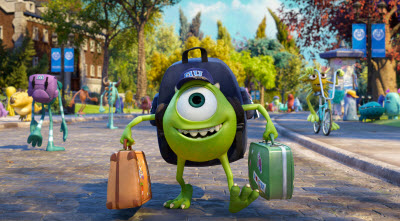
It may be hard to tell at first glance why an animated movie is so hard to create. But the complexity of the scenes is far greater than the original film. All told, Pixar’s character designers created more than 400 characters to fill out the university scenery, which had to seem like it was full of students. Putting all of those students on screen was complex.
The characters fit into different types, such as those that resembled slugs or birds. They had multiple limbs such as tentacles. But following the rule for cartoons, the teams had no more than four fingers per hand.
On average, each shot had more than 25 detailed animated characters. And there were 6.2 limbs and 3.7 eyes per character. All of that had to be computer-animated because it was far too complex to be animated by hand, said Waggoner. Roughly 89 percent of the film is built from computer simulations, she said.
 The payoff?
Will all of this technology pan out? Pixar and Disney will find out after the movie comes out on June 21. For most people who see the movie, the result may be that they won’t notice any of this technological wizardry, except maybe the flag waving in the wind. When I first watched the beginning of Monsters University, I didn’t notice any difference at all in the design of the characters Mike and Sully as compared to the original film.
But that’s the way the Pixar team likes it. They believe that all of the work they put into the technology makes the film more believable and immersive. It serves to draw you into the animated world.
“We try really hard so that the technology doesn’t become the distraction,” Tsutsumi said. “It has to support the story.”
It might seem like a lot of work to create these new technologies for every movie. But the payoff in the past has always been big, as Pixar movies stand out as visual marvels. And each investment in a new animation technology usually pays off in future films.
“We plan to use these innovations in our future films,” Kalache said.
VentureBeat's mission is to be a digital town square for technical decision-makers to gain knowledge about transformative enterprise technology and transact. Learn More
