
I spent a few days with the new Pebble Time smartwatch, and for better or worse, that review period came not too long after I reviewed the Apple Watch.
I learned quickly that comparing these two devices isn’t meaningful, because their respective scopes and use cases are different. And frankly, the Apple Watch is in a completely different league where design and user experience are concerned.
The Pebble Time is different from past Pebbles in that it has a more attractive rounded-square stainless steel front, and a color e-ink screen. It’s also thinner and sports a Gorilla Glass screen. And, Pebble claims, the battery will last “up to seven days.”
The Pebble Time seems like a fairly simple device that does a limited set of things — notifications, simple apps, etc. — well. And it manages these tasks in a way that is uniquely Pebble.
AI Weekly
The must-read newsletter for AI and Big Data industry written by Khari Johnson, Kyle Wiggers, and Seth Colaner.
Included with VentureBeat Insider and VentureBeat VIP memberships.
Pebble went back to its roots on Kickstarter for the Time, as if trying to declare a referendum on its existence as a smartwatch maker. The move obviously fired up the fan base in a big way; Pebble hit its funding goal in record time. In all, 78,471 backers pledged $20,338,986 to fund the Time. Most of those pledgers have now received their watch in the mail.
Navigation buttons
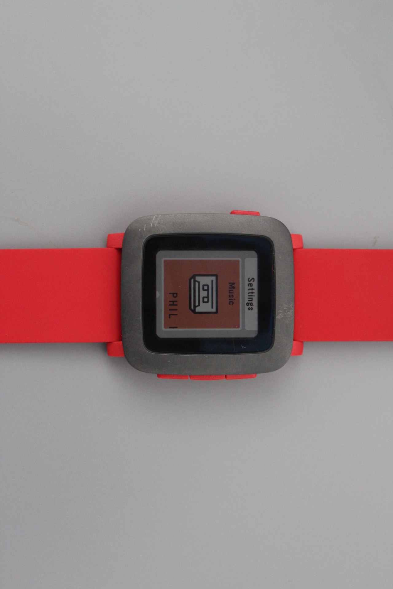
Above: The Music app controls playback on a paired smartphone.
The Time has three buttons of equal size on its right side, and a single home button on the left side. Those buttons have a big job because they’re the only way of interacting with the device — it has no touchscreen.
On the right side, the top button is for scrolling up, the middle one is the “select” button, and the bottom one is for scrolling down. But you can assign these buttons different roles by specific apps. For instance, in the music app, the top and bottom buttons can adjust the volume of music (playing on the paired smartphone). The middle button can be used to pause or play the music.
The single button on the left side of the watch brings you back to the home screen.
When you press either the top or bottom button on the right side of the watch from the home screen, you see your calendar, and the two buttons allow you to scroll backward and forward in time. However, you have to use some force to press those buttons and you have to hold the other side of the watch with your index finger to hold the watch in place.
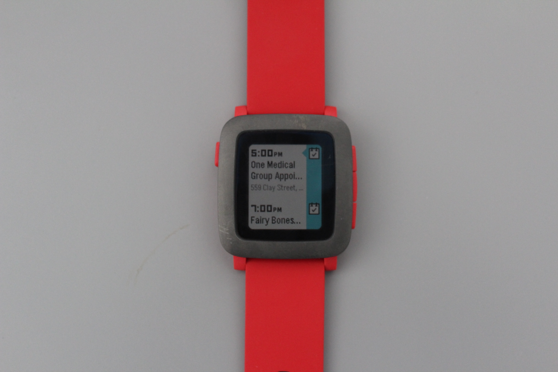
Above: The Time’s scrolling calendar view.
Pressing the right side middle button takes you into a scrolling list of basic apps and settings. These include Settings, Music, Notifications, Alarms, and Watch Faces. After that, you’ll see a list of the apps you’ve installed.
If you want to change the order of these screens — such as to put your downloaded apps at the top — you can use the Pebble app on your phone to do that.
This all seemed sensible and straight-forward to me. It’s intuitive; you don’t really need to read an instruction manual before using a Pebble. That’s something I can’t say about the Apple Watch and many other smartwatches.
Setting up the Time
The Time connects to your phone via regular Bluetooth with Bluetooth Low Power (for notifications). I had some trouble getting my phone to connect with the Time using both flavors of Bluetooth. In fact, my iPhone 6 didn’t seem excited about connecting with the Time at all — it took a couple of sessions to get it to work.
 But after you pair the devices are paired, they stay linked, and notifications from my phone apps seemed to work just fine. You can see them at a glance, and you can dismiss them by pressing the Back button on the left side of the watch.
One thing you notice right away is that the Time has a much more powerful haptic engine than the Apple Watch. When it buzzes you with a notification, you know it.
Appearance
My initial complaint about the Time is the plastic body of the device and the band’s rubbery material.
The Time isn’t the sexiest-looking device; it’s certainly no match for the Apple Watch when it comes its looks. The metallic-looking face of the watch looks just fine, but that piece sits on top of a plastic body that comprises the rest of the body of the watch. It’s this material that’s the problem: it gives the Time a toy-like quality that would make me hesitant to wear the thing on a regular basis.
I also didn’t care for the Time’s watchband. This piece is the same (red) color of the watch itself, and it’s made out of a rubbery material. While I found that putting on the watch was easy, I didn’t like the way the material pulled at the hair on my arm. And the feel of the band on my wrist brought my attention to the watch at various times during the day; a comfortable band lets you forget about your watch until you need it.
The Screen
As other reviewers have noted, the bezel around the front of the watch is covers a lot of real estate relative to the active screen area.
 The Time uses a 64-color e-ink display. While I like that the screen has color (earlier Pebbles do not), the screen is dim and looks dull. Pebble may have gone way to far in dimming the screen to save battery life. I see no way of turning up the backlight.
As for the graphics you see in the OS, you can look at this a couple of ways. The graphics and lettering have a low-resolution, blocky look that reminds me of the old Mac interfaces from the ’80s. Some people might like this aesthetic. Others will just see it as kinda ugly.
Battery
Technically, Pebble’s claim that the battery life of the Time is “up to seven days” is true. But I never saw battery burn rate anywhere near seven days of life on a single charge. In my experience, the Time’s battery runs down in three or four days.
Conclusion
Overall I found wearing the Time to be a little clunky in a physical sense. I’m not wild about the look of the device, and I found using the buttons to be a little difficult. I did get the feeling from using the device that it runs a mature and well-designed OS, such as it is.
The Pebble has lots of loyal fans who have been around since the time when it was the only smartwatch around. But I don’t belong to that crowd and have no special attachment to the device. The Time looks like a big improvement from the original Pebble watches, but compared to wearables I’ve seen from LG, Samsung, and Apple in the last year, it seems like a throwback to an earlier time in smartwatch history.
The $200 Pebble Time is available for preorder from Best Buy, and it should start shipping around July 20.

VentureBeat's mission is to be a digital town square for technical decision-makers to gain knowledge about transformative enterprise technology and transact. Learn More