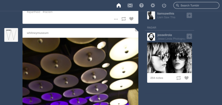
After releasing a new video player last week, Tumblr is giving its dashboard a mobile-inspired makeover today.
In a new update, the blogging platform is growing the size of video and image display by 40 pixels and adding a “quick compose” button for posts. The site will also have a sticky header of icons that stays with users as they sift and scroll through blog posts. The header will contain a search field, message alerts, and the new quick compose button.
Some of these are features already innate to Tumblr’s mobile app. With 65 percent of the platform’s users posting from their phones, Tumblr’s mobile platform may make a better testing ground for user behavior and products.
“[Mobile] is a cleaner way for us to experiment,” says Peter Vidani, creative director at Tumblr. He says because of all of the restrictions related to mobile application development, it’s harder to make new features.
With software companies increasingly focused on mobile, it’s likely we’ll see more mobile first development that eventually moves to desktop.
VentureBeat's mission is to be a digital town square for technical decision-makers to gain knowledge about transformative enterprise technology and transact. Learn More

