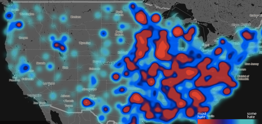
Or, at least, where they’re the most open about displaying their antisocial views.
[aditude-amp id="flyingcarpet" targeting='{"env":"staging","page_type":"article","post_id":737541,"post_type":"story","post_chan":"none","tags":null,"ai":false,"category":"none","all_categories":"big-data,business,media,social,","session":"D"}']The picture doesn’t look good for the Eastern states, although admittedly the bulk of the population is there as well. Areas in Virginia, North Carolina, Texas, and Alabama show up bright red on the map, as do areas in more central states Indiana, Iowa, and Minnesota.
The map is part of a larger project, called the Geography of Hate, by Humboldt State professor Dr. Monica Stephens. The data that forms the map comes from an analysis of every tweet posted between June 2012 and April 2013 that contained at least one of 10 designated “hate words,” including dyke, fag, chink, gook, wetback, and cripple.
AI Weekly
The must-read newsletter for AI and Big Data industry written by Khari Johnson, Kyle Wiggers, and Seth Colaner.
Included with VentureBeat Insider and VentureBeat VIP memberships.
But while the original list of tweets was generated by a machine, every single one of the 150,000 tweets containing one of the target words was individually examined by undergraduate students. As the project description states:
Because algorithmic sentiment analysis would automatically classify any tweet containing “hate words” as “negative,” this project relied upon the HSU students to read the entirety of tweet and classify it as positive, neutral or negative based on a predefined rubric. Only those tweets that were identified by human readers as negative were used in this analysis.
To protect the identity of potentially racist, homophobic, or otherwise bigoted Twitter users, the tweets were aggregated up to the county level, and counties with high levels of hate speech were colored red on the map. Areas with moderate levels — though still higher than the national average — are varying shades of blue, and unshaded areas were below the national average.
Smaller towns seem to have a higher incidence of hate speech — in Virginia, for example, Palmyra is more hateful on Twitter than Richmond. And in Louisiana, New Orleans and Baton Rouge are less hateful than smaller towns nearby.
Image credits: Geography of Hate
VentureBeat's mission is to be a digital town square for technical decision-makers to gain knowledge about transformative enterprise technology and transact. Learn More