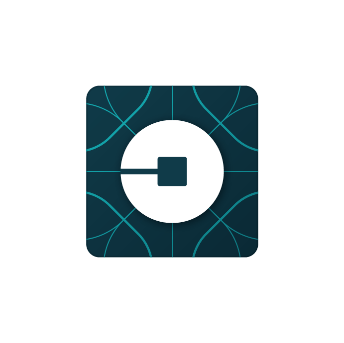
Today Uber unveiled a new brand identity, replacing its stodgy-looking “U” logo, aging gradients, and overall uptight feel with a new design that still feels pretty straitlaced. Let’s take a look.
The new identity
Uber’s new logo drops the strange, curved serif in favor of simplicity. Lots of tech companies are ditching their serifs, including Google.
AI Weekly
The must-read newsletter for AI and Big Data industry written by Khari Johnson, Kyle Wiggers, and Seth Colaner.
Included with VentureBeat Insider and VentureBeat VIP memberships.
This is the new rider app icon, the only one most people will see. Uber says it’s rolling out to various cities now. And below, you’ll find Uber’s new driver app icon.
With the new identity, Uber introduces two concepts: the bit and the atom, which manifest themselves literally in the company’s new design philosophy. These concepts hinge on one phrase, “We leave no bit or atom unturned to create industries that serve people, and not the other way around.” It’s a nice phase.
Overall, Uber is gunning for a friendlier, more approachable look. The company is hunting for a middle ground between its founding elitism and its pink-mustachioed competitor.
Stay tuned for more as we comb through Uber’s rebrand.
VentureBeat's mission is to be a digital town square for technical decision-makers to gain knowledge about transformative enterprise technology and transact. Learn More


