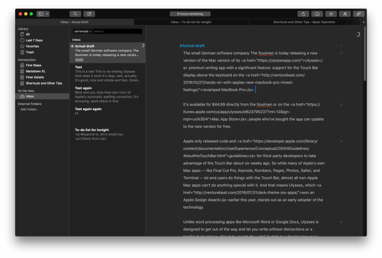
A small German software company called The Soulmen is today releasing a new version of its Ulysses premium writing app (for Mac) with a significant feature: support for the Touch Bar display above the keyboard on the revamped MacBook Pro.
It’s available for $50 on the Mac App Store; people who’ve bought the app can update to the new version for free.
Apple only released code and guidelines for third-party developers to take advantage of the Touch Bar about six weeks ago. So while many of Apple’s own Mac apps — like Final Cut Pro, Keynote, Numbers, Pages, Photos, Safari, and Terminal — let end users do things with the Touch Bar, most non-Apple Mac apps can’t do anything special with it. And that means Ulysses, which won an Apple Design Award earlier this year, stands out as an early adopter of the technology.
In contrast to word processing apps like Microsoft Word or Google Docs, Ulysses is designed to get out of the way and let you write without distractions or a boatload of options. (Need to search the web? Switch to a freakin’ browser.) What you have here is something that lets you write in Markdown and then export documents that look the way they should in HTML, PDF, or Word’s .docx format. For people who care less about how things look and more about expressing what’s on their minds, Ulysses’ simplicity will be welcome.
In addition to Touch Bar support, the new version of Ulysses lets you open multiple tabs inside the app, so you can effectively work on two documents at once — Apple made this type of thing possible with the release of macOS Sierra in September — and import Evernote ENEX files.
But the Touch Bar is the big attraction in Ulysses 2.7. When you’re editing, you have buttons for adding links, images, and footnotes; shortcuts for adding Markdown headings to text; templates for bullets, numbered lists, block quotes, text notes, code blocks, and raw source blocks; and icons for comments and annotations and various kinds of Markdown emphasis, like making text strong or striking it out.

Above: The Touch Bar display you see when you’re in the editing window in Ulysses.
There’s also a button that opens a pop-up window containing a preview of your current document, so you can quickly see how it will look in another format. When you’re looking at the preview, the Touch Bar changes to offer you buttons for altering the format and style, as well as a big green button for saving the file in the other format. Hit that big green button and you see Apple’s standard Save and Cancel buttons.

Above: The options you see on the Touch Bar when you’re in the sheets column in Ulysses and a particular sheet is highlighted.
Plus, right next to the escape key you have a button that will bring up buttons for switching the view and showing or hiding the right drawer for attachments.
When you’re looking at a set of sheets — essentially a series of documents in a collection — the Touch Bar shows a different set of buttons. One is for marking a sheet as a favorite, so you can quickly access it from the app’s library. Another button gives you a quick way to apply a keyword to the sheet. Another button lets you set a writing goal for the sheet. Yet another button brings up statistics for the sheet. A share button is on the Touch Bar, and so is a search button.

Above: What you see once you’re looking at a preview of a sheet.
Why the search button isn’t visible when you’re typing, I’m not sure. And for that matter, Ulysses really should let you customize the buttons that you see on the Touch Bar when you’re using the app. Apple lets you do that with its apps, and it really does make the Touch Bar feel more customized.
Ultimately, the Touch Bar makes Ulysses more powerful for beginners (like me) who can’t be bothered to read the app’s introductory material and go back to it again and again. It says that it’s okay if you don’t know all the keyboard shortcuts or don’t feel like wading through menus. For people who have used the app for a long time, it might be unnecessary.
I suspect that as more third-party developers experiment with Touch Bar integrations, software that previously felt wonky will become a little more accessible. And that could mean more users will keep coming back.
As for Ulysses, the Touch Bar’s header and emphasis shortcuts are enough to make it stand out from other text editors that support Markdown. And that counts for something.
VentureBeat's mission is to be a digital town square for technical decision-makers to gain knowledge about transformative enterprise technology and transact. Learn More

