 Yesterday, Skype updated its Mac client, adding group screen sharing, video calls with mobile users, and significantly altering the user interface. That is not the story. Rather, the story is why the company changed, and how the update is largely focused on placating angry Apple users.
In November 2010 Skype updated its Mac client and Skype went from a messaging tool that took up a corner of your screen to a communications juggernaut that demanded virtually your entire monitor. To be sure, I was not just feeling sentimental, I recently re-downloaded Skype 2.8 from Old Apps. Installing this two-year old software was a liberating experience.
Here was Skype 2.8 for Mac
Notice how slim the Skype window was when the user was not actively Skyping? Having Skype active and visible on the desktop was not a hardship — in fact, it was common. And when you were actively Skyping, the drawer at right kept all your chats well organized and accessible. If you only had one chat going, you could hide the drawer.
AI Weekly
The must-read newsletter for AI and Big Data industry written by Khari Johnson, Kyle Wiggers, and Seth Colaner.
Included with VentureBeat Insider and VentureBeat VIP memberships.
The point? Skype 2.8 was a very Mac-like application that respected your screenspace.
Skype 5 changed all of that.
In January of 2011, Skype released a new version that was intended to bring the Mac client into feature parity with the Windows version. One of the causalities in that endeavour was any semblance of sensibility with reference to software version numbers. The other was the user’s desktop real estate.
Here was Skype 5 for Mac
Godzilla on an LCD screen it may not have been, but it was LARGE. And suddenly, everything was joined together in one big window that could not be resized.
Mac users who tried the beta versions told the company about the problems, but when the final 5.o version was actually released and had no significant size reductions, they went ballistic. Almost 400 people commented on the Skype blog post announcing the new version, and they were not gentle:
The GUI is completely unusable
…
So great, instead of 500% now the window and contacts are just 450% too large.
…
I’m staying with 2.8, thank you very much …
…
The interface is still hideously bloated and unusable.
…
The smallest window size takes up more than 33% of my screen real estate. Version 2.8 takes up a fraction of the screen and is much more intuitive to use.
Through a few more minor updates the user interface remained largely unchanged. Until Skype 5.8, released yesterday, which the company’s blog post indicates was aimed at these very complaints, saying “your contact list just got slimmer,” and “you’ve been very vocal about the revamped full-screen user interface which we introduced in Skype 5.0.”
Well, 5.8 brings back a few things that Mac users have been longing for two long years.
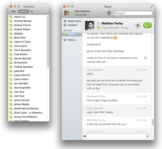
Here’s Skype 5.8 for Mac
Two things are immediately apparent.
One, you can separate the contacts monitor from the main Skype window, and two, you can make the main Skype window considerably smaller than in the previous version. Both are major steps back towards the user interface that Mac Skype users knew and loved in version 2.8.
Some might argue (OK, I would argue) that the Skype user interface circa 2012 still doesn’t come close to approximating the elegance and simplicity of a two-year-old version. But there’s no denying that it’s gotten better. And, that the people have won.
All hail democracy.
Image credits: Disruptive Telephony, ShutterStock
VentureBeat's mission is to be a digital town square for technical decision-makers to gain knowledge about transformative enterprise technology and transact. Learn More


