 More than half of Americans now own smartphones, but as an industry, we’re still figuring out how to design well for the limited screen sizes and the sometimes flaky connections. Designing for mobile requires extra attention to detail. Over the next few weeks, I will be taking a close look at some design features that work well and some that fail.
First up is HotelTonight, one of my favorite mobile companies. It offers easy access to same-day hotel reservations using iPhone, iPad, and Android devices. It provides a fair value to consumers and hotels. And it has a business model that makes sense. (Sell things for more than it costs you.)
I consider it one of the best designed apps out there. It excels at the details, even something many companies ignore: error messaging. A while back, I wrote about how Square did a poor job of error messaging. Today, I want to take a look at how HotelTonight responds to error conditions. (To be clear, some tech people wouldn’t consider these “errors,” but users do.)
HotelTonight makes inventory available at noon local time. If you check the app before noon, you get a counter that shows when rates will be available and an option to get notified. The background is keyed to your city, making it obvious that you’re in the right place.

When I tested this, I got a notification at just the right time and I was able to pull up the hotel rates.
I asked HotelTonight CEO Sam Shank about the performance of the notifications, i.e. is it worth the design time to implement such a feature. Although he didn’t give me specifics, he said, “We only keep things in the app that are additive to our goals, so, yes, it leads to more transactions. With our business it’s interesting to note that revenue and user happiness are aligned — users are happy when they get a great hotel at a great rate, and hotels are ecstatic to fill an otherwise empty room — which is also the moment in time where we generate revenue to pay for and grow our service.”
That brings up a related point: even if you’ve built something, if you find that it’s not additive, don’t be afraid to take it out. Every button, every control is something that a user has to think about.
Another error case is when the user is checking for rooms after the 2 a.m. cutoff:

Again, the messaging is clear.
When I was in Istanbul recently, I launched the app and saw this message:

In other apps (for example, Uber), the app doesn’t seem to be cognizant of the fact that it doesn’t provide service in a particular market.
Just as important as it is to show users the right message is capturing data on where people are attempting to use your app. This can help prioritize new markets.
“We look at customer request data in aggregate and prioritize our sales efforts so that we have hotels where people need them,” Shank said. San Antonio and Minneapolis were two markets that were re-prioritized based on the data. “They were not high in terms of room nights booked vs. other cities we hadn’t launched, but there were more people opening the app in those cities. We created a heatmap and used this to prioritize.”
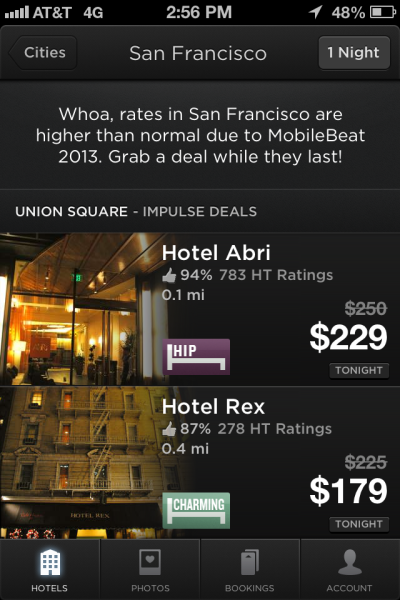
Another important use case is when hotel room rates are especially high during a special event, such as New Year’s Eve or Mardi Gras. Although this isn’t an error, it’s definitely something many users don’t expect. Most travel sites don’t explain the reason; HotelTonight does. (This screenshot is a mock up HotelTonight made; Shank will be speaking at VentureBeat’s upcoming MobileBeat conference. But it reflects the type of messaging seen on the app.)
Error messaging doesn’t have to be all serious, either. If you go to an invalid page on the HotelTonight’s mobile site, you get this:

Designing error messaging certainly isn’t the sexiest thing in the world. But it’s a critical part of the user experience because you have the opportunity to turn potential frustration into delight. And help capture sales that might otherwise not happen.
Rakesh Agrawal is an analyst focused on the intersection of local, social and mobile. He is a principal analyst at reDesign mobile. Previously, he launched local, mobile and search products for Microsoft and AOL. He blogs at http://redesignmobile.com; and tweets at @rakeshlobster.


