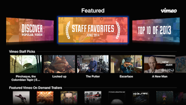
Streaming video service Vimeo today rolled out a slick new version of its Apple TV app that’s aimed at minimizing the time it takes people to navigate to content.
To do this, Vimeo overhauled the user interface so that you click fewer times before actually playing a specific video. As you can see from the screenshot above, the top row within the new Apple TV app focuses on curated content from the Vimeo staff, a selection of content you may like based on past activity, and a “top 2013” category.
There’s also a much greater emphasis on Vimeo On Demand content; the service’s platform that enables indie film makers to generate revenue by making their work available for rent or purchase. Selecting a VOD video allows you to watch a short trailer for the film to see if you’d like to make a purchase, and lets you add titles to a “watch later” queue.
Sadly, you can’t actually rent or buy movies through the Apple TV app, but you can log into Vimeo’s mobile app to make those purchases, which can then be viewed on your TV screen.
Speaking of mobile, today Vimeo also updated Cameo, the mobile video editing iOS app it acquired back in March.
The new Cameo update attempts to improve the musical aspects of the app, with a new soundtrack browsing feature, genre sorting, and more. Focusing on music seems like a pretty good idea for Cameo, since music videos are typically much shorter and require less editing.
VentureBeat's mission is to be a digital town square for technical decision-makers to gain knowledge about transformative enterprise technology and transact. Learn More


