Visual.ly’s service is similar to document-sharing site Scribd in that it provides an easy way for people share information. But rather than simply uploading pretty infographics, the startup is aiming to give users tools to build custom visualizations — no design or animation experience required.
[aditude-amp id="flyingcarpet" targeting='{"env":"staging","page_type":"article","post_id":309011,"post_type":"story","post_chan":"none","tags":null,"ai":false,"category":"none","all_categories":"business,enterprise,entrepreneur,media,","session":"A"}']“Both regular and interactive infographics [bring in] a lot of interest (page views) for publishers,” said Visual.ly co-founder and chief marketing officer Tal Siach in an interview with VentureBeat. “But, to make a pie chart move is not that easy.”
Siach is correct. A lot of time, effort and energy goes into producing a comprehensive infographic. It requires skilled designers, lots of data collection and superior creative direction. “It would take hours and hours to create an infographic in Photoshop, which is why we want to simplify the process so that anyone can create them by selecting options and entering specific data,” he said.
AI Weekly
The must-read newsletter for AI and Big Data industry written by Khari Johnson, Kyle Wiggers, and Seth Colaner.
Included with VentureBeat Insider and VentureBeat VIP memberships.
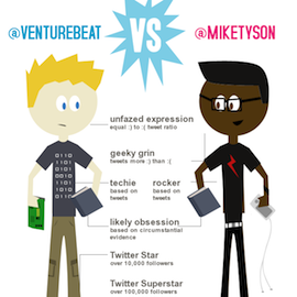
The company launched an exclusive Twitter Visualizer Project, which shows off some of the capabilities Visual.ly plans to offer its users. Using Twitter’s API, the project generates a personal infographic based on a user’s tweets. You can customize avatars, compare two different Twitter celebrities and/or alter the look and feel of the image.
With 34 celebrities, five mouths, seven hair colors, 12 hair styles, two genders, 11 outfits, two positions and 28 accessories, the Twitter Visualizer can put each Twitter user in 17,592,960 different scenarios, the company said. A tool like could do great things for online news reporting.
The Twitter Visualizer is actually pretty cool. Yet, Siach said it’s just the tip of the iceberg for what the company wants to do.
Eventually, the company wants to create a subscription-based service for publishers, advertisers and anyone else seeking custom data visualizations. The service will go beyond what’s available to the regular community and give subscribers access to several different kinds of customizable data.
Visual.ly made waves when it debuted its closed beta at the 500 Startups Demo Day event in April. Since then, the company has had over 60,000 people sign up for beta invitations as well as a long list of talented graphic designers looking to show off their work. The startup has already forged many partnerships with publishing, design and distribution companies. Those partners include The Atlantic, CNN Money, eBay, Inc. Magazine, GOOD, OMD, National Geographic and Smirnoff.
Here’s a look at Visual.ly’s Twitter Visualizer Project at work: @VentureBeat vs. @MikeTyson:
[aditude-amp id="medium1" targeting='{"env":"staging","page_type":"article","post_id":309011,"post_type":"story","post_chan":"none","tags":null,"ai":false,"category":"none","all_categories":"business,enterprise,entrepreneur,media,","session":"A"}']
VentureBeat's mission is to be a digital town square for technical decision-makers to gain knowledge about transformative enterprise technology and transact. Learn More