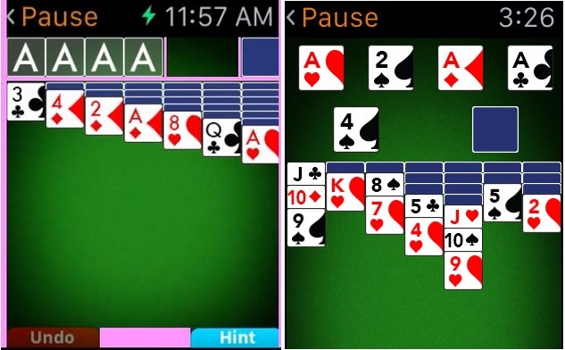
At MobilityWare, we’re huge believers in Apple products. In fact, when the app store first opened in 2008, we had one of the first games available. So when Apple announced Watch, we quickly ramped up development and began working on several new concepts without the benefit of an SDK. Our first game was to be Solitaire, a game we had tremendous success with on the iPhone.
But a funny thing happened on the way to launch: Apple rejected us. We absorbed Apple’s feedback and, backed by a new design philosophy, we came up with a superior product on our next attempt and Apple approved us.
The rejection turned out to be a tremendous learning opportunity that we would like to share. Here’s what we learned:
1. Take a cohesive approach
As game designers, we are ambitious by nature. Why have just 5 levels when you can have 55? But with Apple Watch, we needed to rein in those instincts and view the project from a Design 101 perspective. For a game, “simple” is actually very hard and requires that all dev team members are looking at the project through the same design lens. Everything from length of game play to information delivery and game mechanics require a cohesive understanding of the platform’s inherent limitations as well as its opportunities.
2. A clean screen is an approved screen
It’s tempting to look at a small 38mm screen and think you need to use every available pixel. Not so! We learned that on-screen objects need a little breathing room in order to not overwhelm the user’s eyes. Additionally, the edges of the watch are beveled, which can make touch recognition less accurate. For Solitaire, we had to forego the traditional card stacks layout and create one optimized just for Apple Watch. Additionally, we used the Digital Crown feature to add space.
3. Control your controls
Aside from the obvious one-handed limitation of playing games on a watch, the small screen limits control options and accuracy. Our research showed that games being approved tended to have either basic D-pad or simple tap controls. So we developed a number of small touch-control prototypes to improve accuracy and further aid the player. For Solitaire, we ended up with a proprietary “smart-move” control scheme that was more generous and forgiving to players. In the end, the revamped controls yielded a much better product.
4. Set guidelines
With two additional Apple Watch titles now under development, we’ve established a set of principles for the platform based on our learnings from our first rejection. As a result, our development process is significantly streamlined and produces a better end product – one more likely to be approved on the first go-round.
These simple guidelines include the following:
- Timing: The game must deliver a positive experience within a fast time frame.
- Controls: The controls must be simple, yet deliver a high degree of accuracy.
- Delivery: Avoid text by instead using use a color or graphic to deliver information, or perhaps an animation to convey emotion.
- Fun-Factor: Most importantly, make it fun to play on the platform.
Robert Jackson is the Vice President of Product Development for mobile game company MobilityWare, whose first game, Solitaire, was among the first on the App Store in 2008.
VentureBeat's mission is to be a digital town square for technical decision-makers to gain knowledge about transformative enterprise technology and transact. Learn More


