 Google is testing a new design for its streaming video-sharing site YouTube, which highlights elements of the company’s Google+ social network, reports TheNextWeb.
Despite being the most popular online video service in the world, YouTube’s current website design is not very appealing compared to other streaming video sites. So any change to its current design is something to talk about.
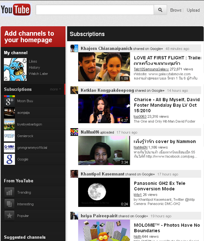
As you can see in the screenshot below, the new design is heavily influenced by Google+ integration. All subscriptions and channels you follow are organized into a left sidebar, which makes it easier to see videos that are shared from people within your social circles on Google+.
On top of those subscriptions is your avatar and links to your profile information. While I’d argue that this also isn’t the prettiest of user interfaces, it’s much better than the screen full of overflowing video thumbnails that YouTube currently uses. The new design is also more in line with the company’s experimental Cosmic Panda video player redesign, which VentureBeat first reported about back in July.
The new Google-plus-focused design also adds more sizing options to videos, makes recommended content pop out when clicked and includes a new favicon (the little icon in your web browser bar next to the URL).
At this point, we don’t know if the new design will eventually roll out to all users or if it’ll remain in testing mode. We’re reaching out to Google for more information and will update this post with anything new.
[Screenshot via Faceblog.in.th]
VentureBeat's mission is to be a digital town square for technical decision-makers to gain knowledge about transformative enterprise technology and transact. Learn More


