Zite lets you build a custom digital magazine by pulling in shared links from bookmarking and social sites, such as Twitter, Google Reader, Delicious and Read It Later. It then builds a personalized selection of articles based on activity from your social profiles. Unlike most of its competitors, Zite learns your reading habits by giving you voting buttons for each piece of content. The idea is to give you more of what you actually want to see without having to disregard all the boring and/or uninteresting stuff.
“A lot of services, like Twitter (for example), suffer from giving you too much information if you follow lots of sources or not enough if you follow just a few,” Zite CEO Mark Johnson told VentureBeat. “I call it the Goldilocks Problem. It’s either too much or not enough.” Logically, that would make Zite the just right amount of information, according to the classic fairy tale story.
Initially, I assumed many of the user interface elements from Zite’s iPad app would get lost in translation of the iPhone’s smaller screen, but that isn’t the case. The experience of reading news is just as enjoyable, especially during idle moments throughout the day (standing in line, boring meetings, waiting for the bus, etc.).
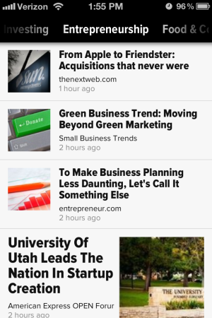
The biggest change in the iPhone version is the app’s navigation. Since side bars aren’t practical for the smaller screen, the news sections are displayed at the top. Switching between news sections is done by swiping the section name horizontally, which is nice if you only have one hand free. Articles from each section are arranged in a vertical stack with thumbnails that help break up the text.
Earlier this week, Zite competitor Flipboard also launched an iPhone version of its popular iPad app. The launch was so successful that it actually crashed the Flipboard service for a time. Clearly, people like the idea of a customized digital magazine even if it’s a fraction of the size. Johnson said that isn’t much of a surprise, as a Zite iPhone app was the most requested feature from users.
One thing you won’t find in both the iPhone and iPad Zite apps is advertising. The company does have plans to integrate advertising, but not until the ad spots are useful/relevant to the user and don’t distract from the overall experience, Johnson said. However, he is optimistic about generating revenue through branded channels, which aggregate news related to the brand’s expertise and help promote its own blog posts. The Zite recently launched its first branded channel partnership with health and fitness retailer Lululemon. The channel is also ad-free and requires opting-in to see its curated content.
Founded in March 2011, the San Francisco-based company was acquired in August by broadcast news organization CNN for over $20 million . Zite faces a growing number of competitors, including Flipboard, Editions by AOL, Yahoo’s unreleased Livestand and recently launched Google Currents.
[iPhone app screenshots via Zite]
VentureBeat's mission is to be a digital town square for technical decision-makers to gain knowledge about transformative enterprise technology and transact. Learn More
