This post has not been edited by the GamesBeat staff. Opinions by GamesBeat community writers do not necessarily reflect those of the staff.
Editor's note: Joe thinks that game tutorials do too much hand-holding these days. Do you agree? Click the "Comments" link with your left mouse button to add your opinion. -Brett
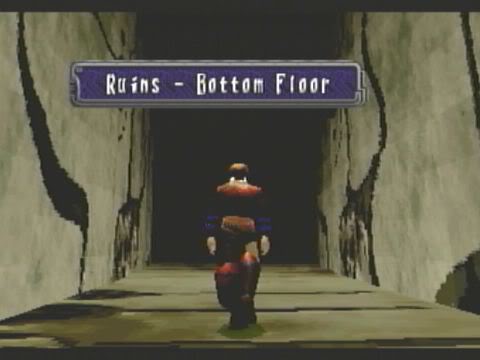
After the opening cut scene of the 1998 Sega Saturn RPG Panzer Dragoon Saga, you're subjected to a seemingly random bit of gameplay. It's the first time you're given control of the protagonist, Edge. He stands in a narrow hallway. Brown, pixelated walls warp and stutter as the Saturn's processors desperately maintain the scene.
The view from over Edge's shoulder reveals walls on either side that extend into darkness. There is only one way to go: forward. But how? Most gamers would assume you simply press up on the d-pad (they'd be right). Others may begin to fumble with the controls, pressing buttons until they get the desired result. Eventually they'd figure it out, and no matter how long they took, they'd never be punished and they'd never be condescended to.

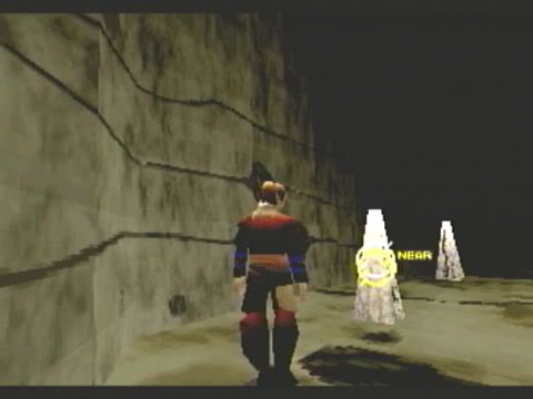
As Edge proceeds, the end of the hall comes into view. There are strange objects in the room, and naturally, they must be interacted with. Again, players begin fumbling around with the buttons. They find functions: a run button, camera rotation, and a cursor to interact with objects.
Highlighting an object, they may find it is too far away, but they've learned that Edge will give insight on something no matter what the distance. They get closer to the mysterious white box in the room, opening it to reveal an elevator key. They now know these objects contain items. They use the elevator key and the next cut scene begins.
At this point, the player has watched a 10-minute intro, walked into an elevator, and then watched another cut scene. This bit of gameplay spliced into the game's introduction seems inconsequential. And yet without an obvious tutorial or dialog box, the player has learned the basics of interacting with the game.

Panzer Dragoon Saga perfectly represents the primordial ooze that eventually became the games we play today. This was a game ahead of its time, and its early influences can be seen in many modern games. But the brilliance of this opening scene has come and gone — a forgotten example of elegant game design.
Most modern games opt instead to talk down to their players. A similar sequence plays out, but even the most basic commands are explained through graphics rather than gameplay and experimentation: "Press Left Stick to Run," "Press A to Jump," etc.
With game controls becoming more and more standardized, there's more opportunity than ever for experimental tutorials, but they're incredibly rare. How many first-person games begin with one low obstacle and one high obstacle followed by a "Press A to Jump" or "Press Left Stick to Crouch" prompt? How many full-screen, action-halting splash pages must we endure before developers realize how badly they are breaking immersion?
Lazy tutorials stem from a fear that gamers will get frustrated and quit. And it could be that an unfortunate few fired up Panzer Dragoon Saga and spent hours lost in that tiny hallway. But that's a chance the developers took, allowing the majority of players to figure out the rules in an elegant, natural fashion.
Now it would feel dishonest to go any further without addressing Panzer Dragoon Saga's extensive combat tutorial. Fifteen minutes later, players are introduced to the game's RPG combat system through an itemized list of multi-paragraph tutorials — exactly the kind of thing I'm suggesting developers avoid. But again, Saga came out during a time of growth. The developers toolbox was not as rigidly defined as it is now, and RPG battle systems tend to be based on abstract ideas.

But there's nothing abstract about pressing one button and getting a response. While it may be important to explain more complex ideas, game developers should leave some concepts to experimentation and discovery.
This goes beyond controls and into more general concepts like the rules of the game's world and enemies. Imagine if a prompt in Halo explained that smaller enemies scatter when their leader is killed. Or if in Dead Space you were told that the regenerating mutant was an invincible predator before you started wasting clips on it.
The problem is that this is already starting to happen. BioShock 2, for example, explains just about everything through on-screen prompts and audio warnings several times in advance.
If games continue down this road, they will lose any sense of discovery or experimentation. The artistic merit of game design will be watered down with quick-and-dirty text prompts and guide arrows.

Perhaps this is only a phase. Consider the abundant opening tutorials of the last generation: All too often, players were subjected to barren, soulless, and extensive tutorials before they could even play the game. Modern games work these tutorials neatly into the gameplay, allowing players to become engrossed in the characters and world while they're being taught. In that sense, modern games could merely be a stepping stone towards smarter, more natural game design.
I imagine a future where each new video game world offers an opportunity for discovery, a chance to experiment and explore. It would be a future where only the most abstract concepts are explained and text prompts are kept to their absolute minimums. Instead, games will teach their rules visually through level design, artificial intelligence, and clever scripting. They'll treat their players as intelligent problem-solvers, not mindless spectators.
Games are the realm of thinking people. Let's keep it that way.
